Advertisement
If you have a new account but are having problems posting or verifying your account, please email us on hello@boards.ie for help. Thanks :)
Hello all! Please ensure that you are posting a new thread or question in the appropriate forum. The Feedback forum is overwhelmed with questions that are having to be moved elsewhere. If you need help to verify your account contact hello@boards.ie

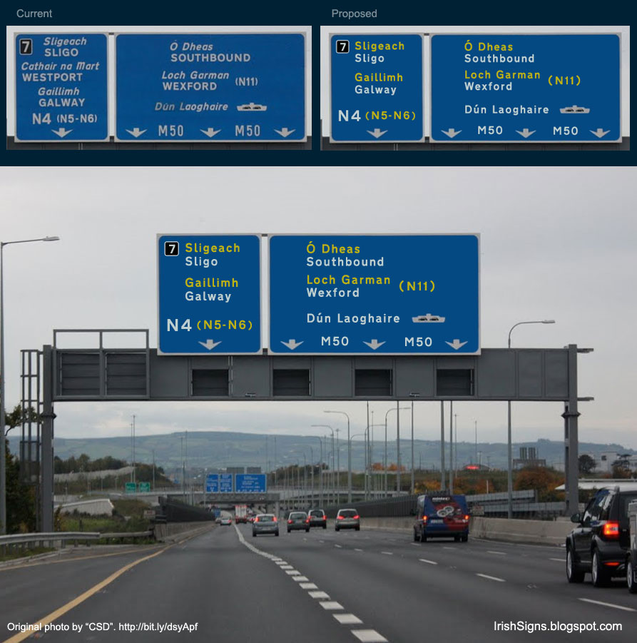
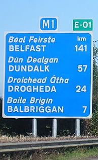
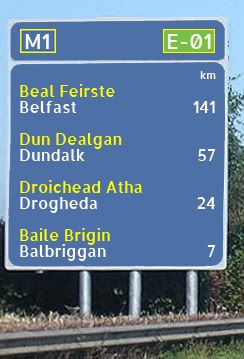
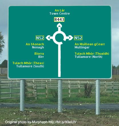
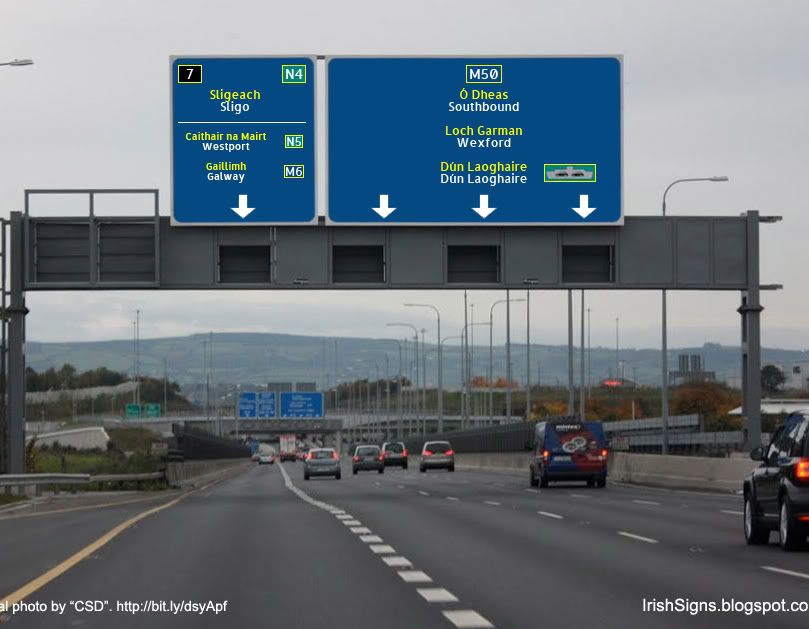
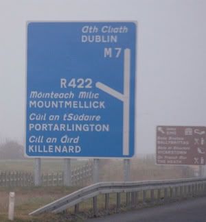
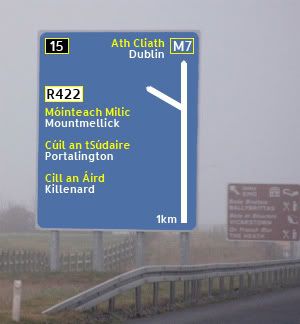
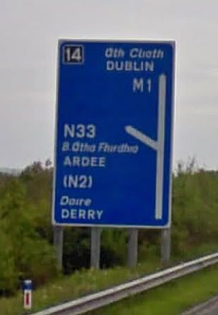
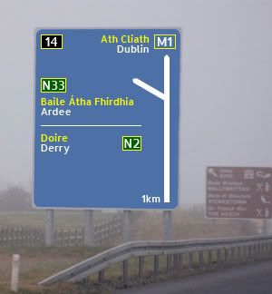
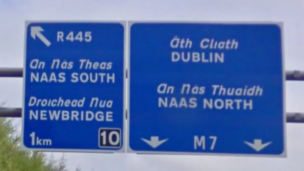
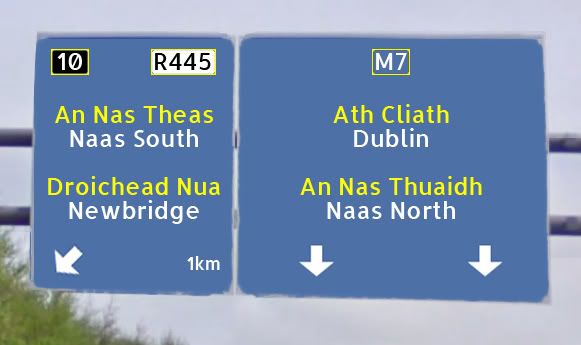
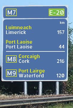
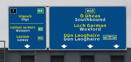
Bilingual Road Signs in Ireland

Options
24567

Comments

  • Registered Users Posts: 186 ✭✭That username is already in use.


    I have two more proposals, this time using Clearview, as used in the States.

    M50-Southbound-1.jpg

    Tullamore.jpg


  • Registered Users Posts: 186 ✭✭That username is already in use.


    Jayuu wrote: »

    old-m-rc01.jpgm-rc01.jpg

    Good work. The above is a good comparison of the dreadful and incoherent mess that we have at the moment and how easily it can be fixed.


  • Registered Users Posts: 1,132 ✭✭✭Stonewolf


    MYOB wrote: »
    Burtonport!

    Also, the second from the top doesn't have a road to it at all...

    Well there you go, I'm actually from Donegal and went to school with gaeltacht kids and I had no idea. Nobody calls the place anything but Burtonport (I'm pretty sure people nobody uses the Irish spelling of Arann Mor either).

    Honestly, I really don't see the point of having bilingual signs aimed at a monolingual populace.


  • Registered Users Posts: 186 ✭✭That username is already in use.


    Please find attachted two fonts I am using to create these signs.

    1. Transport - Used on UK road signs. Also used in Ireland, but butchered with CAPS for English and Italics for Irish, which the font was not designed for. Please note that Transport does not support fadas.

    2. Clearview - Used in the States


  • Registered Users Posts: 369 ✭✭Empire o de Sun


    Please find attachted two fonts I am using to create these signs.

    1. Transport - Used on UK road signs. Also used in Ireland, but butchered with CAPS for English and Italics for Irish, which the font was not designed for. Please note that Transport does not support fadas.

    2. Clearview - Used in the States

    That's not clearview,

    http://upload.wikimedia.org/wikipedia/commons/9/94/Clearview_sample.svg


  • Advertisement
  • Registered Users Posts: 186 ✭✭That username is already in use.


    That's not clearview

    Do you have Clearview you can upload here?


  • Registered Users Posts: 369 ✭✭Empire o de Sun


    136856.png136857.png


  • Registered Users Posts: 186 ✭✭That username is already in use.


    Can you attach a TTF or OTF?


  • Registered Users Posts: 2,278 ✭✭✭mackerski


    Others have hinted at it, but let's examine from first principles why we are doing this in the first place. Firstly, there are countries that have multilingual signs, and many (Wales) make an utter pig's ear of it. I'm not so fond of the Scottish approach either, since they often end up robbing the yellow that drivers have become accustomed to associate with an A-road number. It's worth noting that Ireland, Scotland and Wales are all countries that have a dominant/minority language split and have opted for bilingual signs to accommodate this.

    But if we look at many of the countries with several languages, but where the languages are not endangered, we often find that signs are as a rule monolingual, with the occasional translation, usually in brackets, of significant locations on a long-distance route (such as how some, but not all, French road signs include the German spelling of Aachen). From my own observations, monolingual signs are the rule in:
    • Belgium
    • Luxembourg
    • Gaeltacht (oddly enough)
    • Italy
    • Switzerland

    In all of the countries (and the Gaeltacht) listed above, roads are signed in the language local to that area, though with a few twists. In Italy, for instance, Motorway signs are sometimes in Italian even in the German-speaking zone.

    I think bilingual signs are an impossible dilemma. The ones we have now are readable (in English) because the typography does indeed draw attention to the English form at the expense of the Irish. As such, they are mere lip-service (and frequently mis-spelt lip-service too).

    So if you feel strongly about the place of Irish on the signs, as the OP clearly does, it's no surprise that you would look for ways to grant equal prominence to Irish. We've seen some attempts at this in the thread, and I think some of them actually manage it.

    So that's good, right? Not really. Because as I look at the signs that grant parity to both languages I suddenly can't find the information I need as quickly. The road sign no longer functions. This is bad. This is, I am sure, why most countries with a mixture of languages - ones used for practical purposes and usually devoid of baggage - pick the most reasonable language for the area in which the sign is placed and use it.

    Today we already do this to some extent anyway. We've already seen an example posted from the Gaeltacht. Place names in the Gaeltacht may now not even be signed in English from outside the Gaeltacht.

    A pragmatic way to make signs more readable - whether in English or Irish - would be to explore cases where a similar policy could be used for English language names. Some, like Beaumont, are clearly neither Irish nor English and can without injury to anybody's national pride readily be rendered in a single language, as already happens in some cases. Other places have, during this century, been assigned Irish names that have no basis in tradition - Blanchardstown springs to mind. If it is valid to sign only the original, traditional name of a Gaeltacht town, it must surely be valid to do the same outside the Gaeltacht. There are going to be plenty of cases where this doesn't work, but if Irish names are to gain extra prominence on signs without making the whole sign unreadable, you have to gain the space somewhere.

    A further option - certain signs, such as route confirmations, could be erected twice, once in English, once in Irish. We would, of course, have to argue over which one the driver should see first - but that's another day's work.


  • Registered Users Posts: 748 ✭✭✭Jayuu


    I've just done my versions of the latest two images (the roundabout and the ads for Sligo/Galway).

    n-round-01.jpg
    I think this was fairly straightforward. The more I do these the more I think there is a case for patching the actual route number is the relevant colour code because thereafter I think you can leave the rest of the sign in its base colour, so you are getting the information you need without odd blocks of colour on it.

    m-ads04.jpg
    This one took a bit of time to work out and I'm still not sure about whether it works. I was trying to be consistent with my earlier version (for the Naas exit) in which I had put my route number of the exit in the top right hand corner.
    This then left the problem of how to deal with the secondary routes off the exit. I tried a lot of different things before I decided that again to be consistent I should use the white line to differentiate between primary route and the secondary routes. Once I had done that then I realised that there was no reason why the secondary route destinations and patching had to be the same size so I lowered them down. Again the advantage of this system is that it clearly identifies the route with the destination.
    The one thing that I'm not completely happy about is that there is a lot of blue space on the main sign because of the font size used and I didn't want to stretch the font to fill the space. I'm also not sure about the placement of the icon for the ferry. Clearly it has to be beside Dún Laoghaire but I wasn't sure whether the text itself should move to the left to accommodate it. I did decide to patch it in a different colour so that its stands out as different.
    Once again I had to make a decision to put Dún Laoghaire on the sign in both colours for consistency. I did have a look at alternatives but I think in the longer term being consistent on a double usage is better.
    By the way it could be argued for consistency that both Wexford and Dún Laoghaire on the main signs should also have route numbers beside them like the exit signs but I think that's forgivable in what you are trying to convey here.

    Have to say that I'm quite enjoying this exercise and it is showing me that its harder than you think to come up with a consistent usage policy. I'm not completely forgiving the NRA for the messy signs we have now but I guess I'm being a bit more lenient with them. :)


  • Advertisement
  • Registered Users Posts: 369 ✭✭Empire o de Sun


    Can you attach a TTF or OTF?

    There is all the USA Fonts, Highway Gothic Series and the new Clearview Series.


  • Registered Users Posts: 3,772 ✭✭✭Nuttzz


    ardmacha wrote: »
    Why are you doing it, then? Keep the thread about sign design, please.
    Scottish style proposal 2 is good.

    Will do,

    Proposal 2 is quite readable compared to proposal 1, however I dont know what is wrong with what we use at the moment


  • Registered Users Posts: 674 ✭✭✭etchyed


    Nuttzz wrote: »
    Will do,

    Proposal 2 is quite readable compared to proposal 1, however I dont know what is wrong with what we use at the moment
    Really, you don't? Because I spent a good 5 minutes of my life explaining to you exactly what's wrong with it. It'd be nice for you to at least explain why you disagree, rather than just ignore the reasons that you've been given.


  • Registered Users Posts: 674 ✭✭✭etchyed


    using AutoCAD Lt

    here an old one I did
    Interesting to see Irish placenames in that style, but the toll symbol is not good. Red circles indicate prohibition of something.


  • Registered Users Posts: 674 ✭✭✭etchyed


    OT: I can't see much wrong with bilingual road signs in Ireland. Most people, even Irish speakers, will be looking for the English language name for their destination. The present system, where these are in a clear, easy to read font, in capital letters makes it easy to see them even when driving at high speed.
    Mixed case is easier to read at high speeds. That's not a matter of opinion.
    Arabic speakers clearly look at the Arabic script, non-Arabic speakers look at the Latin script.

    AFAIK, this doesn't cause any problems in those countries.
    I think you're underestimating the difference between filtering out writing in an entirely different script and filtering out writing in a different language in the same script as your own.


  • Registered Users Posts: 2,091 ✭✭✭marmurr1916


    etchyed wrote: »
    Mixed case is easier to read at high speeds. That's not a matter of opinion.

    I think you're underestimating the difference between filtering out writing in an entirely different script and filtering out writing in a different language in the same script as your own.

    It's never been a problem for me or for anyone I've ever known. What percentage of people even look at the Irish version of the name? I doubt that very many foreign tourists take much notice either, at least not when they're actually looking at the signs for for directional purposes.


  • Registered Users Posts: 674 ✭✭✭etchyed


    Jayuu wrote: »
    I decided to have a go at this and also expanding out from Garret Reil's site and project had a look at what I would like to see in signage both on motorways and in general.

    Here are a couple of examples I came up with. I used some of the examples already shown here and also I decided to use the ALLERTA font which I think works really well as a clean crisp font (it also helped that it was Open Source as well!).
    I don't really understand why you've decided to use a random font like this. There are a relatively small number of fonts used for roadsigns around the world, examples of which are in this post by Empire o de sun. These fonts are designed specifically for road signage. I'm not a typography expert but I'd imagine there are sound reasons why authorities don't go about just using Arial or whatever takes their fancy. So I think it makes more sense to use a roadsign-specific font, and I don't see what the problem is with Transport to be honest.
    Firstly some advance directional signage:
    old-m-ads01.jpgm-ads01.jpg
    The first thing is that I decided to use the colours for the road types involved on the signage, so in this example because the R442 is a regional road its put into a black on white patch. I think this reinforces the road type of the exiting road.
    Under the current rules, coloured patching is not used on motorways in Ireland. Where patching is used (ie national and regional roads) the destinations are patched, not just the route numbers. Patching route numbers alone was an early implementation of patching rules and where you see it on relatively new signs, it's wrong.

    I'm not entirely sure I agree with the blue-only-on-motorways rule. The French use the colour of the route the exit leads to rather than simply blue. But for consistency with the signage on, for example, dual-carriageway N-roads, I'd patch all the destinations too. Those little white and green route number patches are a bit small to be noticed.
    old-m-ads02.jpgm-ads02a.jpg
    This is similar to the first one except to show how I would indicate where a secondary route is accessible. I really don't like the current arrangement of the brackets. I think it throws off the design of the signs. I'm not sure whether the white line between the destinations is necessary but I did want some way to indicate the primary route being taken. Note again the use of colour for the road type.
    m-ads02.jpg
    This is an alternative for the above sign where I've put the secondary route designation to the right of the location. I can't make my mind up on whether this is a better option or not. It does make better use of space on the sign should there be a need to indicate more than one secondary route.
    I think your dislike of brackets is very much an aesthetic thing. IMO they show more clearly and intuitively the meaning intended, i.e. you'll take the N33 for a while to get to the N2. So I don't really like these ideas.
    Finally for the moment in the advance directional signage is an option for overhead gantries. This may need further refinement.
    old-m-ads03.jpgm-ads03.jpg
    What I really hate about the old sign here are the inconsistencies on it. Now I know this is one that has been around a while and newer signs may be better but the fact the route numbers, arrows and names are all in different places make the sign really messy. In my version the route numbers are on the same level (although I still have to work out how you would deal with an exit with multiple route numbers!) and the junction number is in the familiar top left position. Also the arrows are consistently at the bottom.
    Another thing here is that I think the use of different colour for Irish and English makes it possible to centre all the text on one axis as opposed to centering the overall text but having the Irish and English version start in the same positions.
    While this also has elements of your proposals that I don't like (patched R-road number, yellow box around junction number and motorway number - why?!!!) you're right about the inconsistency and I like the way you've tidied it up.
    Jayuu wrote: »
    m-rc02a.jpg
    Much as I disagree with your ditching of the brackets for aesthetics' sake, I can't help but like this. It does show very clearly what's what.

    Sorry for all the image quoting and sorry to Jayuu if this seems like an attack. I appreciate they will have taken time to put together and there are some good ideas there. Hope you can take the criticism how it's intended.


  • Registered Users Posts: 674 ✭✭✭etchyed


    It's never been a problem for me or for anyone I've ever known. What percentage of people even look at the Irish version of the name? I doubt that very many foreign tourists take much notice either, at least not when they're actually looking at the signs for for directional purposes.
    I realise this. But that's because Irish signs demote the Irish to a bizarre oblique mess that's easily ignored.

    I don't think you understand my point, which is that your comparison with Arabic signage makes no sense. It's much easier to filter the Arabic text than it is to filter out Welsh text on Welsh road signs.

    That's why colour differentiation, a la Scotland, is the best option in my opinion.


  • Registered Users Posts: 2,091 ✭✭✭marmurr1916


    etchyed wrote: »
    I realise this. But that's because Irish signs demote the Irish to a bizarre oblique mess that's easily ignored.

    I don't think you understand my point, which is that your comparison with Arabic signage makes no sense. It's much easier to filter the Arabic text than it is to filter out Welsh text on Welsh road signs.

    Unless you're an Arabic speaker, which the majority of people in Arabic-speaking countries tend to be. ;)
    etchyed wrote: »
    That's why colour differentiation, a la Scotland, is the best option in my opinion.

    Have seen it in real life. Don't think it's all that great.


  • Advertisement
  • Registered Users Posts: 674 ✭✭✭etchyed


    Unless you're an Arabic speaker, which the majority of people in Arabic-speaking countries tend to be. ;)
    And they'll quite easily filter out the English
    Have seen it in real life. Don't think it's all that great.
    It's great if you want to give equal prominence to two languages. As I said in my earlier post, whether you agree with that premise or not is immaterial in discussing how best to implement it.

    Mackerski's post really gets to the heart of this. The current signs seem to intentionally not meet their bilingual purpose. They are a fudge, which keep English-speakers happy by giving English much more prominence. Most irritatingly, Irish-only placenames are written in that dreadful oblique font, making it in some ways the default font for signage.

    The crap way in which the Irish is written makes its inclusion, as mackerski said, lip-service (a more appropriate description than my "tokenism"). I think it should either have equal prominence or not be there at all.


  • Registered Users Posts: 748 ✭✭✭Jayuu


    etchyed wrote: »
    I don't really understand why you've decided to use a random font like this. There are a relatively small number of fonts used for roadsigns around the world, examples of which are in by Empire o de sun. These fonts are designed specifically for road signage. I'm not a typography expert but I'd imagine there are sound reasons why authorities don't go about just using Arial or whatever takes their fancy. So I think it makes more sense to use a roadsign-specific font, and I don't see what the problem is with Transport to be honest.

    Well I mainly used Allerta because I didn't have the other fonts on my PC when I was doing the signs. :) I can easily go back and do them in one of the other fonts.
    That being said Allerta was designed specifically for signage by its creator, so its not just a random font, and it has a lot of thought put into it as to how to make each letter clear and easy to read. I happen to think it works very well.
    I don't like Transport mainly because of the similarity between the lower case "a" and the "o" especially where the fáda (again not part of the original font) is used. Perhaps its because I don't like its current use in Ireland is why I don't like it.
    etchyed wrote: »
    Under the current rules, coloured patching is not used on motorways in Ireland. Where patching is used (ie national and regional roads) the destinations are patched, not just the route numbers. Patching route numbers alone was an early implementation of patching rules and where you see it on relatively new signs, it's wrong.

    I'm not entirely sure I agree with the blue-only-on-motorways rule. The French use the colour of the route the exit leads to rather than simply blue. But for consistency with the signage on, for example, dual-carriageway N-roads, I'd patch all the destinations too. Those little white and green route number patches are a bit small to be noticed.

    I know patching isn't used (or shouldn't be used) currently but this isn't about just reproducing what is current but examining different approaches. The problem with patching the entire destination is that you can end up with splotches of colour all over the sign. Again I think just patching the route number is clean and simple and gets the message across. Remember its not just one sign you see. There would be a whole series of signs approaching any junction.
    I did some work and courses many years ago in computer based training systems and GUI designs and one of the main things that research at that time showed was that the more colours you have on a screen the more distracting it is for the user. I would suggest that the same is true for signage. This style allows for a consistent back colour and then small splashes of another colour to highlight differences.
    etchyed wrote: »
    I think your dislike of brackets is very much an aesthetic thing. IMO they show more clearly and intuitively the meaning intended, i.e. you'll take the N33 for a while to get to the N2. So I don't really like these ideas.

    I don't agree with you that its intuitive about the meaning. I think its because you already know what the brackets mean. But somebody coming to it for the first time may not understand the intention. My main problem with the brackets in this example is that its only around the route number so its not entirely clear why the route number is in brackets and the destination isn't.
    That said I'm not sure the any of my alternatives convey a clear meaning either. I think perhaps if I were to do this again I would put the route number first and then the destination (as I did in the distances sign later on that you liked).
    etchyed wrote: »
    While this also has elements of your proposals that I don't like (patched R-road number, yellow box around junction number and motorway number - why?!!!) you're right about the inconsistency and I like the way you've tidied it up.

    Looking at this further I think the yellow box around the junction number is a mistake. I think it should be white as currently used. The idea of the yellow box around the route numbers is to establish a pattern that helps the route number stand out from the rest of the information. So anywhere you see a yellow box you're referencing a route number. If this was used consistently on all signage then its make the whole signage system clearer. In isolation it probably doesn't really add anything to this sign.
    In fairness to the existing sign I think its been there a while and its probably not representative of current usage practice.
    etchyed wrote: »
    Much as I disagree with your ditching of the brackets for aesthetics' sake, I can't help but like this. It does show very clearly what's what.

    I do like this one as well and I think it works best for the concept of identifying main routes and other routes. I can't help myself about the brackets, I just really dislike them. :)
    My one criticism of my design is that by not having all the text aligned correctly it can make the sign more confusing. However I suppose the line break and consistent use of alignment within each section slightly remedies that. I think that is the main problem I have with the use of the brackets. It shoves the text and the numbers out of line with the rest of the sign.

    etchyed wrote: »
    Sorry for all the image quoting and sorry to Jayuu if this seems like an attack. I appreciate they will have taken time to put together and there are some good ideas there. Hope you can take the criticism how it's intended.

    Of course I don't take it personally. Everybody is entitled to an opinion and to disagree with others. As I said in my last post doing this has shown me how tricky it is to come up with a consistent standard that can be used. In fact I think its inevitable that at some point there will be signs that don't entirely fit the standard. But I do think that our current system isn't great and its application is not consistent. Obviously its not going to be changed in the near future (if ever) but it is a worthwhile exercise looking at alternative options and proposals.


  • Registered Users Posts: 186 ✭✭That username is already in use.


    Jayuu wrote: »

    m-ads04.jpg

    :)

    Super work, Jayuu. This is great. Collaboration, just as I wanted!

    I definitely like your idea for the route numbers.

    One thing; you have decreased the font size in order to fit in all the info.

    Make sure to keep the font size the same as the original as I have done.

    M50-Southbound-1.jpg

    As soon as I have the time, I'll upload a new pic using some of your ideas.


  • Registered Users Posts: 748 ✭✭✭Jayuu


    Yes, I take your point about the font size. The problem is that I don't want to stretch the font in order to make it fit more because it starts to look odd. Maybe there's no way around that. Perhaps I'll look at the spacing of them.

    I've also had redesigned them in the USA font that you uploaded, thanks for that. They installed on my system under the name Roadgeek (!) but it looks like Clearview. I've used the Series 3W version as I think that the best one. Perhaps I should use a wider version of the font for the larger signs. It may not look that bad because its still part of the same font group.

    I do want the signs to look consistent because that is one of my main gripes with the current system. I hate the real narrow version of the Transport font that is used on some of the signs in order to fit the information on the sign. It looks so amateurish.


    m-ads04-small.jpg
    Here is the revised version using the Clearview text and with the main text larger (done by using a larger font and stretching it slightly). I've also put the junction box back into a white surround as well as the ferry symbol so as to distinguish them from the route numbers. Don't know if I'm entirely happy with it but it probably does work better on the larger sign.


  • Registered Users Posts: 369 ✭✭Empire o de Sun


    They are Roadgeeks fonts. The real version of Clearview is subject to license and cost thousands for the complete set.


  • Registered Users Posts: 748 ✭✭✭Jayuu


    They are Roadgeeks fonts. The real version of Clearview is subject to license and cost thousands for the complete set.

    I assume they are similar to the Clearview font. They certainly look similar.


  • Registered Users Posts: 3,772 ✭✭✭Nuttzz


    etchyed wrote: »
    Really, you don't? Because I spent a good 5 minutes of my life explaining to you exactly what's wrong with it. It'd be nice for you to at least explain why you disagree, rather than just ignore the reasons that you've been given.

    Ok,

    I dont find them ugly,

    I dont see what is wrong with italics, it shows the difference between Irish & english

    I never had a problem reading them because the english was capitalised.


    I do think the different colours is a good idea, and the improvements outlined here are nice to look at, but i cant see any change coming down the pipeline for a while


  • Registered Users Posts: 369 ✭✭Empire o de Sun


    Jayuu wrote: »
    I assume they are similar to the Clearview font. They certainly look similar.

    they are his/her "interpenetration", so in effect they are an, if not exact, a 99% copy.


  • Registered Users Posts: 674 ✭✭✭etchyed


    Nuttzz wrote: »
    Ok,

    I dont find them ugly,
    Whether the signs are ugly or not is not important, I acknowledge that.
    I dont see what is wrong with italics, it shows the difference between Irish & english
    As has been discussed, it gives the Irish less prominence.
    I never had a problem reading them because the english was capitalised.
    Most people can read them quicker if they aren't
    I do think the different colours is a good idea, and the improvements outlined here are nice to look at, but i cant see any change coming down the pipeline for a while
    Nor can I but this is more a hypothetical discussion than anything else.

    It seems to me you're either unable to understand the problems with the current signs or unable to come up with decent arguments that they're fine other than "sure it's grand as it is". If that's all you have to add why bother posting?


  • Advertisement
  • Registered Users Posts: 674 ✭✭✭etchyed


    Jayuu wrote: »
    Well I mainly used Allerta because I didn't have the other fonts on my PC when I was doing the signs. :) I can easily go back and do them in one of the other fonts.
    That being said Allerta was designed specifically for signage by its creator, so its not just a random font, and it has a lot of thought put into it as to how to make each letter clear and easy to read. I happen to think it works very well.
    I don't like Transport mainly because of the similarity between the lower case "a" and the "o" especially where the fáda (again not part of the original font) is used. Perhaps its because I don't like its current use in Ireland is why I don't like it.

    I know patching isn't used (or shouldn't be used) currently but this isn't about just reproducing what is current but examining different approaches. The problem with patching the entire destination is that you can end up with splotches of colour all over the sign. Again I think just patching the route number is clean and simple and gets the message across. Remember its not just one sign you see. There would be a whole series of signs approaching any junction.

    I did some work and courses many years ago in computer based training systems and GUI designs and one of the main things that research at that time showed was that the more colours you have on a screen the more distracting it is for the user. I would suggest that the same is true for signage. This style allows for a consistent back colour and then small splashes of another colour to highlight differences.
    Thanks for the response. Apologies about the font, I didn't realise it was specifically chosen. And that's an interesting point about the colours.


This discussion has been closed.
Advertisement