Advertisement
If you have a new account but are having problems posting or verifying your account, please email us on hello@boards.ie for help. Thanks :)
Hello all! Please ensure that you are posting a new thread or question in the appropriate forum. The Feedback forum is overwhelmed with questions that are having to be moved elsewhere. If you need help to verify your account contact hello@boards.ie
Hi all! We have been experiencing an issue on site where threads have been missing the latest postings. The platform host Vanilla are working on this issue. A workaround that has been used by some is to navigate back from 1 to 10+ pages to re-sync the thread and this will then show the latest posts. Thanks, Mike.
Hi there,
There is an issue with role permissions that is being worked on at the moment.
If you are having trouble with access or permissions on regional forums please post here to get access: https://www.boards.ie/discussion/2058365403/you-do-not-have-permission-for-that#latest
There is an issue with role permissions that is being worked on at the moment.
If you are having trouble with access or permissions on regional forums please post here to get access: https://www.boards.ie/discussion/2058365403/you-do-not-have-permission-for-that#latest
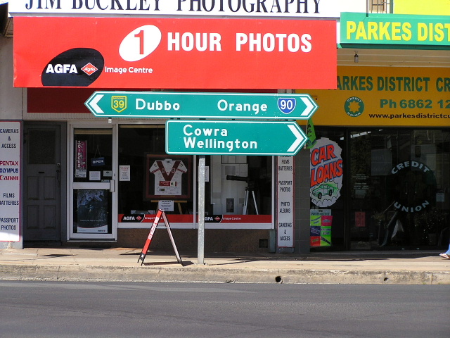
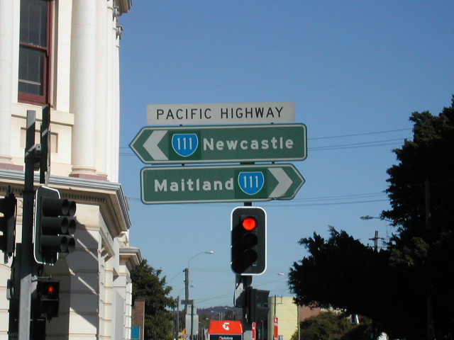
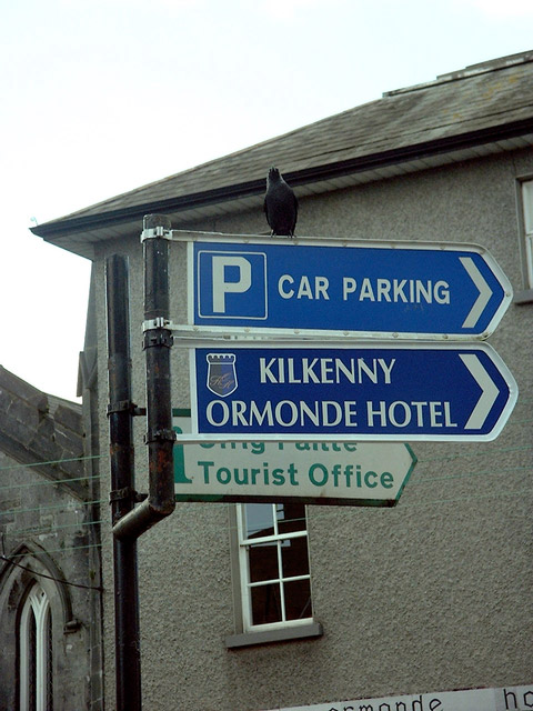
Poor Road Signage Pictures
Comments
-
Good to see they’ve put up a set of lights with the white borders that are more securely fastened than those on the older Mellor heads. As this crossing is for cyclists as well will they be marking it with two pathways and thus three white lines? In combination with the stop line at the lights this will make for a slightly ambiguous set of road markings. I think dashed lines would be a superior option.I wonder where the pointless pedestrian crossing is?
Came across this site – www.elmore.ie – the Elmore Group. They seem to supply lots of signals, lighting and traffic control systems to both the Republic and the UK. There’s some curious stuff on it. They supply the three types of pedestrian push buttons you’ll see in the UK/Ireland. The thing is though, why is the large ‘silver’ button type used in Dublin city but the Prisma Teknik/UK style versions used elsewhere down there? Surely it would be more of an aid to the blind in particular if there was one standard specification thereby reducing confusion as all buttons would feel the same.
The other strange thing about lights in the Republic is the two types of pole they’re mounted on. One is the same as the UK version with a grey plastic coating and a pole top termination unit. The other is galvanised with an access door about midway. The problem with the latter is that it surely contravenes the safety logic of using circular poles in the first place. If you fall and head butt one of these in the wrong place your going to do yourself some nasty damage on those sharp edges. I wonder is this why the latter isn’t used on the UK? Oh, and I’m surprised LA’s haven’t looked about getting a version with stripes.")
On traffic light heads the Republic seems just as inconsistent. Some have white borders but others don’t. In this case while many down they’re simply aren’t fitted with the borders they could have, many other sets have the smaller heads which seem to have no backing board attachments at all. Then there are the ‘mini’ Alustar versions (not Techmiracle as I previously thought) now going up in Dublin city but nowhere else! I like these but again, as with poles and buttons, why is there so little standardisation in the Republic? You’d think that consistency would bring the benefits of lower replacement costs, etc. It’s managed right across the UK.
Lastly, I see that Elmore have the maintenance contract for all the two-aspect school warning signals put up by the NRA. So now you know who to email if you see one in poor nick!:cool:0 -
Does anyone know if the SCATS traffic management system supplied by Elmore is used anywhere outside of Dublin?
Pic: It’s a shame that when DCC went to such lengths to install the attractive AluStar heads/stainless steal poles that matching countdown displays couldn’t be sourced. The later looks as if it’s in the style of the Mellor heads. Interestingly, the Elmore site shows a set of two aspect AluStar pedestrian crossing lights – so they’re suitable for the UK as well.
I forgot to ask you about this. Can you say more at this stage?Murphaph wrote:We're working on a website atm, will keep you informed when it goes live. 0
0 -
MT wrote:Came across this site – www.elmore.ie – the Elmore Group. They seem to supply lots of signals, lighting and traffic control systems to both the Republic and the UK. There’s some curious stuff on it. They supply the three types of pedestrian push buttons you’ll see in the UK/Ireland. The thing is though, why is the large ‘silver’ button type used in Dublin city but the Prisma Teknik/UK style versions used elsewhere down there?
I pass a few of the 'silver' pedestrian button type on the way to work. I frequently have to contact DCC Traffic Mgt Centre (1800-872-345) to report the buttons being stuck.
I've just emailed Elmore about the solar powered road studs, asking if they are installed anywhere in Ireland. They sound great, a massive improvement on the crappy passive cats eyes out there.0 -
Join Date:Posts: 5117
Victor, thanks for the link.daymobrew wrote:I wonder where the pointless pedestrian crossing is?") I love my pointless pedestrian crossing!
I love my pointless pedestrian crossing!
It's on the Outer Ring Road to the west of Clondalkin. I believe this junction is going to be a new access road for Corkagh Park which has yet to be connected up. The No Through Traffic sign is on White's Road, just at the crossroads beside the entrance to Castleknock College. It was pointing in the wrong direction, so I straighened it.
We need armies of sign straighteners in this country!0 -
Shame about them getting stuck because out of the various designs the silver button types would be my preferred choice. They are the least bulky and have a fairly simple yet attractive design and with the large button are the easiest to use. The button on the UK version is too small and fiddly while I don’t think the one on the Prisma Teknik is raised thereby being difficult for the blind to find through touch. The silver button types also respond to all the senses with sound, a flashing light and a vibrating panel. So they cater for all disabilities and none.I pass a few of the 'silver' pedestrian button type on the way to work. I frequently have to contact DCC Traffic Mgt Centre (1800-872-345) to report the buttons being stuck.
Pic: This newly installed crossing on Patrick street in Cork has only two aspects for pedestrians. Again, it’s yet another example of inconsistency – to go along with different posts with various finishes, some heads with borders/some without/grey borders in Dublin, mid-post access/post-top access, 3 different button types and peculiar looking heads like these.
For a small country the Republic certainly goes in for variety!
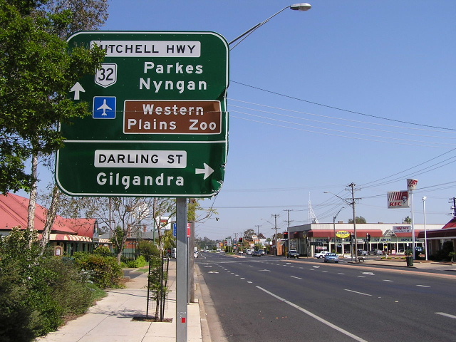
Indeed, that picture captures some other common failings: a go left arrow seemingly blocking the lights, brown finger posts and the obligatory random stripey post to the right. If urban areas want to go for finger posts for ‘touristy’ reasons due to their rustic appearance then they should be of the type that are fixed and can’t be rotated.
Pic: It’s strange that Cork’s Patrick street redevelopment went for the opposite of what went up on O’Connell street in Dublin. The former has stainless steel signposts and galvanised traffic light posts whereas the latter has the reverse?! I wonder does stainless steel provide as much grip for sign brackets?
On a positive note the Republic’s ‘no entry’ sign is far more logical than the European version we have up here.
*****************
Given that the TSM is poorly complied with or even understood I’d be concerned that the sign and signal business seem to be dominated by one major player in each – Rennicks and Elmore respectively. Surely a bit more competition for these monopolies might lift standards of compliance with the regulations. Would the Republic’s market be large enough to attract a UK firm? After all, Rennicks and Elmore have both expanded into the Britain.0 -
Advertisement
-
Could you see if it had been mounted using the anti-rotation brackets with raised pips? If not, send an email to the LA as the sign manual requires such measures be taken.spacetweek wrote:The No Through Traffic sign is on White's Road, just at the crossroads beside the entrance to Castleknock College. It was pointing in the wrong direction, so I straighened it.0 -
Some canabalisations from earlier in the thread.0
-
MT wrote:Could you see if it had been mounted using the anti-rotation brackets with raised pips? If not, send an email to the LA as the sign manual requires such measures be taken.
If the sign manual were to be applied to the White's Road sign you'd probably focus first on the typeface - the one used for the Irish text is not only non-standard for road signs, it's in the old script that was abolished in the 1960s. Which BTW I think is fine, since it's clearly intended as a "heritage" sign.
Dermot0 -
-
I saw the No Through Traffic sign last night and wondered why the wall was on a different side to that in the photo. I has assumed that there was a second sign.spacetweek wrote:The No Through Traffic sign is on White's Road, just at the crossroads beside the entrance to Castleknock College. It was pointing in the wrong direction, so I straighened it.
We need armies of sign straighteners in this country!
The finger post estate signs near me (Riverwood, near Coolmine train station) used to get turned in the wind. Numerous times I had the wrench and vice grips out to fix them. Lots of stares from people. One lady asked me to fix the fallen sign near her house; I had to explain that I wasn't from Castlethorn Construction or the LA, no could I fix a fallen sign.
It feels good to be proactive.0 -
Advertisement
-
Fallen signs are a major problem. They are often caused by anti-social behaviour believe it or not. There is a very new sign in Porterstown that was erected with a single pole in concrrete in soil, it was pulled sown yesterday or the day before. It's actually east nough to pull them down if they aren't surounded by a foot or more of deep concrete as the pole is a very effective lever!
I was at the match yesterday and driving across 'old Dublin' you see a marked difference between the way DCC do road signs and the way FCC do 'em. You see FAR more use of existing street furniture being used for signage than elsewhere and I bet a big reason is that it's easier in suburbia and rural settings to dig a hole in the muck, throgh some mortar into it and stick up a pole and a sign rather than going to the trouble of using a bander to secure signage to a lamp post, but in the city there is no mck, so to dig the hole you'd have to break up concrete first so they don't bother and the bander is easier.
On another note relating to DCC, the gantry signs on the R110 (Naas Road) have proper paneling in accordance with the TSM which indicates an exit but no lane drop. It looks almost pefect but I must go and get a pic of them to make sure.0 -
spacetweek wrote:Victor, thanks for the link. I love my pointless pedestrian crossing!
It's on the Outer Ring Road to the west of Clondalkin. I believe this junction is going to be a new access road for Corkagh Park which has yet to be connected up.
They bothered to cover up the signs for Adamstown (well, most of them) on the Outer Ring Road, but not the one for Corkagh Desmene, despite the fact that following this sign will lead you into a roadblock!0 -
-
Join Date:Posts: 5117
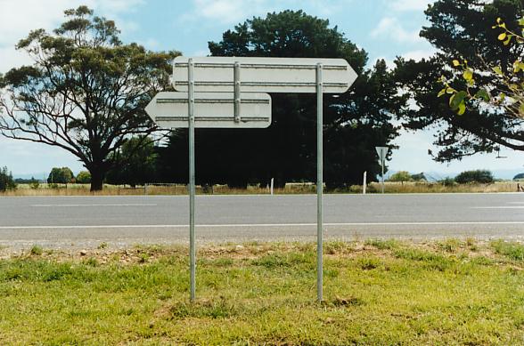
I'm confused by the sign; it looks really old, but it's in km/hour? What is it, some kind of experiment?Victor wrote:0 -
At-the-junction-signage revisited:
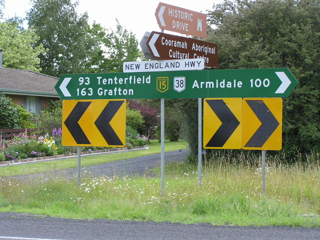
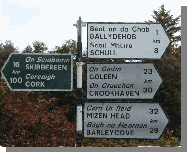
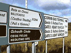
This is one of the areas where signage in the Republic is either dire or extremely haphazard. So I’ve put together a collection of inadequate signage and juxtaposed it with examples of superior junction signs from Australia.
Pic: Needless finger post stuck in here when the posts for the plate signage could have been combined with another plate flag for the minor road – like this. That set up in New South Wales, Australia is a fairly standard and convenient method of displaying plate fingers at a T junction. It’s frequently employed throughout UK (example) but I’ve never seen this arrangement in the Republic. I realise that the South’s TSM is critical of too much signage ‘bulk’ in one location but this beats the use of easily twisted finger posts any day.
Pic: If signs have to be combined on the one spot at a cross roads then to avoid the inevitable rotation plate fingers should be used. The New South Wales arrangement isn’t ideal (the sign for Warren would be less than easily made out from the far side of the priority road) but this method results in signs that are far more resistant to vandalism and knocks than a finger post.
Pic: Again a finger post is susceptible to twisting whereas a plate arrangement isn’t. The later also trumps the Irish version as chevrons, route numbers and a dead end warning are also included giving a much more visible and informative arrangement.
Pic: Not only can fingers on one post be twisted but the entire thing can be pulled over easily. Both problems are eradicated when two posts per sign are used – example.
Pic: Republic’s approach to an important T junction – Australian/UK method. Which is more robust and less cluttered? The latter also avoids having fingers in the same plane increasing all round visibility.
Pic: Easily twisted fingers, whereas the plate versions with two posts per sign can’t be rotated.
Pic: Fingers on solitary posts allow for signs to be twisted or even pushed over. Plates make for a much more robust set up.
Pic: Another collection awaiting a vandal to twist them. No such risk here.
Pic: The font on Irish fingers in general is smaller, less spaced and so less readable than the Australian equivalent. But these older finger posts are particularly sore on the eyes. The contrast with the highly visible plates in Oz couldn’t be more marked.
Pic: Finger posts also allow for the careless habit of placing signs in the same plane reducing visibility. Not possible with a combined plate assembly. That generic campsite sign provides a clue to what could be used in place of the gazillion guest house fingers tacked onto junction signage in the Republic – a simple [B&B’s> plate that could be used for all such houses.
Pic: And there’s no excuse for older signage that isn’t quite up to date in the Republic. Back when this finger post was put up the Australian’s were still using a plate version – with chevrons – even if the signs are less eye catching than the most modern type.
Pic: In the Republic tourism gets unreliable finger posts and plenty of private advertising. In Australia they use proper plate signs and locals don’t seem to take advantage.
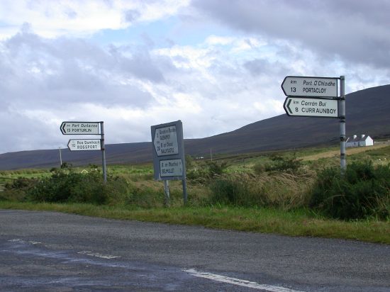
Pic: Poor picture but enough to compare with a much more readable Australian equivalent.
Pic: Easy to twist. Completely secure.
Pic: Clutter. Clarity.
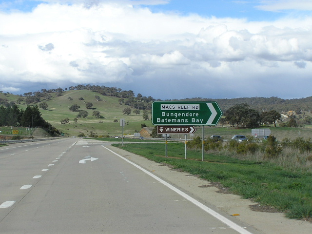
Pic: You just know that if Ireland had wineries each and every one would have to have a separate sign.
Pic: How is it that local authorities in the Republic can’t seem to figure out how to use plate signage for all three directions at a T junction? The Australian’s have no difficulty – example. There are also too many directions given at the Irish junction.
Pic: In the Republic important direction signs, like this one for Connemara, are often tucked away amongst a wall of advertising. Australia seems to keep things clear and simple by only permitting genuine direction signage at junctions. Pity LAs in the south can’t enforce this policy.
Pic: I’ve reviewed this offering before but here is how it might properly be laid out. Signs for the priority road have been placed where they can be clearly read on the far verge.
Pic: It’s just so easy to follow… er, not. No wonder those cyclists had to stop. No such problems even with older signage in Australia.
Pic: In Australia tourism info is neatly combined with the other signage using no extra posts. This junction in the Republic betrays a less concerned philosophy. The direction signs have been plonked partially in front of a separate tourism finger post. Couldn’t the info have been combined like the tidy Australian version instead of this mess?
Pic: STOP! Or you’ll never make sense of this lot. Though now superseded by larger plates this example of older NSW junction signage provides much more clarity.
Pic: Another thing local authorities in the Republic haven’t figured out is how to mount a shorter plate beneath a longer one when the available posts are too far apart. As in that Gaeltacht picture they usually resort to the half-arsed measure of bolting on an easily twisted finger on just one of the posts. In the UK and Australia they seem to have long ago found a solution to this conundrum. Simply use an additional short post part way along the larger sign – front view. Simple really!
Pic: Another frequent failing of junction signage in the Republic is excess information: there are often just too many directions given. The Australians keep things simple with fewer locations thus enabling drivers to quickly and easily take in what they’re being told.
What can you say, really? The pictures speak for themselves: junction signage in Australia is easy to follow and assembled to withstand wear and tear, the equivalent in the Republic can only be described as god awful tat for the most part.0 -
I think someone just "had an idea". It's at the skew bridge on the Lower Glanmire road in Corkspacetweek wrote:I'm confused by the sign; it looks really old, but it's in km/hour? What is it, some kind of experiment?0 -
The R148 used to be the N4. They just patched the old signs.icdg wrote:On the other side of that level crossings, the start of urban area signs for Cluain Saileach/Clonsilla are in N-road colours. Not the first time I've seen the wrong colours used though, there's a sign on the R148 in Leixlip also in N-road colours (although the actual "R148" on it is patched in white).0 -
How’s this for a bit of improvised patching!! This must have taken place after Minister O Cuiv’s directive on ending the use of bilingual signs in the Gaeltachts. But, my God, talk about a rough job! Why are the numerical patches yellow backed for a white panels? And while white spray paint (trés professional) has been applied to the top panel the lads doing this must have ran out as they’ve had to use brown on the lowest white panel.:rolleyes:They just patched the old signs.
It’s just an unsightly mess – where’s the pride in their work?? 0 -
Instead of too many directions being given, do you suggest one (or two) destinations for each direction? Maybe with a route number like in Australia?MT wrote:Pic: Another frequent failing of junction signage in the Republic is excess information: there are often just too many directions given. The Australians keep things simple with fewer locations thus enabling drivers to quickly and easily take in what they’re being told.
For the junction in Cork would you suggest Skibbereen for the left direction (or Cork because it's bigger) and Mizen Head for the right?0 -
Join Date:Posts: 5117
Yes, I think so. The system should be: at junctions, control (and very close) cities only; after the junction, distances and other towns. See attachment for the what the Irish junction should say.daymobrew wrote:Instead of too many directions being given, do you suggest one (or two) destinations for each direction? For the junction in Cork would you suggest Skibbereen for the left direction (or Cork because it's bigger) and Mizen Head for the right?
Also why was Barleycove listed last when it is the 4th furthest away? They should be strictly in order of distance.0 -
Advertisement
-
That would depend on the class of road. It looks (but could be wrong of course) like a national route exists to the left in which case the terminal town/city must be shown on top if possible and the next town/village of importance below. The (what looks like) local or regional road to the left should really just have the next town of significance, even if it's smaller than a following town. If this rule wasn't applied (as is the case here) you end up with potentially dozens of destinations appearing on signs. At the end of the day, a visitor should have a map and once the signs show rute numbers and 1 destination in each direction (like those excellent Aussie signs MT supplied) you can quickly and easily find yur way.daymobrew wrote:Instead of too many directions being given, do you suggest one (or two) destinations for each direction? Maybe with a route number like in Australia?
For the junction in Cork would you suggest Skibbereen for the left direction (or Cork because it's bigger) and Mizen Head for the right?
If the rules were applied religiously people would get used to how it's done. Curreently it's a right mix n' match.0 -
Join Date:Posts: 5117
That's the worst thing I've ever seen! It looks like it was altered by schoolkids. That sign needs to be replaced immediately.MT wrote:How’s this for a bit of improvised patching!! This must have taken place after Minister O Cuiv’s directive on ending the use of bilingual signs in the Gaeltachts. But, my God, talk about a rough job!0 -
I've seen worse! A junction was converted from roundabout to signal controlled up the road from me and they just sprayed GREY paint on the white backed sign around the circle bit but leaving the arrows. It looks absolutely attrocious, oh and they left the roundabout warning diamonds in place just to confuse people.spacetweek wrote:That's the worst thing I've ever seen! It looks like it was altered by schoolkids. That sign needs to be replaced immediately.0 -
spacetweek wrote:That's the worst thing I've ever seen! It looks like it was altered by schoolkids. That sign needs to be replaced immediately.
What it actually looks like is an attack by vandals who have an ideological hatred of the English language - a bit like the folks that like painting out the "L'" in "L'derry". But of course we realise that it's nothing of the sort - when the local authority does it, it suddenly becomes reasonable.
Dermot0 -
See Murphaph’s reply: I’d pretty much agree with his points. I feel that route numbers should always be included as these are as important as the destinations IMV. People should get into the habit of giving directions along the lines of ‘I live 5 miles out of Cork on the Rx’ instead of ‘…on the such and such road’.Instead of too many directions being given, do you suggest one (or two) destinations for each direction? Maybe with a route number like in Australia?
On important routes, distances should be given on route marker signs after the junction – as spacetweek has shown. However, if it’s just a junction on minor roads then at-the-junction signage would suffice with route numbers (if any) and distances given. No need for the added expense of reassurance/dist. signs. That’s pretty much the policy up here and it would seem to be the case in Australia as well.
Is there a limit on the number of destinations that can be displayed on a route marker sign? I’d say five should be the max. as any more becomes difficult to take in. Important tourism locations could be patched in brown (or additional)and the distance to other important roads, such as the M50, could also be provided with patching.
Although I’ve mentioned it before, the separate plate for the route number on the Republic’s route marker/dist. signs is pointless. I haven’t seen the equivalent in any other country, probably because a single panel is easier to install and maintain. Italian version.
Patching:
Pic: Unlike that bodge job above I think that when a sign has to be patched the same colour should be used. This maintains visual continuity making the sign easier to read. It’s also a lot less unsightly. Compare the ‘National 20’ patch here to the yellow backed R numbers in my previous post. The Australian patch is also the correct size matching the proportions of the other shields.0 -
Victor wrote:The R148 used to be the N4. They just patched the old signs.
Not in the case - Leixlip never had much in the way of green N-route signage in the first place, and those that were there were inevitably 1980s-style. This sign is early 2000s vintage however, and was put up to indicate a new automatic level crossing on a side-road off the R148 when the Maynooth line upgrade project was done...0 -
RPA plan to spend €60m over 4 years resigning all national routes.0
-
Yeah that sign post dates the M4 by quite a few years. It's another poor installation. I took a pic of it a few weeks ago but it's not great.......icdg wrote:Not in the case - Leixlip never had much in the way of green N-route signage in the first place, and those that were there were inevitably 1980s-style. This sign is early 2000s vintage however, and was put up to indicate a new automatic level crossing on a side-road off the R148 when the Maynooth line upgrade project was done...0 -
Interesting pic, Murphaph. Elementary mistake aside, that sign does demonstrate the much greater scope for providing information that map signage gives you over the stack variety. Putting up warning, regulatory signs, etc. on map signage is now very common in the UK and is a real bonus.
Does this sign signify a change in heart on the part of authorities down there - that map signs may be the way to go?Victor wrote:RPA plan to spend €60m over 4 years resigning all national routes. Eh? I know there's a love in between your government and the RPA at the moment but surely they haven't given them responsibility for road signs too! CIE and now the NRA must be well mad.  0
0 -
Advertisement
-
Don't think so. That sign is up a while and it's one of the few I know of. There is one on Middle Abbey Street to indicating a no entry to Liffey Street Upper ahead. The Luas crossings would have been an ideal candidate for map type warning/direction signs but they didn't.MT wrote:Does this sign signify a change in heart on the part of authorities down there - that map signs may be the way to go?
Too many acronyms!MT wrote: Eh? I know there's a love in between your government and the RPA at the moment but surely they haven't given them responsibility for road signs too! CIE and now the NRA must be well mad. 0 -
Are there any details of what this upgrade of signage on national routes will actually involve? Will it just be a long overdue maintenance job or a fundamental review of how signs are positioned, designed, etc.? However, this again highlights the folly of having an agency in charge of only one section of the road network. The NRA can only focus on N route signage when it’s the R route stuff that’s often the worst by far.
I came across this article on how tourists find the experience of navigating Ireland’s (presumably just the RoI) road network. They’ve pictured a fingerpost that’s already been reviewed on this thread.0 -
What would worry me if they're planning an overhaul of the signage is that they'll just spend a whack of money breaking signs that are already correct. As an example of this, see the M50, whose exit fork signs used to be uniform blue. Many of them have now gained green patches that go completely against the standards. And we paid them to do it...
Dermot0 -
More on at-the-junction signage:
Pic: Another problem with fingers on a single post is that each sign can be bent or broke off by someone swinging on it. Again, this problem is solved with plates on at least two posts – example from up here.
Pic: In urban areas in the Republic finger posts seem to be preferred in every situation over the plate variety. Presumably the logic behind this is that with only one pole there’s less intrusion into pedestrian space. However, this still leaves signs vulnerable to the two major faults with finger posts: they can be twisted or even pulled over. Indeed, these are more likely to happen with lots of people around. So the signs used in pedestrian areas in Ireland seem to be of a type least resistant to vandalism.
Again, the Australians seem to have come up with an answer. This involves a cantilevered post that solves all three problems – maximum pedestrian space, plates can’t be twisted and bolting to the ground ensures the whole structure can’t be pulled over by vandals. Another example, this time combined with traffic lights. Another cantilevered/traffic light combo.
Sadly, when an LA in the Republic attempted a similar feat of engineering to place at-the-junction signs on a cantilevered post the words cutting and edge didn’t come to mind. Unlike the cleverly designed Australian solution this looks like an ad hoc use of a post designed for advanced signage not fingers. I don’t know which is more bird brained, the engineer responsible or the feathered one perched on this bodge job. :rolleyes:
Pic: Another problem with fingerposts is the seemingly irresistible temptation to bolt on more and more fingers. This reaches a ridiculous point where any passing motorist is simply overwhelmed with excess information. There really needs to be some sort of limit on the total number of things – directions, tourist attractions and so on – that can be displayed on any one signage assembly.
Pic: This assembly’s half right. But why burden the motorist with an additional advanced direction sign alongside junction signs. An additional plate finger could have been added for the Corrib Gas Terminal. The other info could have been kept to an advanced sign further on.
The other reason advanced signage shouldn’t be placed at junctions is the confusion and inconsistency it creates. It helps if motorists become familiar with a regular system of signs – a bodge job like this, with an advance stack at a junction, needlessly breaks the pattern that drivers need to get to know.
This Scottish junction gets it right with advance signage prior to and plate fingers at the turn-off. Notice how there’s just one mention of B&B instead of the clutter of advertising fingers common in the Republic.0 -
…continued
Pic: Too much info, leaning, lacks durability. This type of assembly’s much better.
Pic: When they had neatly repaved this area couldn’t the rubbish that passes for signage have been updated too? Get rid of the clutter and put up clear plate signs on two posts. I can’t think of any redeveloped junction up here that hasn’t used the most up to date plate signage. Plate signage won’t end up twisted to point the wrong way.
Pic: It’s not only the amount of stuff signed but also the nature of separate fingers that adds to the sense of information overload. The lowermost pairs of fingers on this post could have been displayed as single plates with bi-directional arrows above. No need for the duplication.
Pic: A recurring problem in the Republic is one where even if there are too many signs to display authorities needlessly stick in another post to create more than one point of focus for the driver. This makes signage much harder to follow. This Australian junction (note the neat A4 patch) probably has too much info for a driver to absorb but at least it’s all part of the same assembly.
Of course, the Republic could cut down on all the information overload in one swoop if the illegal private advertising cluttering up junctions and fingerposts was removed. Tourist signs should be restricted to major attractions or generic (‘campsites’) signage.
Pic: And how many points of focus have been created here with all those advertising fingers. The plate signage here would be quite good if it weren’t for all the distracting clutter around it. Junction signage that’s easy to follow is clearly assembled and doesn’t overwhelm the motorist with excessive info. Again this requires a limit on tourist signage.
Pic: If there is call for tourist signage to be installed by itself then at least do it right and use plate fingers. Though I feel that given the readiness of locals in the Republic to use signposts as their own personal billboards separate tourist signage should be avoided – it only seems to encourage abuse of the system. It’ll soon be as bad as Greece!
Pic: A junction up here provides a more appropriate equivalent to the fingerpost and stop sign combined in a previous post. Although the signage at the NI junction isn’t in great nick it does get more of the basics of assembly right: traffic at the stop sign have a clear view of directions on the far verge and plates have been used so there can’t be any twisting. The ‘STOP’ has also been mounted on two posts to avoid rotation.
Pic: It’s so much easier to follow when done right. Unlike displaying far too many directions together on the one fingerpost, where some of the signs are partially obscured by those in the same plane. :rolleyes:
Pic: The font on older fingers is often completely illegible at anything more than five metres. The font size used on secondary signs in the UK is far easier to comprehend.0 -
…continued
Pic: I love the way, as is so often the case down there, that private advertising takes precedence over genuine direction signs on so many finger posts. Do people actually push the important LA signs further down the post to make way for their own?
Another example – funny how despite the careful use of solely Gaelic or bilingual signs by the authority the illegal B&B finger gets away without a single word of the first official language. A double offence, anyone? And why do tourists get the luxury of an English translation for the tourist office but not the walk signed beneath?! Even estate agents seem to have copped onto the usefulness of public signage too.
Pic: Restaurants take priority. As do cottages. And B&B’s.
Pic: Indeed, there is frequently a chaotic lack of vertical ordering of destination and tourism signage in the Republic – further example. In the UK destination takes priority over tourism thus providing a familiar layout that drivers can expect at junctions.
The tourism panels on this advanced stack should have been patched to reduce the number of arrows and the sign’s disjointed appearance. By using a patch for tourist info this UK stack has a much less cluttered layout. Australian example. A distorted pic of another UK stack with tourist patching. The Irish stack sign would have been easier to follow with just two arrows/panels and this patched layout.
Pic: While I can understand the reasons for using monolingual Gaelic signs in Gaeltachts to encourage those that live there to actually use the language, surely the same burden shouldn’t be placed on tourists. Most are simply spending part of their holiday in a Gaeltacht and haven’t made a lifelong commitment to live there and learn the language. So couldn’t a bilingual/English exception at least be made for tourism signage/crucial services? Welsh bilingual plates.
The Scottish often use monolingual Gaelic signs in the Highlands(not me) but that’s only because many names were never anglicised in the first place. Even in Gaelic speaking areas an English version is given, although it’s often reduced in size. And after all things like police stations could be vital for a tourist too.
However, Ireland should have copyrighted this famous phrase – seen here on the border with England.
Phew, I think I'll give my fingers a rest now...:p0 -
Advertisement
-
Some excellent pics there MT, I particularly like one you've taken of UK signage yourself in your area. It really highlights how ridiculous it is when our rule books are so similar yet one side of the border makes a constant balls of it and the other it's near perfect.
The website is experiencing some technical problems at the moment but hopefully will be resolved shortly. I'll lt you all know as soon as the thing goes live. Naturally, we can only put up pics of known locations with the current status known also-so we can't put up old pics of fingerposts unless someone can validate that they are still there etc. We can't afford to get things wrong when our campaign is about something so particular (and some might say anal!).0 -
I’m afraid none of the pics I’ve posted so far are my own, they’ve all been pulled off the web. The problem is I’ve no digital camera at the mo.
While I wouldn’t go as far to say NI does signage perfectly (there are plenty of mistakes up here too) the stuff across the border is often diabolical by comparison. But why is that? As you say the rule books are near identical so how unearth can there be such a difference on the ground? It’s baffling. While there are varying standards, most developed countries seem to make a reasonable fist of putting up traffic signs – leaving the Republic as a puzzling exception.
You guys are running one of the most high tech economies in Europe and yet can’t seem to figure out how to put up direction signs at a T junction.
Link: The picture on this web page makes the above point. The poorly arranged clutter that passes for signage at this junction is woefully thought out. What’s worse is that it all looks relatively recent. Two fingerposts posts have been placed directly in front of a reasonable looking tourist plate sign. It’s looks as if a sign has already been pulled off one of the posts as it supports nothing. Then of course, out of all the posts used in this cluttered assembly one is randomly given the ‘stripey’ treatment – what make’s it so special? Why the inconsistency – a shortage of paint?
And why couldn’t proper plate signage have been used with that tourist finger positioned on the far verge facing the minor road where it might be much more easily read?
The bodge job above increases my suspicion that fingerposts are just an aide for laziness. It’s possible to stick them in randomly without any real consideration for driver visibility. As some effort has to go into positioning all the posts for a plate assembly at a junction, more of that tiresome thing called thinking is required.
When, for example, will the muppets in LAs down there realise that signs at a T junction are often best placed facing the minor road – not off in a corner requiring a rubber neck to read? [See attached sketch.]
Pic*: An example from Enniskillen shows that sometimes it can be clearer to put signage for a turn-off in that corner where the priority and minor road intersect. But only signs for right/left turns – not those for traffic joining the priority road.
*I can confirm that the signs at this junction are still in place – so maybe you can make use of that photo, but again it’s not mine. It’s been taken on the A4 approaching the junction with the B80 – the advance stack.
But as down there these route numbers are almost unknown locally with people referring to the Dublin and Tempo roads respectively. As the A4 is the road to the M1/Belfast many baffled tourists are informed on asking for directions that ‘to get to Belfast you take the Dublin road.’ Only in Ireland!
Then there’s the half-right approach with plate signage for the priority road but easily twisted fingers for the minor road. Typically, private advertising comes top.
So you’re running some sort of campaign for change then? Sounds good.The website is experiencing some technical problems at the moment but hopefully will be resolved shortly.
The local authorities probably…and some might say anal!). But yeah, I can see how it could be perceived as a bit crankish. However, if it succeeds I wouldn’t worry about any minor stigma. After all, plenty of other countries have taken a detailed approach – why should something similar be seen as peculiar in the Republic?
From my own point of view, I’m not the anorak wearing, train-spotting type in the slightest. I just happened to take an interest in this problem after getting lost one time too many down there. And yet it has never happened up here, across the water or any of the times I’ve driven through France!0 -
MT wrote:Another signage offering via Google. Don't even ask me what websites these pics are connected to, I'm simply doing random searches.:o
Anywho, this selection of fingerposts would have been much more easily and durably displayed had a simple plate containing this info. been attached directly to the facing wall.
This method is always used up here whenever a nearby surface is available. It reduces clutter and cuts down on costs. It's a more visually appealing way of doing things and leaves fewer bits to be knocked or vandalised.
Again I’ll have to check the manual for the procedure concerning the lesser destinations of Johnstown and Abbeyleix. I don’t think I’ve ever seen it done this way in the UK.
Although these signs from the UK are incorrect they at least give an example of mounting signs on nearby surfaces (the railing).
Those signs were put up because we had a protest about the big ugly signs the NRA wanted up in Durrow, Co. Laois. It is a back street in Durrow connecting the N77 to the N8.0 -
My problem isn't with the size of the signs, just the way they've been mounted. Instead of a fingerpost as they've used here, a plate with all these fingers on it could have been attached directly to the wall. It would have been the same size but even less obtrusive and much more robust - fingers on one post can be bent.
Indeed, it would have looked neater still had the two fingers in each direction been combined into one.
The UK is good at using nearby structures instead of posts for displaying signs. The logic seems to be that walls, lamp posts, etc are more robust and using them instead of posts reduces clutter. Birmingham example. This seems to be an area where the Republic falls down in particular - except some parts of Dublin.
Oh, ignore the Sabre photo I provided for comparison, it's been changed for some reason - to a fingerpost with lost on it appropriately!0 -
A minor but interesting – well, possibly only to me – signage development has occurred up here. Waterways Ireland have been putting in new piers etc. around Lough Erne in Fermanagh. There’s one that’s been done close to me, however, in the process they’ve managed to destroy the face of one of the DoE’s information signs and then put back a place name sign crookedly on its posts. Furthermore, they removed some signage but (unusual for up here) left the bare posts still sticking out of the ground.
Why is this interesting? Well WI is a cross border body created under the GFA and is effectively run by the Republic. Does this explain the bungled signage?
I like to think of this collection of damaged/crooked signs as a little piece of the south up here!! It all stands in stark contrast to the immaculately mounted Roads Service signage standing nearby. Even the WI notice of work used the flimsy aluminium sheeting used throughout the Republic. Accordingly, it had been bent by someone bumping into it.
Sheesh, never mind a cross border waterways body, what about a cross border body for road signs – and this time we get to run it. 0 -
Advertisement
-
Please make it stop, it's horrible!
Today was my first time to drive on the newly opened Ashbourne Bypass section. It was about 18:30, and the road was empty, which shows you how well they've signposted it from the old N2 but anyhow... What do I discover but yet another example of signposting worst-practice à la M50 SE. Yet again we have a classic D2 junction with no lane drop. Yet again the manual mandates a simple fork sign. Yet again some tool specs the wrong sign and a collection of other tools failed to spot it.
To have spotted this waste of taxpayers' money today, just as failure to keep left becomes a point-earning offence, would be funny if it weren't so tragic. At least the guards are guaranteed a revenue stream at this spot for quite a while.
The painted out sign, BTW, is for Dublin and somewhere else that I can't recall. You've also got to wonder, given that the left lane is indicated as a lane drop, why it bears the number N2.
Dermot0 -
It's remarkable, Dermot, how they can get such basic thing wrong repeatedly and not spot it. I can't think of any other country that has made such an elementary error. With the possible exception of the UK where the gantry signage is often the pits - indeed, I've a suspicion this blunder may well have been copied from somewhere in Britain.
Even the lunatic Saddam Hussein managed to preside over the installation of proper gantry signage. Pity he wasn't so hot on human rights.
By the way, someone's posted a near identical picture over on that sabre sight - so word is spreading. But will it ever reach the ivory tower the boffins at the NRA appear to inhabit?0 -
What a bunch of useless idiots! Have you tried contacting anyone directly at the NRA about this? I've sent them a couple of emails about the M50 SE signing fiasco, but got no reply of course. I'd love to actually speak to a real live person there and ask them what the hell they think they're playing at with these signs.mackerski wrote:Please make it stop, it's horrible!
Today was my first time to drive on the newly opened Ashbourne Bypass section. It was about 18:30, and the road was empty, which shows you how well they've signposted it from the old N2 but anyhow... What do I discover but yet another example of signposting worst-practice à la M50 SE. Yet again we have a classic D2 junction with no lane drop. Yet again the manual mandates a simple fork sign. Yet again some tool specs the wrong sign and a collection of other tools failed to spot it.
To have spotted this waste of taxpayers' money today, just as failure to keep left becomes a point-earning offence, would be funny if it weren't so tragic. At least the guards are guaranteed a revenue stream at this spot for quite a while.
The painted out sign, BTW, is for Dublin and somewhere else that I can't recall. You've also got to wonder, given that the left lane is indicated as a lane drop, why it bears the number N2.
Dermot0 -
Some more signage mishaps from a look around the web:
Pic: Don’t the people responsible for this gem realise that shrubs tend to grow up and out. How will you read the wording then? Why not stick to the standard TSM sign which is much clearer – and cheaper no doubt!
Pic: The problem with overly decorative signs is that they’re often difficult to read at speed. Again, the standard TSM version is much clearer.
Pic: Nicely done town sign and tourist info panel combination.
Pic: It’s as well this place isn’t called straight.
Pic: The lesser spotted striped variety. How do LAs decide which signs get the stripey treatment – it all seems so random! Was there a shortage of black and white paint in Tourmakeady?
Pic: When you go to all the bother of building a neat little flower pot thing around a sign why not finish it off properly and mount it at the top of its posts?
Pic: Posted a full version of this pic previously but its relevant here. There’s little point in putting up a town sign if it’s almost entirely obscured by fingers you then stick in front of it!
Pic: Why couldn’t they have removed one of the Ballycastle posts and combined the speed limit and town sign to reduce clutter? This LA in the UK made the effort to combine the two. Another example. Even neater Scottish solution. Pity they didn’t remove the older version. Similar idea.
Pic: Undergrowth should be cut to stop info being obscured. Attractive sign all the same though. Better here.0 -
MT wrote:By the way, someone's posted a near identical picture over on that sabre sight - so word is spreading. But will it ever reach the ivory tower the boffins at the NRA appear to inhabit?
You'd think it might, given that they solicited public comment on the M50 incarnation of these daft signs. Plenty of posters here made their feelings known then. Fat lot of good it did.
Dermot0 -
Yeah, I too made an extensive and fairly detailed submission to the NRA site on the failings of the SE M50 signage. Alas, it seems to have come to nought. Must have been a PR excercise. :mad:
Even worse, these signs have apparently now been put up on the N25 in Cork. So the NRA seems determined to go against international standards and install misleading gantries right across the Republic. If I were you I'd be demanding a tax rebate!0 -
I had the same silence when I asked about advance signs for the toll bridge (to tell people which lanes to use and how much the tolls are).Alun wrote:I've sent them a couple of emails about the M50 SE signing fiasco, but got no reply of course. I'd love to actually speak to a real live person there and ask them what the hell they think they're playing at with these signs.
Phone their Press Office. I remember getting a detailed letter from them when I wrote (a letter) asking about the NTR contract.0 -
Speaking about the shambles of this 'new style' overhead gantry, did anyone see the last overhead gantry before you get to the M50 on the N2, It's been changed!!!!!!! The lane drop arrowin lane 1 for the M50 Northbound was changed to point to the left, (and the arrow is out of proportion with the other two completely), when the point down arrow was correct as this lane leaves the
N2 for the M50. Who is this Muppet doing this to our Roads . And what was wrong with the Gantry Style used on the M1, it's perfact. 0 -
More shocking incompetence. How do they do it, putting up logical road signs is hardly rocket science, so why do the NRA seem to get it wrong time after time? Given that the Roads Service up here manages to do a pretty reasonable job, I think it’s time the NRA swallowed its pride and asked for some advice. At the moment it appears they haven’t a notion.Pfungstadter wrote:The lane drop arrowin lane 1 for the M50 Northbound was changed to point to the left, (and the arrow is out of proportion with the other two completely), when the point down arrow was correct as this lane leaves the
N2 for the M50.
I must say I don’t like the use of an arrow pointing to the bottom left corner for indicating an approaching slip road – that is when it’s actually a slip road that’s coming up and not a lane drop. Instead, an arrow pointing to the top left corner provides for greater visual differentiation with the straight-on arrows: example. How is it the NRA can do it like this here but no where else? Do they make it up as they go along?
In addition the bottom left arrows can then be used for another purpose – signifying a lane ending and merging into an other as is Dutch practise.0 -
Because that sign, unlike most of the others, follows the rules! These new ones are just confusing - they actually encourage the already bad enough practice on the M50 of driving constantly in the overtaking lane (is the M50 the only motorway in Europe with more traffic in the overtaking lane than Lane 1?). I know the NRA haven't much practice with gantries (the only one I knew of, for years, is a former one at the Lucan exit of the N4, removed circa 1998 when the outbound carrigeway was widened to three lanes).
Incidently, take a look at the EIS for the M50 widening and you'll see an example of even more mad gantry signs, that use yellow-on-blue text for N-road numbers. Thankfully these ones aren't real (yet). They also show a symbol for the Port Tunnel...0 -
Advertisement


This discussion has been closed.
Advertisement