Advertisement
If you have a new account but are having problems posting or verifying your account, please email us on hello@boards.ie for help. Thanks :)
Hello all! Please ensure that you are posting a new thread or question in the appropriate forum. The Feedback forum is overwhelmed with questions that are having to be moved elsewhere. If you need help to verify your account contact hello@boards.ie
Hi all! We have been experiencing an issue on site where threads have been missing the latest postings. The platform host Vanilla are working on this issue. A workaround that has been used by some is to navigate back from 1 to 10+ pages to re-sync the thread and this will then show the latest posts. Thanks, Mike.
Hi there,
There is an issue with role permissions that is being worked on at the moment.
If you are having trouble with access or permissions on regional forums please post here to get access: https://www.boards.ie/discussion/2058365403/you-do-not-have-permission-for-that#latest

Road signs and Irish Language

2456

Comments

  • Registered Users, Registered Users 2 Posts: 25,796 ✭✭✭✭Strumms


    I’m multilingual and have lived outside this country as well as having extensively travelled so that debunks your little rant there. :) closed mind ? No just not of the same mind as you evidently :)

    im comfortable anywhere, debating whatever, but as this topic is about road signage I’d rather stick to that as opposed to making up hokey insults as you are inclined in your post above... thanks :)


  • Registered Users, Registered Users 2 Posts: 1,753 ✭✭✭KrisW1001


    My thoughts are that this copies both good and bad ideas from Continental Europe, but by doing a complete clean-sheet redesign to address the problem of long place-names, you’re throwing away all of the good ideas that are present in the current system.

    First off, yes, we need a properly-drawn condensed typeface: Irish signage would benefit greatly from a proper condensed version of the Transport face. (Italy uses a redrawn condensed Transport typeface, but unlike Transport, It does not seem to be sold commercially). Personally speaking, I do not like ClearView as a typeface, and I don’t think it is significantly more legible than Transport (the great claims made for the legibility of Clearview were in comparison with the FHWA Standard Alphabet series, a typeface that is distinctive, but hard to read).

    Putting the junction-number on a separate plate makes the sign more expensive, and creates confusion with the existing practice of putting route numbers on upper plates for route-confirmation signs. I don’t see a good reason to have it separate.

    The top-left arrow is pointing nowhere. I prefer the current design that is pointing to a road-lane. If you want to keep that orientation of arrow, moving it to the bottom left of the sign will convey the sense of “exit” better than the top-left.

    Boxed route-numbers are one of the bad ideas you’ve taken from Continental Europe. These were a feature of pre-1960s signage systems that were rejected by the UK as soon as they did scientific legibility testing. The box outline is visual noise. If you’re going to devote that area of the surface to showing the route number, then use it all for showing the route number. If you must box the numbers, give them more space inside, but it’s better to not do it at all. One of the few good changes we made from the original British design guidelines was to enlarge route-numbers on direction signs; it seems a shame to abandon it.

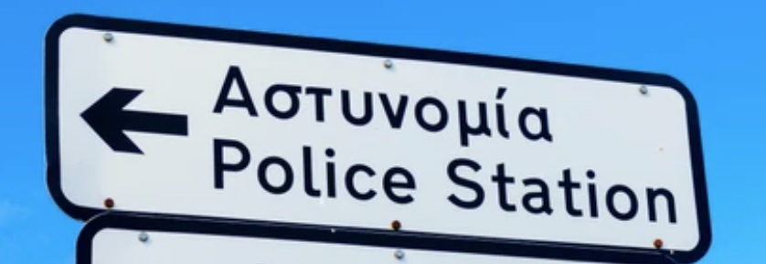
    I’m still unconvinced by the idea of yellow text for destination names. I do know the Greek signage uses it, and I think it’s too busy - the white version does away with the colouring, and looks better for it: the fact that the top line is in Greek alphabet and the lower in the Latin is enough of a distinction.


  • Registered Users Posts: 29 EthanL13


    I do not like ClearView as a typeface, and I don’t think it is significantly more legible than Transport

    I chose to use Clearview not for its supposed improved legibility, but rather it was a personal touch. The use of yellow and white text in Transport doesn't really sit with me (even though I do find Scottish bilingual signs to look not that bad). Otherwise, I don't think Transport is a bad typeface in itself.

    Putting the junction-number on a separate plate makes the sign more expensive, and creates confusion with the existing practice of putting route numbers on upper plates for route-confirmation signs. I don’t see a good reason to have it separate.

    The reason I placed it separately was because... where else can it go without making the sign bigger or crammed with too much information right next to each other? There is space at the top right, but then it would be too confusing. Currently, on exit taper signs, the route numbers are "floating" and uncentred while the junction number sits nicely at the bottom right. Following your opinion on "hierarchy" (albeit based on ADS signage rather than exit taper signage), I chose to place it at the top, followed by the route number, followed by the destinations. And while you mention it, I quite dislike the separation of route numbers on route confirmatory signs. The current rule is that it they are separated when there is more than one destination signposted; I'm not quite sure of the reasoning behind this, as even the UK doesn't do this. The only European country I can think of that follows this practice is France, but they separate their route numbers on all signs anyway. In my opinion, it looks much better when it's all on the one sign, like here: https://goo.gl/maps/LBcSUWGgJziwTMUG6

    The top-left arrow is pointing nowhere. I prefer the current design that is pointing to a road-lane. If you want to keep that orientation of arrow, moving it to the bottom left of the sign will convey the sense of “exit” better than the top-left.

    This was sort of an experiment on my part. I followed Dutch practice here, where they've used arrows pointed upwards since 2010.

    If you’re going to devote that area of the surface to showing the route number, then use it all for showing the route number. If you must box the numbers, give them more space inside, but it’s better to not do it at all. One of the few good changes we made from the original British design guidelines was to enlarge route-numbers on direction signs; it seems a shame to abandon it.

    Again, this was another experiment. I did realise afterwards that it should be bigger with wider spacing.

    I’m still unconvinced by the idea of yellow text for destination names. I do know the Greek signage uses it, and I think it’s too busy

    I disagree, Greek signage is still relatively clear, especially since it's based on German signage (at least, the motorway signs are). But speaking of which, when I experimented using coloured route numbers (red for motorways, white for N roads and yellow for R roads) it became all too much, so I did away with it.

    ...the fact that the top line is in Greek alphabet and the lower in the Latin is enough of a distinction.

    This is where the Balkans exceed in their bilingual signage. Greece could've done the same, but at least their signage gives inspiration for Irish signage to follow the same practice, for me anyways. 😉


  • Posts: 0 [Deleted User]


    If you're multilingual and have lived abroad, you should really get over your dislike of Irish because the signs will remain bilingual regardless of your grudge against it. If you don't like Irish, use the English version. It's really not that difficult. The Irish state isn't going to change the constitution just because you have a latent dislike towards a language because what, you didn't get an honour in it? Your initial premise was the signs needn't be cluttered by being bilingual. Now you're saying you're multilingual but you still want road signs in English only. If you want a debate about the constitutional status of Irish, this isn't the forum for it. We're discussing the case for altering/reforming the font and style of signage in either or both languages. Your rant is nothing to do with that. You can save your begrudgery/disdain for Irish in other appropriate fora; this isn't the one for it. Your contributions are nothing but contrarian attention seeking based on your own sour prejudices.


  • Registered Users, Registered Users 2 Posts: 25,796 ✭✭✭✭Strumms


    where did I say that I dislike Irish ? I don’t dislike it at all. You are making things up now :)

    im saying that there are no people in this country who require Irish on the signs... every person who speaks Irish here speaks English...

    therefore, de-clutter the signs, have only the information on them that is required.


  • Registered Users, Registered Users 2 Posts: 4,277 ✭✭✭km991148


    no. Safety should. The current signs could be much better- very confusing at speed sometimes


  • Posts: 0 [Deleted User]


    The signage is required to display the official names of places in the official languages of the state. The said official languages are Irish and English. I suggest you get over yourself and deal with this legal and constitutional reality.


  • Posts: 0 [Deleted User]


    I take it you will be lobbying the Greek government to display road signs in Greek only? Everyone in Greece speaks Greek natively. There's no need for the latinised version, ergo, why bother cluttering the signs with 2 versions of the same language? Sure you're a multilingual troll, I'm sure you'll only be delighted to have the opportunity to learn the Greek alphabet while meandering through the Athens metro or deciding what ferry to take at Piraeus. I think you should do the same in the UAE. Arabic is the legal language. Oh, English is supplanting French as Lebanon's 2nd language. You should lobby that French is replaced with English on their signs too, or eradicate both so that only Arabic is displayed on road signs. Clutter, etc.


  • Posts: 3,801 ✭✭✭ [Deleted User]


    where did you live?

    when you were living abroad did you get really angry with signs that had dual languages on them? Or do you get angry only when signage isn’t in English. I bet if you were in an Arab or Asian country when the signs had supplementary English you were happy enough


  • Advertisement
  • Registered Users, Registered Users 2 Posts: 25,796 ✭✭✭✭Strumms


    You are getting a bit emotive dude... over a road sign. No the sign is there to inform people... THAT is the reality. :)


  • Posts: 0 [Deleted User]


    Okey dokey, multilingual-troll-who-hates-signs-in-multiple-languages. I'm not the one transposing his/her/their childhood trauma of learning a language by ranting online anonymously about the legal status of Irish being displayed on road signs. Stick to the topic at hand or find another forum/bar stool to vent your issues.


  • Registered Users, Registered Users 2 Posts: 25,796 ✭✭✭✭Strumms


    Dont hate signs in multiple languages...Im simply discussing it and querying why the sinage is in two languages that people here both speak... the translation is not done to assist with comprehension.... as anyone speaking Irish speaks English too.. therefore its pointless....

    Everybody here who speaks irish speaks english...if you dont speak irish its in English anyway... so whats the point in cluttering up signs....making them almost unreadable to fast moving traffic and spending money on producing and printing bigger signs in two languages. .

    Im all for the promotion of the language but roadsigns should be containing only information 'needed' nothing else... Maira & Pat who are natural irish speakers can get on fine going from A to B with a simply clutter free easy to read and see ...


  • Registered Users Posts: 29 EthanL13


    M50 signage, anyone?


  • Registered Users, Registered Users 2 Posts: 574 ✭✭✭Aontachtoir


    Oh yes. Yes, this is beautiful. What typeface is it?

    @Strumms But what do we do for non-English speakers who are visiting Ireland? If English-speakers can't follow Irish signs safely, then if the signs are only in English non-English-speaking visitors will surely get terribly lost.


  • Registered Users Posts: 29 EthanL13


    What typeface is it?

    Clearview. Used in Canada and some parts of the US.


  • Advertisement
  • Registered Users, Registered Users 2 Posts: 26,676 ✭✭✭✭Peregrinus


    As mentioned earlier in the thread, there's no evidence - from Ireland or elsewhere - that bilingual signage causes confusion. And this is a much-studied question.

    Think about how road signs work. A road sign is not a page of text that you read from one end to the other. Nor is it even a shopping list, on which every item is of equal importance to the reader. People don't read through a road sign and decide which destination they'd like to visit; they already know which destination they'd like to visit; they look for that name; they largely filter out the rest. And they don't find that name by starting at the beginning and reading through the text until they recognise the word the want; they take in the entire sign at one glance, and hone in on the bit they are looking for.

    Because we write letter after letter, word after word, starting at the left and working across, and then down, the page, we assume that that's how we read. In fact it's not how we read. Even in a conventional page of text, the eye doesn't scan steadily across the page; it move in a series of jerks, taking in groups of words simultaneously. And most road signage has sufficiently few words in it that you can take them all in simultaneously. On a directional sign at a a junction, the groups of words associated with each direction will certainly be that small, even if the sign is bilingual. So, basically, you are looking for the arrow associated with a group of names that includes the name you want.

    Post edited by Peregrinus on


  • Registered Users, Registered Users 2 Posts: 1,753 ✭✭✭KrisW1001


    Plus, these are names, not instructions.

    A name is a collection of letters, it does not matter whether they come from a language you can understand or not. I could find my way to Szczecin in Poland without knowing how to say it.

    I find it hard that someone with the intelligence needed to operate a car lacks the intelligence to recognise and follow a pattern of letters written on a sign-face. I find it less hard to believe that any given person could just be playing silly buggers on an internet forum, so I won’t be replying on the subject any further.

    @EthanL13 : Still far to visually busy for something that has to be understood quickly. I’d still lose the outlines around the route numbers, for reasons already mentioned. Also, I’d remove the white backing on the R-route number. Regional routes are the third class of route, but your styling makes them the most visually prominent on the sign: someone who does not know how Irish road numbers are allocated may misinterpret this design choice as suggesting that the R route is the preferred way to a destination.

    The aircraft and ship images are poor. They’re too small, and the boxout loses them their distinctive shapes. Remember that when reading a moving sign, you need to provide as many visual cues as possible to the reader. Putting things into boxes stops your eyes seeing their shape properly. Speed reading your main sign gives something like: "Box, Box, Bxxl Féxxxtx, Bxlfxxt, Bxxlx Mxxxa, Bxxyxxn, Arrow, box, arrow, box, arrow", It’s only on a more detailed viewing that the lower boxes resolve to “M50”, but those top icons are very dense and far too similar to each other, and it takes a while for them to be distinguished. Our existing boat and plane pictograms are superior here, simply they are very different from each other, or from any other element on a sign.

    On the exit sign, the exit number gets lost because it’s so far away from the business-end of the sign: the arrow. The arrow is the visually dominant part of the sign, it’s the largest area of white (or would be if you didn’t highlight the R-route number to compete with it), and it is where the eye is drawn to. This is by design. Try not to weaken the message (get in this lane!) with extraneous details.

    I still don’t think colour is a good idea on motorway signage, as it has to be read at higher speeds. M50 is not typical as it’s under 100km/h limits, but you have to consider a design for all motorways, not just one specific one.


  • Registered Users Posts: 29 EthanL13


    So something like this is what you'd prefer to see? Only changes from current signage are use of Transport Medium instead of Heavy (as Heavy is designed for dark text on light backgrounds only), use of the new Motorway typeface which now has support for the entire alphabet (so there is no longer a need to use the N, R or L from Transport Heavy, condense it and then use numbers from Motorway) and a much better border (the current one is just... strange).

    I still disagree with your point about boxed symbols and route numbers - if the rest of Europe has them, then there surely can't be a major issue problem with them? Yes, the ferry symbol could be improved (maybe a side view of a boat rather than front view), but other than that, for consistency's sake, it is much better to have all symbols the same width and height generally, in my opinion.


  • Registered Users, Registered Users 2 Posts: 574 ✭✭✭Aontachtoir


    @EthanL13 This is also really nice. I prefer the white-only as opposed to the mixed colours. The typeface is nice and clear and the Irish versions are mercifully easy to read. For a second you'd be forgiven for thinking you were in a legally bilingual country.


  • Registered Users, Registered Users 2 Posts: 1,753 ✭✭✭KrisW1001


    I like that. The use of Transport Heavy on our motorway signs is annoying - it reduces legibility at night, and it saves precisely no money given how these are now made.

    The other thing you’ve done which is good is to add space around the destinations again. When using colour, you didn’t feel the need to do this, and it made it less obvious that these were just two places. Negative space between groups like this is important for understanding a sign.

    (Incidentally, where did you get the newer Motorway font from? )

    You say that it would be better to keep icons the same “for consistency sake”, but this is a common mistake graphic designers make when designing to conveying information. It’s also a common mistake when designing typefaces (another hobby of mine): a good design accentuates differences that are important, and removes the differences that are not, but if you go too far, you end up with “grey mush” design that has its distinctive points so smoothed away that it becomes taxing to read.

    Boxed numbers are a legacy of German signage design, which has been adopted elsewhere in Europe. Germany doesn’t put route-type prefixes on its signs, so without some kind of box-in, road numbers could be confused for distances. The Irish signage system uses prefixes, so there cannot be confusion between Route 25 (“N25”) and 25 km (“25”). German practice was very influential across Europe, but it was developed without much reference to visual science. For example, the DIN 1451 type used on German signage was designed for ease of production, not legibility: it is not a very good typeface for sign design as its letters are too “samey”.

    When the UK redesigned its signage, they started with the pre-existing US and German systems as a starting point, but subjected the design elements to legibility testing - some things got dropped as a result, and the use of outlined or decorated route badges was one of those. What they ended up with was a very good system, and we changed the one part that arguably didn’t work so well (overhead gantry signage), moving closer to European practice to create something that is, on balance, better than the UK’s long overlapping gantry boards..

    A lot of other countries borrowed from the German system on the basis of it being something that was proven to be cheap to manufacture and work reasonably well. That’s not the same as being the best. Germany could correct some of the weak-points of its signage, but doing so would break the established practice, and consistency is an important goal too.

    The boxed-in symbols are bad because they are hard to distinguish from each other. The unboxed ones are very obviously different. Being able to quickly recognise things is a key to good signage. (The reason why a port and airport should be given special treatment is easily answered with another question: what’s the Czech for Airport?)


    P.S., and not wanting to wind anyone up, but given how similar the Irish and English versions are of those place-names, that sign would not be that much worse off without the English names on it at all. (Maybe keep “Belfast” out of courtesy)


  • Advertisement
  • Posts: 0 [Deleted User]


    why would a person in Ireland who doesn't speak Irish not be able to navigate to a town he knows as "Dunquin" by following signs for "Dún Chaoin?"

    Well that's a simple example. How about Beal an Mhuirthead?


  • Registered Users, Registered Users 2 Posts: 574 ✭✭✭Aontachtoir


    I'm not sure what your question is. I guess she would follow roadsigns for Béal an Mhuirthead.


  • Posts: 0 [Deleted User]


    And what town is it? You see in your simplified example the Irish was almost exactly the same as the English translation. That's not always going to be the case.


  • Registered Users, Registered Users 2 Posts: 574 ✭✭✭Aontachtoir


    Béal an Mhuirthead is Béal an Mhuirthead. It has no other official name in Irish or English.

    This is a repeat of the Firenze/Florence question discussed earlier in this thread. Just like the driver who doesn't speak Italian follows the signs for Firenze to get to the place she knows as Florence, the driver who doesn't speak Irish is perfectly capable of following signs for Béal an Mhuirthead.


  • Posts: 0 [Deleted User]


    Ah you are just being deliberately obtuse man. Unless you don't actually know its the town of Belmullet. Good luck with your campaign.


  • Registered Users Posts: 29 EthanL13


    @KrisW1001 To me, that sign is just screaming for colour for the Irish text.

    The other thing you’ve done which is good is to add space around the destinations again. When using colour, you didn’t feel the need to do this, and it made it less obvious that these were just two places. Negative space between groups like this is important for understanding a sign.

    Could you explain what the difference is? Since I simply placed the text in Transport over that of Clearview and then deleted the Clearview text.

    (Incidentally, where did you get the newer Motorway font from? )

    It's available at k-type.com. The new Transport fonts are available there too. 

    Fair point about the symbols. I think that maybe I might leave them "boxless" from now on. Route numbers on the other hand - I think we'll have to agree to disagree. To me it's the best way of highlighting them, it grabs the attention of the reader and it distinguishes them from the destinations. I mentioned before that I experimented with other colours (red for motorways, white for N roads and yellow for R roads, so that it would be highlighted no matter what colour sign it's placed on and resolve any confusion about which road class is which). But, with the yellow text, it became too much. You'd just have to hope that people will know that N roads are the main roads and R roads are not.

    But in my opinion, it's pointless in redesigning our signs if they're going to remain almost identical as they are currently. There are clear attempts on the current signage to move away from the UK design, such as more European gantries, the (awful) chevrons on roundabout diagrams and the use of grey backboards on flag signs. If all the signs are to be replaced you may as well come up with a unique design, like I've done (though it's clearly not perfect), or at the very least replace the arrows with something better and use only one font for all signs.


    Post edited by EthanL13 on


  • Registered Users, Registered Users 2 Posts: 574 ✭✭✭Aontachtoir


    What is the official name, in English, of Béal an Mhuirthead?


  • Moderators, Sports Moderators Posts: 12,181 Mod ✭✭✭✭Cookiemunster


    Wait, what? Since when is Belmullet not called Belmullet. I've never heard it refered to anything but that. Is this another thing like Dingle where nobody actually uses its Irish name?


  • Posts: 0 [Deleted User]


    I'd really pity any tourist lost in North Mayo who asks directions to Belmullet from a lad like you. You would probably tell him Belmullet doesn't exist and walk away. A true hardcore Gaelgoir.


  • Posts: 0 [Deleted User]


    As this is a Gaeltacht town, the Irish Béal an Mhuirthead is the only official name. The anglicized spelling Belmullet has no official standing.

    The above is from the Wikipedia entry for Belmullet.


  • Advertisement
  • Registered Users, Registered Users 2 Posts: 574 ✭✭✭Aontachtoir


    Ah now, no need to go projecting your stereotypes like that. I'd be glad to help out any tourist, yourself included. I only asked you a simple question.

    Your post above shows you know that Béal an Mhuirthead's official name in English is Béal an Mhuirthead. So is your complaint that we don't put unofficial place names on road signs?


  • Moderators, Sports Moderators Posts: 12,181 Mod ✭✭✭✭Cookiemunster


    In fairness if only 50% of the population can speak Irish and only 4% of them speak Irish on a daily basis, it's a bit ridiculous that the actual commonly used name of the place is ignored in offialdom.


  • Posts: 0 [Deleted User]


    Glad to hear that. I haven't made a complaint, I'm pointing out that it's not always as easy as you made out to deduce the town you are looking for from the Irish name.

    Are you denying that people looking for Belmullet are confused about the roadsigns?


  • Registered Users, Registered Users 2 Posts: 574 ✭✭✭Aontachtoir


    I haven't met anyone who has been confused by Irish-only roadsigns, to be honest. But I'll let you know as soon as I meet someone who gets hopelessly lost because they can't find the signs pointing them to Belmullet, didn't check their route beforehand, and are unable to consult their phone, read a map, or ask for directions.

    @Cookiemunster The official names for these towns should have been made Irish-only long, long ago, but now that the English name bedded in with the late 20th century influx of English-speakers, its use is probably not going to change without deliberate effort. And seeing as any deliberate effort to promote the use of Irish is met by howls of outrage from those who oppose the language, we probably won't see any of that.

    The official name will remain mostly for officialdom (and, of course, those backwards Irish speakers. But they're not important.)


  • Posts: 0 [Deleted User]


    didn't check their route beforehand, and are unable to consult their phone, read a map, or ask for directions.

    That says it all really. Feck the roadsigns, they are just for show.


  • Registered Users, Registered Users 2 Posts: 574 ✭✭✭Aontachtoir


    They're official signs to point the way to destinations, which is exactly what signs for Béal an Mhuirthead do. If you think they're just for show, why are you so bothered about Irish-only signs?


  • Registered Users, Registered Users 2 Posts: 574 ✭✭✭Aontachtoir


  • Advertisement
  • Registered Users, Registered Users 2 Posts: 1,186 ✭✭✭Vestiapx


    I'd love to see a referendum on Irish and its place as our first language. I don't believe it was ever voted on and if it was it's due a discussion same as same sex marriage abortions and divorce all did.

    Dnt get me wrong I love Irish and I like the road signs as they are but I'd just love to see the discussion on a national scale.


  • Registered Users, Registered Users 2 Posts: 574 ✭✭✭Aontachtoir


    It was voted on when we adopted the Constitution, I suppose. I don't really see the point in a referendum. Either things stay the same or we vote to surrender an important part of our national heritage and become West England. It would be like Brexit - ask a silly question, get a silly answer.

    Much better things to do with our political time. Like discussing adopting nicer roadsigns.


  • Moderators, Sports Moderators Posts: 12,181 Mod ✭✭✭✭Cookiemunster


    If the Irish name's not used by the people who actually live there, then not having the English name on signage is a denial of reality really. It's speaks of a serious insecurity among the Gaeileoir community if you think that place names need to be in Irish to keep the language alive. Even when the English place names are in regular use by the majority of the population. It's like the way my name was Irishised in school for roll call even though there are no direct Irish translations for either of my christian name or surname and it was never used outside roll call. ie it was pointless.

    I go back to my original point. Both English and Irish place names should be on all road signage in the country. Especially when barely anyone living in these places uses the Irish name.


  • Registered Users, Registered Users 2 Posts: 3,241 ✭✭✭hans aus dtschl


    Just popping in to say thanks to all valiantly working to keep this thread on-topic. Some very interesting reading.


    To those attempting to discuss the use/prominence/status of the Irish language, a simple request: please could that be done elsewhere? There are entrenched views on both sides and it takes from the thread.


  • Posts: 0 [Deleted User]


  • Registered Users, Registered Users 2 Posts: 302 ✭✭Piollaire


    All I ask is they get rid of the italics, even the Irish-only Gaeltacht road signs are in italics. Italics are brutal to try to read while driving. We can thank Pádraig Flynn (anyone remember him?) for bringing in this visual and cultural abomination in 1988.

    http://www.irishstatutebook.ie/eli/1988/si/292/made/en/print


  • Advertisement
  • Registered Users, Registered Users 2 Posts: 1,753 ✭✭✭KrisW1001


    @EthanL13 Thanks for the link!

    Regarding the whitespace, my mistake - I was still thinking of one of the earlier signboard designs on the thread.

    "Route numbers on the other hand - I think we'll have to agree to disagree. To me it's the best way of highlighting them, it grabs the attention of the reader and it distinguishes them from the destinations."

    That’s kind of the problem. It grabs the attention, but the colouring scheme you’ve used means that regional routes grab more attention than national primary routes, because a white block with black text drawn on dark blue is more distinctive than a green block with yellow text. That visual appearance is at odds with the true hierarchy, where N roads are more important than R-roads.

    "You'd just have to hope that people will know that N roads are the main roads and R roads are not."

    ... and that’s precisely the problem that you avoid when you take colour away. Our roads are numbered with the most important routes given a low number. That pattern of low-numbers being important is well understood from all areas of life, so seeing "N12" or "R201" as options, without any colour-coding, or knowledge of the Irish road network you will guess correctly that N12 is a more significant route nationally than R201, because 12 is a lower number than 201.

    The ship diagram is better, but the waves are extraneous detail: if it looks like a boat, it does not require “water” underneath - just like there’s no need to put a cloud beside the plane diagram. Fine detail like this just does not work on a road-sign, which has to be read quickly often in bad weather. Simple, recognisable, shapes work best, and sometimes you have to give up real-world accuracy for intelligibility (this is why the speed-camera looks like a bellows, why we have steam-trains on signs and why services show a fork-and-spoon not fork-and-knife).

    You’ve also removed a useful piece of information from that ship diagram: the truck and car indicates that the destination is a Roll-on-Roll-off ferry service that takes both freight lorries and cars. Without any vehicles shown, it’s a direction to a bulk port, as here:

    (Note how L34141 jumps out on this sign - it should be on a white patch with the name of that neighbourhood on it. Although in this specific case, where the road is literally for local access to about 10 houses, I think this is is where the old “Local Access” destination should be used)

    "But in my opinion, it's pointless in redesigning our signs if they're going to remain almost identical as they are currently. There are clear attempts on the current signage to move away from the UK design, such as more European gantries, the (awful) chevrons on roundabout diagrams and the use of grey backboards on flag signs."

    I understand that the use of the chevrons was a deficiency of the equipment originally used to make these signs, but as it is now how the signs look, it has to stay. We have avoided the big diagrammatic signs used in the UK, largely because they’re expensive, but also because they are a kind of information overload, especially on relatively simple junctions that really only offer a left or right turn. For most junctions, our simpler "left for these places, right for these places" advance signage does the same job without the space or fuss. Ironically, the one place where diagrammatic signs do help, in cities, is the one place where they look ugly and oversized.

    Grey backgrounds on flag signs makes the signs cheaper and more durable (the point is very weak on a fully cut pointer flag, so they usually require a turned lip for strength, which is more expensive to manufacture) and also more legible, as you can use the backing plate to obscure other signage that might be the same field of view. It also makes the stacking of flag signs simpler and less irregular. I see that as an improvement over British practice, not a deficiency. (the design of the flags themselves can be poor sometimes, but that’s a different issue, and would happen with or without the backgrounds).

    "If all the signs are to be replaced you may as well come up with a unique design, like I've done (though it's clearly not perfect), or at the very least replace the arrows with something better and use only one font for all signs."

    But a clean-sheet design is not practical: we have thousands of kilometres of roads with the current signage installed. The general design of any new signage must be consistent with what else is in use, otherwise you’re just confusing people.

    These aren’t designs, they’re the products of a design system, and that system has rules that people pick up without ever seeing them written down (e.g., distances are always to the right of place-names; an arrow tells you what turn is coming up, a fingerpost flag tells you where the turn is)

    A design like yours that re-writes the basic principles of the system could never be applied without wholesale replacement of all signage, which would create needless confusion. When we moved to this system, we had no widely-applied systematic design for signage, so there was no loss; now that we do, adopting any completely new system would be a disaster.


  • Registered Users Posts: 29 EthanL13


    It grabs the attention, but the colouring scheme you’ve used means that regional routes grab more attention than national primary routes, because a white block with black text drawn on dark blue is more distinctive than a green block with yellow text. That visual appearance is at odds with the true hierarchy, where N roads are more important than R-roads.

    This solves this route number issue, now all route numbers stand out. But it's too colourful now.

    Our roads are numbered with the most important routes given a low number. That pattern of low-numbers being important is well understood from all areas of life, so seeing "N12" or "R201" as options, without any colour-coding, or knowledge of the Irish road network you will guess correctly that N12 is a more significant route nationally than R201, because 12 is a lower number than 201.

    The vast majority of European countries follow this system too. So there shouldn't really be confusion in the first place.

    The ship diagram is better, but the waves are extraneous detail

    The ferry diagram is German, it isn't something I've made myself.

    You’ve also removed a useful piece of information from that ship diagram: the truck and car indicates that the destination is a Roll-on-Roll-off ferry service that takes both freight lorries and cars. Without any vehicles shown, it’s a direction to a bulk port

    Perhaps an anchor symbol (for example) would suffice to differentiate between the two ports?

    We have avoided the big diagrammatic signs used in the UK, largely because they’re expensive, but also because they are a kind of information overload, especially on relatively simple junctions that really only offer a left or right turn. For most junctions, our simpler "left for these places, right for these places" advance signage does the same job without the space or fuss.

    The change to chevrons on roundabout diagrams was unnecessary though. If we kept the "British" style of ADS forks, why didn't we do the same for roundabouts too? But yes, definitely prefer our ADS signs over the British diagram signs. Maybe to develop on this, all diagram signs (with the obvious exception of roundabout signs) should be replaced in the same way? Sweden for example does not use forks on their ADS signs. But just a random idea, forks probably explain the situation better.


    Grey backgrounds on flag signs makes the signs cheaper and more durable (the point is very weak on a fully cut pointer flag, so they usually require a turned lip for strength, which is more expensive to manufacture) and also more legible, as you can use the backing plate to obscure other signage that might be the same field of view. It also makes the stacking of flag signs simpler and less irregular. I see that as an improvement over British practice, not a deficiency. (the design of the flags themselves can be poor sometimes, but that’s a different issue, and would happen with or without the backgrounds).

    It's definitely better in most cases, but I think it can be a bit over-excessive at times.

    But a clean-sheet design is not practical: we have thousands of kilometres of roads with the current signage installed. The general design of any new signage must be consistent with what else is in use, otherwise you’re just confusing people.

    I don't know, it still seems kind of pointless to me if the design is going to remain exactly the same with the exception of the text. Otherwise, you could keep the signs as they are and just follow the current practice of "replacing" text (generally for when there's spelling mistakes), just you're replacing every single instance of text.

    Post edited by EthanL13 on


  • Posts: 0 [Deleted User]


    But we are talking about road signage, not sat navs.


  • Registered Users, Registered Users 2 Posts: 1,753 ✭✭✭KrisW1001


    The change to chevrons on roundabout diagrams was unnecessary though. If we kept the "British" style of ADS forks, why didn't we do the same for roundabouts too?  But yes, definitely prefer our ADS signs over the British diagram signs. Maybe to develop on this, all diagram signs (with the obvious exception of roundabout signs) should be replaced in the same way?

    As I said, I heard that the chevrons change was down to a cost reasons initially, and then the design stuck.

    We only kept the fork signs on or around divided roads, and I think they work very well there. Plus, the design doesn’t use much extra space. It’s certainly much better than other alternatives. Of the other junction types, only roundabouts really need a diagram, and for some, presenting the actual layout makes it harder to figure out, for example this beauty, Hangar Lane on London’s North Circular Road:

    This junction functions like a large roundabout, that is really all you need to know about it to navigate it: you turn left to enter, turn left to exit, and check your lanes while on it. Showing it on the advance sign like this makes it needlessly complicated for drivers.

    Sweden for example does not use forks on their ADS signs. But just a random idea, forks probably explain the situation better.

    Definitely: That sign doesn’t really work for me at all. I think it really needs a second arrow, pointing upward, to the left of the road-numbers on the upper panel. Then it becomes something very much like our general-purpose advance direction signage.

    seems kind of pointless to me if the design is going to remain exactly the same with the exception of the text.

    For me, the text is one area that isn’t good on our current signage. Everything else is either better than the alternatives, or just a matter of taste. I do consider Kinnear and Calvert’s designs for the UK to be the benchmark in the field (Calvert’s pictograms in particular are by far the clearest set in use anywhere, although we always seem to pick and choose between her designs and the old Vienna set over here) - a reminder that there was a time when our next-door neighbour actually did things right. But the designs were done after most countries had already settled into their own signage, and it’s hard to replace good-enough with a-bit-better, even without considering national pride.

    We still haven’t got gantries right, and some of the earlier designs have ug-leeee text placement. They do, however, function as required. And even speaking as a designer, I would prefer functional over pretty every single time.


    @Piollaire Thank you for that link! I thought the change had been made in the 1970s. Just shows how little signage there was in the 1980s. There are a couple still in Cork, if you know where to look. These are near Turner’s Cross: I think they date to the time of the South City Link Road.

    (Just noticed the small t in "Cionn tSaile"!)

    Post edited by KrisW1001 on


  • Registered Users Posts: 9 deeznuts420


    I've never thought there was a problem with road signs and the Irish language before honestly


  • Advertisement
Advertisement