Advertisement
If you have a new account but are having problems posting or verifying your account, please email us on hello@boards.ie for help. Thanks :)
Hello all! Please ensure that you are posting a new thread or question in the appropriate forum. The Feedback forum is overwhelmed with questions that are having to be moved elsewhere. If you need help to verify your account contact hello@boards.ie

Climate Change - General Discussion : Read the Mod Note in post #1 before posting

Options
1262729313244

Comments

  • Registered Users Posts: 22,348 ✭✭✭✭Akrasia


    dense wrote: »
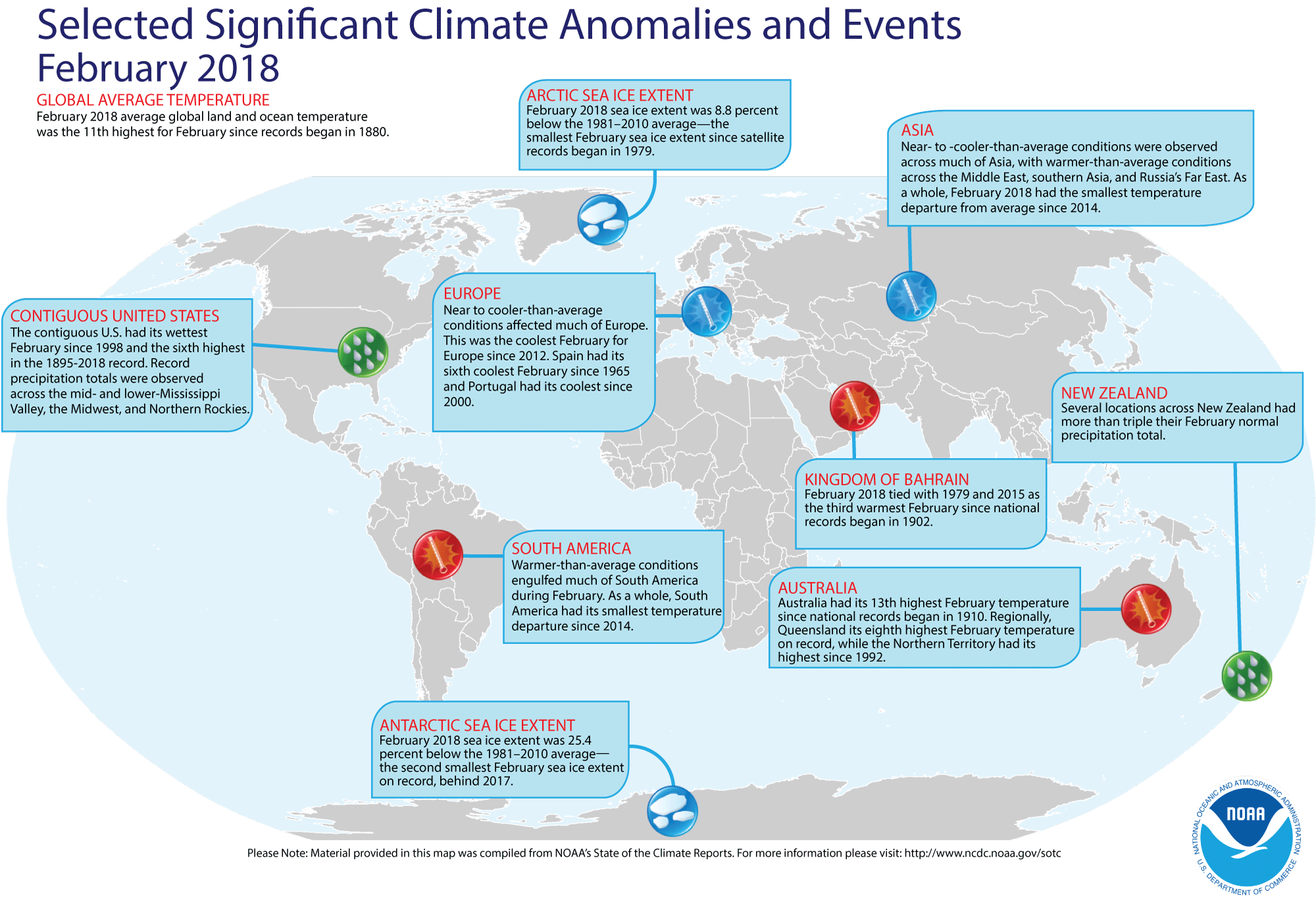
    It was the 11th warmest February since 1880 according to NOAA.

    201802.gif
    Sorry, you're right, NOAA has feb as the 11th warmest february on record, I was looking at the year to date data which had Feb at 6
    https://www.ncdc.noaa.gov/sotc/global/2018/02/supplemental/page-1

    The point I was making was that even though Ireland's had below average temperatures, other parts of the world were significantly above average, and the february global temperature is still significantly above the 20th century average.


  • Closed Accounts Posts: 2,175 ✭✭✭dense


    Akrasia wrote: »
    Sorry, you're right, NOAA has feb as the 11th warmest february on record, I was looking at the year to date data which had Feb at 6
    https://www.ncdc.noaa.gov/sotc/global/2018/02/supplemental/page-1

    The point I was making was that even though Ireland's had below average temperatures, other parts of the world were significantly above average, and the february global temperature is still significantly above the 20th century average.

    Pity about all the "missing data" they don't have, which they show as grey in their world map.


    201802.gif

    And what they do have doesn't seem to be terribly accurate at least for Ireland, according to UCD lecturer Peter O'Neill:


    https://oneillp.wordpress.com/2017/02/09/ghcn-m-raw-data-from-ireland/

    Which would have to make you worry about what they're doing with other data.

    But regardless, take a close look at that map.

    Given that the earth is covered by around 30% of land, and NOAA's empty global "temperature map" indicates that it' sampling a tiny 10% to 15% of the earth and claiming global warming from it, you should take their claims of 11th warmest February or anything else on record with a large dose of salt.


  • Registered Users Posts: 3,512 ✭✭✭Pa ElGrande


    The Greenhouse Conspiracy was made in 1990 by Channel 4 as part of their Equinox series. 28 years later nothing has changed.

    Net Zero means we are paying for the destruction of our economy and society in pursuit of an unachievable and pointless policy.


  • Registered Users Posts: 22,348 ✭✭✭✭Akrasia


    dense wrote: »
    Pity about all the "missing data" they don't have, which they show as grey in their world map.


    201802.gif

    This map refers to GHCNM records only. This is only one temperature dataset and it is the oldest one with the lowest global coverage.

    RSS, for example has global coverage using Satellite measurements.
    And what they do have doesn't seem to be terribly accurate at least for Ireland, according to UCD lecturer Peter O'Neill:


    https://oneillp.wordpress.com/2017/02/09/ghcn-m-raw-data-from-ireland/

    Which would have to make you worry about what they're doing with other data.

    But regardless, take a close look at that map.

    Given that the earth is covered by around 30% of land, and NOAA's empty global "temperature map" indicates that it' sampling a tiny 10% to 15% of the earth and claiming global warming from it, you should take their claims of 11th warmest February or anything else on record with a large dose of salt.
    You need to take Dense's analysis of the state of our knowledge with a larger dose of salt.

    There are multiple sources for climate data that are all taken into account and cross checked against each other to generate the temperature records. There are multiple agencies who generate their own datasets independently and they all make decisions about how to blend the data and exlude outliers or instrumentation errors and they all broadly agree that global temperatures are increasing at about .18c per decade (accelerating in recent decades)

    Even UAH, Roy Spencer, a darling of the 'skeptic' community's, temperature record agree with this after having been convinced to take into account the errors in their analysis and they have updated their temperature records to come more into line with the other datasets.


  • Registered Users Posts: 22,348 ✭✭✭✭Akrasia


    The Greenhouse Conspiracy was made in 1990 by Channel 4 as part of their Equinox series. 28 years later nothing has changed.

    You're right, nothing has changed in the intellectual dishonesty of professional climate change deniers, climate change 'skeptics' have been using the same wrong arguments since then and making the same patently false claims. I watched part of it. By the way, it's not part of the Equinox series, it was made by Hilary Lawson by his production company TVF.
    I notice that this has happened a few times with these kinds of documentaries, where they have been attributed to being a part of a series that has a reputation for being scientific, when they're just one off polemics by politicised documentarians trying to ram home their political ideology rather than explore the actual science.
    (Martin Durkin's documentaries on global warming and the environment are more examples of these kinds of C4 polemics and equally as misleading as this one)

    What has changed is global temperature. Since 1990, global average temperature has increased by about half a degree Celcius.


  • Advertisement
  • Closed Accounts Posts: 2,175 ✭✭✭dense


    Akrasia wrote: »
    This map refers to GHCNM records only. This is only one temperature dataset and it is the oldest one with the lowest global coverage.

    That map is supposedly telling you global temperatures.

    It isn't.

    It's telling you that most of the earth isn't being sampled.
    GHCN-Monthly provides climatological observations for four elements; monthly mean maximum temperature, minimum temperature, mean temperature, and monthly total precipitation.

    https://www.ngdc.noaa.gov/docucomp/page?xml=NOAA/NESDIS/NCDC/Geoportal/iso/xml/C00839.xml&view=getDataView&header=none

    Here's the "global" temperature data map:

    201802.gif

    If you thought that was a bit sparse and has a lot of grey in it, check out the "global" Precipitation data map:

    201802.gif


    Akrasia wrote: »
    RSS, for example has global coverage using Satellite measurements.

    Which was only whipped into line with the empty NOAA map's temperatures after being adjusted to do so.
    Researchers from Remote Sensing Systems (RSS), based in California, have released a substantially revised version of their lower tropospheric temperature record.

    After correcting for problems caused by the decaying orbit of satellites, as well as other factors, they have produced a new record showing 36% faster warming since 1979 and nearly 140% faster (i.e. 2.4 times larger) warming since 1998.

    https://www.carbonbrief.org/major-correction-to-satellite-data-shows-140-faster-warming-since-1998
    Akrasia wrote: »
    You need to take Dense's analysis of the state of our knowledge with a larger dose of salt.

    It's not my analysis.

    It's there to check for anyone who's interested in not being brainwashed into thinking the world is on fire based on non existent GHCN data which is carefully "blended" (your word) into catastrophe.
    Akrasia wrote: »
    There are multiple sources for climate data that are all taken into account and cross checked against each other to generate the temperature records. There are multiple agencies who generate their own datasets independently and they all make decisions about how to blend the data and exlude outliers or instrumentation errors and they all broadly agree that global temperatures are increasing at about .18c per decade (accelerating in recent decades)

    This is wishful thinking, no one is cross checking anything.
    Multiple agencies all on the global warming bandwagon are not highlighting the fact that there is no data for most of the earth.

    This is presumably why you ignored the litany of errors in the GCHN data for The Little Known Tropical Rain-forest of Ireland:

    https://oneillp.wordpress.com/2017/02/09/ghcn-m-raw-data-from-ireland/
    Akrasia wrote: »
    Even UAH, Roy Spencers, a darling of the 'skeptic' community, temperature record agree with this after having been convinced to take into account the errors in their analysis and they have updated their temperature records to come more into line with the other datasets.

    Doesn't sound very "convinced" about satellite measurements to me:

    The graph above represents the latest update; updates are usually made within the first week of every month.

    Contrary to some reports, the satellite measurements are not calibrated in any way with the global surface-based thermometer records of temperature.

    They instead use their own on-board precision redundant platinum resistance thermometers (PRTs) calibrated to a laboratory reference standard before launch.

    http://www.drroyspencer.com/latest-global-temperatures/

    Nor about "catastrophic global warming":
    This website currently concentrates on the response of clouds to warming, an issue which I am now convinced the scientific community has totally misinterpreted when they have measured natural, year-to-year fluctuations in the climate system. As a result of that confusion, they have the mistaken belief that climate sensitivity is high, when in fact the satellite evidence suggests climate sensitivity is low.

    http://www.drroyspencer.com/global-warming-natural-or-manmade/


  • Registered Users Posts: 22,348 ✭✭✭✭Akrasia


    It's like arguing with a goldfish.

    Dense, you've already been told on another thread that the GHCN is only one of a number of datasets used by climatologists. You were told in the post you are replying to that the GHCN is amongst the oldest with some of the least coverage of the different datasets, but you don't seem to grasp these concepts.

    Here is a partial list of the different datasets that are used to compile temperature data around the world.

    LCD
    COOP
    Climate Normals
    USHCN
    GHCN
    GSOD
    USCRN
    GOSIC
    ASOS
    AWOS
    Solar Radiation
    World War II Era Data
    Integrated Surface Database (ISD)
    VIIRS C-RDR
    IGRA
    RATPAC
    RATPAC-A
    RATPAC-B
    Global Marine Data
    ICOADS
    Extended Reconstructed Sea Surface Temperature (ERSST)
    NOAA Merged Land Ocean Global Surface Temperature Analysis (NOAAGlobalTemp)
    Surface Flux Analysis (SURFA)
    Voluntary Observing Ship Climate (VOSClim) Fleet
    Blended Sea Winds
    OISST
    https://www.ncdc.noaa.gov/data-access

    I have absolutely no idea why you used that quote from Roy Spencer. Are you saying he doesn't trust satellite measurements??

    RSS adjusted raw satellite data when we discovered that their orbits were changing and this affected their measurements. Of course that's they should do. You posted a link to a 'recreation' of historic arctic temperatures from Willie Soon and the Donnelly brothers only a few days ago. You seem to like adjustments to historical data when it suits you, but scoff at the idea when it doesn't.

    Dr Spencer has his decadal temperature increase at about 0.11c per decade. This after he had to make multiple upward adjustments to account for instrumentation errors. He's missing one big adjustment though from the findings of a 2017 study showing that the satellites are still under reporting the warming. Some day he might catch up.


  • Closed Accounts Posts: 2,175 ✭✭✭dense


    Akrasia wrote: »
    It's like arguing with a goldfish.

    Dense, you've already been told on another thread that the GHCN is only one of a number of datasets used by climatologists. You were told in the post you are replying to that the GHCN is amongst the oldest with some of the least coverage of the different datasets, but you don't seem to grasp these concepts.

    What "concepts"?

    The concept of believing that vast areas of earth devoid of GCHN instrumentation are somehow showing you a GHCN map in tenths of degrees of human induced "global warming"?

    And displaying accurate precipitation trends, based on non existent GHCN stations?

    Akrasia wrote: »
    Here is a partial list of the different datasets that are used to compile temperature data around the world.

    No, it's primarily a list of national US weather services, with a few partial global sets thrown in and it also includes the rather dubious USHCN data, with 42% of its stations failing to meet standards.


    And I wouldnt be getting too excited by all those 85, yes 85 radiosonde ballons in RATPAC supposedly covering the whole earth, which even the UNIPCC doesn't seem too interested in due to quality issues.

    https://www.ipcc.ch/publications_and_data/ar4/wg1/en/ch3s3-4-1-1.html

    Funny thing is, even with all those US datasets to hand, still no one can tell how much "warming" occurred in the 20th century there outside of the half degree of warming that came about as a result of adjusting the adjustments.

    https://data.giss.nasa.gov/gistemp/faq/

    Akrasia wrote: »
    RSS adjusted raw satellite data when we discovered that their orbits were changing and this affected their measurements.

    We? They, surely?


  • Registered Users Posts: 22,348 ✭✭✭✭Akrasia


    dense wrote: »
    What "concepts"?

    The concept of believing that vast areas of earth devoid of GCHN instrumentation are somehow showing you a GHCN map in tenths of degrees of human induced "global warming"?

    And displaying accurate precipitation trends, based on non existent GHCN stations?
    No, the concept of using multiple datasets to construct a temperature record. And you never mentioned GHCN, I did, you said this "Pity about all the "missing data" they don't have, which they show as grey in their world map."

    In that post you were trying to make it look like the NOAA don't have data for the majority of the world. You were either lying or ignorant of the other datasets (which you can't be because I told you about them before)
    No, it's primarily a list of national US weather services, with a few partial global sets thrown in and it also includes the rather dubious USHCN data, with 42% of its stations failing to meet standards.


    And I wouldnt be getting too excited by all those 85, yes 85 radiosonde ballons in RATPAC supposedly covering the whole earth, which even the UNIPCC doesn't seem too interested in due to quality issues.

    https://www.ipcc.ch/publications_and_data/ar4/wg1/en/ch3s3-4-1-1.html
    Wrong again, there are lots of global data in those datasets, and the curators of global temperature records use all of them together to generate a global temperature record. And the weather balloons can provide near global coverage and their limitations are well understood so they can be accounted for when these data are translated into the global temperature record.


  • Closed Accounts Posts: 2,175 ✭✭✭dense


    Akrasia wrote: »
    No, the concept of using multiple datasets to construct a temperature record. And you never mentioned GHCN, I did, you said this "Pity about all the "missing data" they don't have, which they show as grey in their world map."

    In that post you were trying to make it look like the NOAA don't have data for the majority of the world. You were either lying or ignorant of the other datasets (which you can't be because I told you about them before)

    This all started after you claimed that February was the 6th warmest February on record according to NOAA.

    Without accusing you of being either ignorant or lying I corrected you and then I showed you the GHCN M map for February and commented on the large amount of areas of grey on the map, which signifies according to NOAA, areas of "missing" data.

    https://www.ncdc.noaa.gov/sotc/service/global/map-land-sfc-mntp/201802.gif
    Akrasia wrote: »
    Wrong again, there are lots of global data in those datasets, and the curators of global temperature records use all of them together to generate a global temperature record.

    Not for the GCHN M map you were being shown, thats why there's so much grey areas on it.

    I do of course accept that DIY bolt-together hockey stick style graphs which nobody takes seriously and "blend" as you say, temperature proxies from various sources such as timber, ice with instrumental records to portray climate catastrophe do exist.
    Akrasia wrote: »
    RSS adjusted raw satellite data when we discovered that their orbits were changing and this affected their measurements.

    So, was it exciting to have been part of the team that discovered the errors?


  • Advertisement
  • Registered Users Posts: 22,348 ✭✭✭✭Akrasia


    Dense, you had to deliberately ignore the maps posted on NOAA's state of the climate page for February and find one that only includes GHCN data and then you claimed that NOAA are making their claim based on 10% global coverage, which is totally misleading.

    Noone claims that we have 100% perfect global coverage in temperature stations, but to say NOAA only have 10% coverage is a lie

    According to themselves, they claim about 93% global coverage using the datasets they use. Other bodies make different choices in how they cover gaps, and they claim between 85% and 99% global coverage (because they are all independent bodies, different scientific groups independently verifying each work, the way science is supposed to be done. And that doesn't include the RSS records or the UAH records which don't use temperature stations or surface measurements at all.

    Berkeley Earth set up a climate monitoring centre from the perspective of climate skeptics and they started from scratch and built their own temperature analysis from the ground up, and they too arrived at the same conclusions as the more established ones.

    Now the EU have also set up a new independent climate monitoring service called Copernicus, and they have started reporting and their results are also in line with the consensus.

    How many different scientific bodies do you need to independently look at these data before you acknowledge that maybe they might know something that you don't know?


  • Closed Accounts Posts: 2,175 ✭✭✭dense


    When you figure out what "missing data" actually means, let me know Akrasia.

    In the meantime, lets celebrate some good news.

    In Nature, it is reported that just one-third of reefs in the world’s largest coral system were transformed by warmed waters, after a comprehensive underwater and aerial survey.

    Just like sea levels refusing to sink Tuvalu, and like the polar bears, coral reef is now inconveniently refusing to play along with "climate chaos", and according to Tim McClanahan, a conservation zoologist at the Wildlife Conservation Society in Mombasa, Kenya, "there is accumulating evidence that corals do acclimate”.

    There is Tim, and that won't please some people.

    https://www.nature.com/articles/d41586-018-04660-w


  • Registered Users Posts: 22,348 ✭✭✭✭Akrasia


    Just 1/3 of reefs?

    Great news altogether. Crisis averted


  • Registered Users Posts: 1,267 ✭✭✭paddyisreal


    A quick question in relation to this debate. How accurate can a lot of these historically weather stats be when the period they are taking from is so small in the scheme of things. Considering that humans are on earth for around 200,000 years and a lot of this data seems to be from the last 200 years , should it not all be taken with a pinch of salt. ?


  • Registered Users Posts: 3,512 ✭✭✭Pa ElGrande


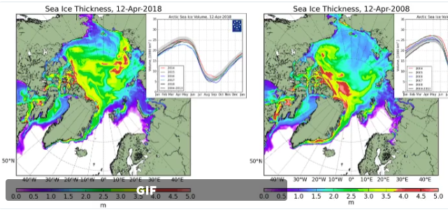
    The Arctic melting season each year is ~70 days each year good luck trying to shift this from the Arctic sea. The ice today is clearly thicker than it was 10 years ago


    Arctic-ice-volume-2018-April-2008-comparison.png

    Sea ice thickness and volume


    Arctic sea ice and temperature is cyclical, and tracks ocean circulation patterns rather than greenhouse gases.

    Net Zero means we are paying for the destruction of our economy and society in pursuit of an unachievable and pointless policy.


  • Closed Accounts Posts: 2,175 ✭✭✭dense


    The Arctic melting season each year is ~70 days each year good luck trying to shift this from the Arctic sea. The ice today is clearly thicker than it was 10 years ago


    Arctic-ice-volume-2018-April-2008-comparison.png

    Sea ice thickness and volume


    Arctic sea ice and temperature is cyclical, and tracks ocean circulation patterns rather than greenhouse gases.


    Isn't it funny the way climate alarmists visualise -48°c as Burning Red Hot on their various charts?


    station.png


    Screen_Shot_2018_02_26_at_1.31.32_PM.png


  • Registered Users Posts: 22,348 ✭✭✭✭Akrasia


    The Arctic melting season each year is ~70 days each year good luck trying to shift this from the Arctic sea. The ice today is clearly thicker than it was 10 years ago


    Arctic-ice-volume-2018-April-2008-comparison.png

    Sea ice thickness and volume


    Arctic sea ice and temperature is cyclical, and tracks ocean circulation patterns rather than greenhouse gases.


    Here's the arctic sea ice volume graph since the ice monitoring satelites were launched
    SPIOMASIceVolumeAnomalyCurrentV2.1.png

    Here's a 20th century reconstruction based on shipping and aircraft reports
    seasonal.extent.1900-2007.png

    The DMI model statistic which your blogger copied from another blogger is just cherrypicking. The trend in PIOMAS, Cryosat and the DMI are all for decreasing ice extents and ice volume even if there is some inter annual variability


  • Registered Users Posts: 22,348 ✭✭✭✭Akrasia


    A quick question in relation to this debate. How accurate can a lot of these historically weather stats be when the period they are taking from is so small in the scheme of things. Considering that humans are on earth for around 200,000 years and a lot of this data seems to be from the last 200 years , should it not all be taken with a pinch of salt. ?
    I had replied to this earlier but for some reason the post didn't save.

    The quick answer to your quick question is that we should question all the science and whether the conclusions of each study is justified by the quality of the science conducted. Climate science is a robust field that has had tens of thousands of climate scientists and related disciplines putting a lot of time and work into collecting as much data about global and local climate systems as we can possibly gather. The further back we go in history, the less reliable the temperature records are, so there is a bigger uncertainty bar attached to them, but because the field has conducted so many independent studies using lots of different methodologies and different sources of data and proxy data, we can be confident that today is warmer now than it has been in at least the past 100k years, (lots of studies say this, but here is an example of one dx.doi.org/10.1038/nature19798) and CO2 concentrations are higher than they have been in at least 2 million years, before the evolution of homo sapiens

    And scientists have a very clear understanding of radiative forcing attached to CO2 so we know that CO2 will cause the planet to store more heat, the only uncertainty is how the climate feedbacks will behave in a warmer world. Skeptics think the feedbacks will all be negative (ie cooling) and real scientists think that there will be a mixture of some negative feedbacks but a strong positive feedback signal leading to a likely climate sensitivity of somewhere close to 3c for a doubling of CO2


  • Registered Users Posts: 22,348 ✭✭✭✭Akrasia


    dense wrote: »
    Isn't it funny the way climate alarmists visualise -48°c as Burning Red Hot on their various charts?

    Not really, why would it be funny for a temperature anomaly map to show higher temperature anomalies as red and the highest temperature anomalies as the deepest red?

    Seems perfectly sensible to me, but then, I don't 'read between the lines'


  • Closed Accounts Posts: 2,175 ✭✭✭dense


    https://isccp.giss.nasa.gov/role.html#COMP_MODS
    Akrasia wrote: »
    And scientists have a very clear understanding of radiative forcing attached to CO2 so we know that CO2 will cause the planet to store more heat, the only uncertainty is how the climate feedbacks will behave in a warmer world. Skeptics think the feedbacks will all be negative (ie cooling) and real scientists think that there will be a mixture of some negative feedbacks but a strong positive feedback signal leading to a likely climate sensitivity of somewhere close to 3c for a doubling of CO2

    The "real scientists" at NASA are sceptical of such claims:
    . A doubling in atmospheric carbon dioxide (CO2), predicted to take place in the next 50 to 100 years, is expected to change the radiation balance at the surface by only about 2 percent.

    Yet according to current climate models, such a small change could raise global mean surface temperatures by between 2-5°C (4-9°F), with potentially dramatic consequences.

    If a 2 percent change is that important, then a climate model to be useful must be accurate to something like 0.25%.

    Thus today's models must be improved by about a hundredfold in accuracy, a very challenging task. To develop a much better understanding of clouds, radiation and precipitation, as well as many other climate processes, we need much better observations.

    https://isccp.giss.nasa.gov/role.html#COMP_MODS

    And once you delve beneath the headlines, even the UNIPCC acknowledges the amount of continuing uncertainty about radiative forcing: Ch. 8, (P 181)

    http://www.climatechange2013.org/images/report/WG1AR5_Chapter02_FINAL.pdf


  • Advertisement
  • Registered Users Posts: 8,219 ✭✭✭Gaoth Laidir


    Akrasia wrote: »

    Here's a 20th century reconstruction based on shipping and aircraft reports
    seasonal.extent.1900-2007.png

    The DMI model statistic which your blogger copied from another blogger is just cherrypicking. The trend in PIOMAS, Cryosat and the DMI are all for decreasing ice extents and ice volume even if there is some inter annual variability

    You wouldn't have the up-to-date version of that graph, would you? It's missing the last 11 years.


  • Closed Accounts Posts: 2,175 ✭✭✭dense


    Akrasia wrote: »
    Here's the arctic sea ice volume graph since the ice monitoring satelites were launched
    SPIOMASIceVolumeAnomalyCurrentV2.1.png

    Here's a 20th century reconstruction based on shipping and aircraft reports
    seasonal.extent.1900-2007.png

    The DMI model statistic which your blogger copied from another blogger is just cherrypicking. The trend in PIOMAS, Cryosat and the DMI are all for decreasing ice extents and ice volume even if there is some inter annual variability


    In line with the previous mentioned uncertainties in other areas of "climate science", here Mark Serreze, director of the National Snow and Ice Data Center admits that there is a lot about the Arctic ice that they "don't understand". Who knew?

    "Sure, it is warming, which is consistent with sea ice loss, reductions in spring snow cover and strengthening summer melt of the Greenland ice sheet, but pieces of the puzzle are still missing. This could very well be one of those missing pieces."

    https://insideclimatenews.org/news/24062016/tiny-pink-algae-snow-arctic-melting-global-warming-climate-change


  • Closed Accounts Posts: 2,175 ✭✭✭dense


    You wouldn't have the up-to-date version of that graph, would you? It's missing the last 11 years.

    Cherry picking?


  • Registered Users Posts: 22,348 ✭✭✭✭Akrasia


    You wouldn't have the up-to-date version of that graph, would you? It's missing the last 11 years.

    I don't, I grabbed the graph off an EU science education website, have the last 11 years been significantly different?


  • Registered Users Posts: 22,348 ✭✭✭✭Akrasia


    dense wrote: »
    Cherry picking?
    No its not. I used the best graph I could find in the limited time I had that showed a longer term trend in ice loss at the arctic. Ice loss didn't end and start to recover 11 years ago. I

    Using a slightly out of date map isn't cherry picking unless i deliberately exclude newer data because it's contrary to the point I've making.

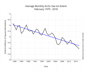
    In my case, I showed two graphs, one using satellite data to the present date, the other using historical data that's a bit out of date. The satellite data still shows a decline in ice volume to the present date. and the same goes for the extent. In fact, the March 2018 sea ice extent was the 2nd lowest maximum on record according to NSIDC
    Figure3-388x300.png
    http://nsidc.org/arcticseaicenews/2018/03/


  • Registered Users Posts: 8,219 ✭✭✭Gaoth Laidir


    Akrasia wrote: »
    I don't, I grabbed the graph off an EU science education website, have the last 11 years been significantly different?

    No, the trend is still downwards, but I have a thing about people quoting old data like that. I checked your source and it doesn't have an update, and I can't find that type of chart on the NOAA site. But anyway, it's already been shown thay the very flat-looking pre-satellite record is anything but.


  • Registered Users Posts: 22,348 ✭✭✭✭Akrasia


    No, the trend is still downwards, but I have a thing about people quoting old data like that. I checked your source and it doesn't have an update, and I can't find that type of chart on the NOAA site. But anyway, it's already been shown thay the very flat-looking pre-satellite record is anything but.

    You implied that I was cherry picking, and that implication was picked up and ran with by others on this thread. I don't think that was fair given that I included a newer graph to go alongside the older graph in the same post and I only used the older graph to show that the decline is not normal at least on human timescales.

    On geological timescales, of course ice retreats and recovers, but these are usually due to changes in earths orbit and rotation and solar output. None of these factors explain the current decline. The other 'natural' driver of glaciation/deglaciation is CO2 concentrations in the atmosphere. This is what is driving the current change, but it's not a natural increase in CO2, it's a result of human activities and humans are now faced with the task of preventing further increases in CO2 to minimise the amount of global warming.


  • Registered Users Posts: 22,348 ✭✭✭✭Akrasia


    One of the biggest skeptical arguments is the role of clouds in the future of climate change, will clouds be a net positive or negative feedback.

    The models we have available don't do a great job of representing clouds but some are better than others.

    A recent study published in Nature compared the models with the observational record and they discovered that the models that most accurately represented clouds in the past, are the models that have the strongest positive cloud feedback and predict more warming.(about 15% more than the average of all the climate models)

    https://www.nature.com/articles/nature24672.epdf?referrer_access_token=WBC06SW5A7379BDGSipTl9RgN0jAjWel9jnR3ZoTv0M9MNvZLfp8n-6pkVINMq-6NzXnNACAiz2kolAtVg3Y-h0at7mDHlQSF0McjGJkmp4nqDrcWEQGbEni58B-3Lf7JFzi7VYWHXX4Fbymq0ZbuoChvkLMauyKSyCT51Ng6zweDbOx0CkkxwmU7RrwcO6KiZGeYO2-eQ8fBQRCWSB7ePY7tzve70GrckgMS4Y18vYj9HrOdi3a6uPQD1JuHPcNAcH9M_LNP0Bd_aGsbkka-bTlTMkVz5cTTSeWgPOXh_Yb4a2ZDwx0n4EK1oSt-O1XSjCU4ARTmT_-bzxWJqfVchTZrY-XMNbHo6Brt5sZYxbAITurrIq6AjPFN5oKORg7eQvOwmA9Q08BmSDe0u8sWvahhifitLeKX4AnXIZ5X1Y%3D&tracking_referrer=www.washingtonpost.com


  • Registered Users Posts: 8,219 ✭✭✭Gaoth Laidir


    Akrasia wrote: »
    You implied that I was cherry picking, and that implication was picked up and ran with by others on this thread. I don't think that was fair given that I included a newer graph to go alongside the older graph in the same post and I only used the older graph to show that the decline is not normal at least on human timescales.

    I wasn't implying that at all. I'm not responsible for what other people post. I'm just surprised that a newer version of the graph isn't available.


  • Advertisement
  • Registered Users Posts: 3,512 ✭✭✭Pa ElGrande


    He is a lecture from 2014 by MIT Professor of Atmospheric Sciences, Richard Lindzen. There is very little about climate that is fully understood.

    Net Zero means we are paying for the destruction of our economy and society in pursuit of an unachievable and pointless policy.


Advertisement