Advertisement
Help Keep Boards Alive. Support us by going ad free today. See here: https://subscriptions.boards.ie/.
If we do not hit our goal we will be forced to close the site.

Current status: https://keepboardsalive.com/

Annual subs are best for most impact. If you are still undecided on going Ad Free - you can also donate using the Paypal Donate option. All contribution helps. Thank you.
https://www.boards.ie/group/1878-subscribers-forum

Private Group for paid up members of Boards.ie. Join the club.

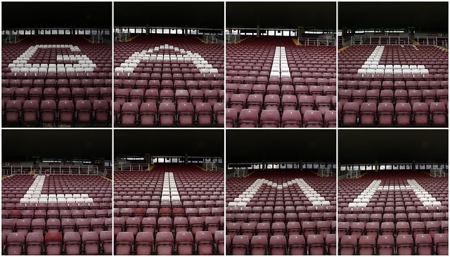
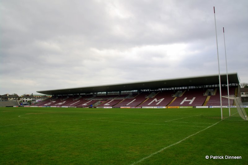
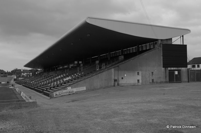
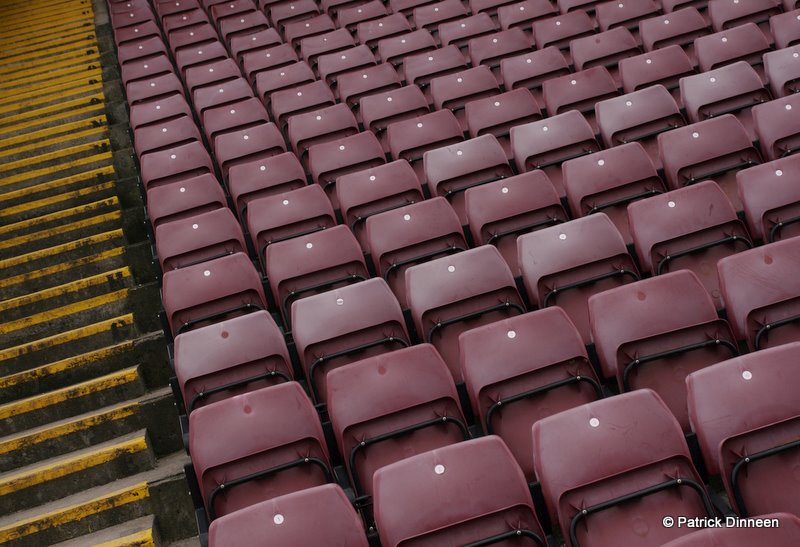
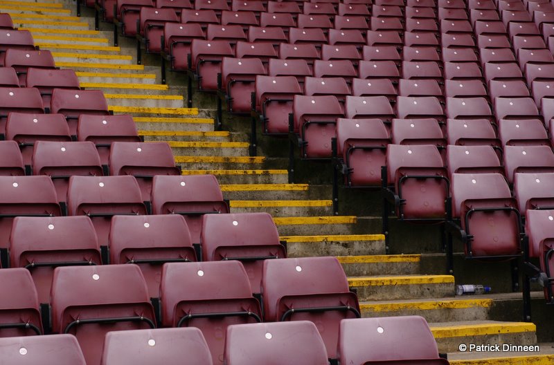
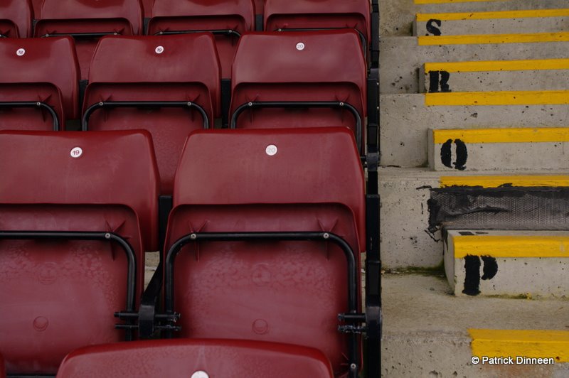
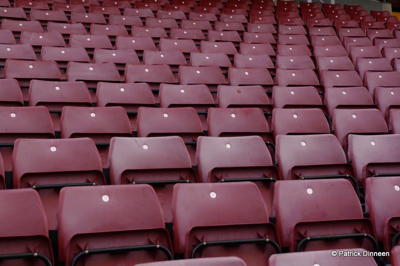
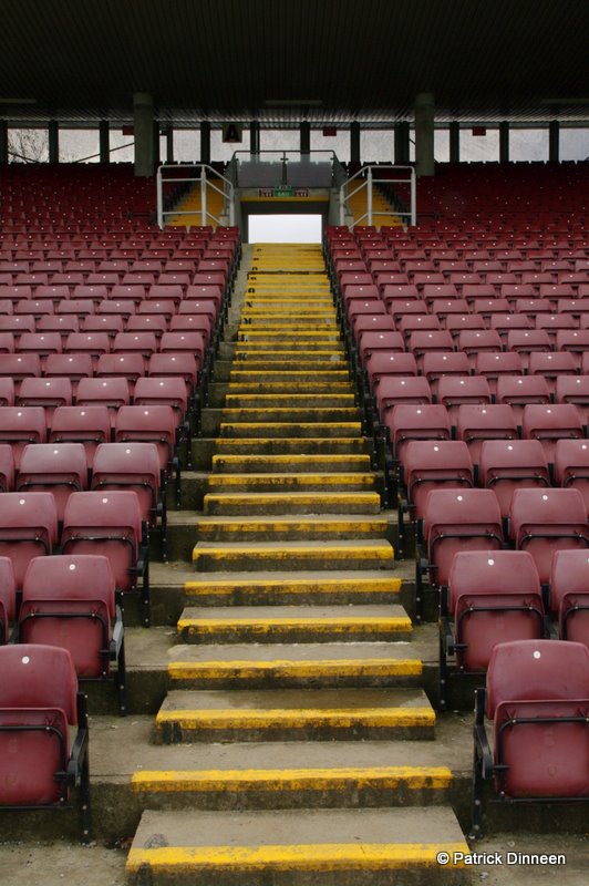
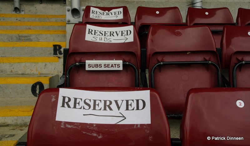
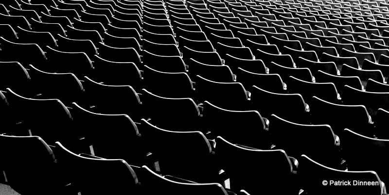
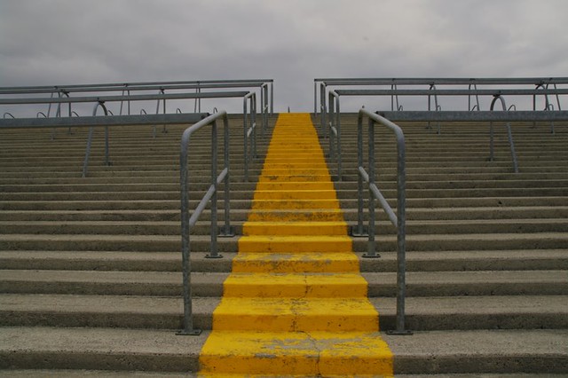
C&C Photos of Galway GAA Pearse Stadium

Comments

  • Registered Users, Registered Users 2 Posts: 4,283 ✭✭✭bullpost


    Love the abstract one best, though I'd go for a slightly tighter crop.

    Lighting is a bit flat in the rest.


  • Registered Users, Registered Users 2 Posts: 10,265 ✭✭✭✭Borderfox


    Yeah abstract one is excellent


  • Closed Accounts Posts: 2 uumotor


    great, it is beautiful


  • Registered Users, Registered Users 2 Posts: 9,046 ✭✭✭CabanSail


    The Mono Abstract is very good indeed.

    I would just darken the triangle in the lower left corner and make the watermark less intrusive (make that layer about 20%).


  • Registered Users, Registered Users 2 Posts: 679 ✭✭✭just-joe


    really like the black and white one!


  • Advertisement
  • Registered Users, Registered Users 2 Posts: 749 ✭✭✭BlastedGlute


    That black and white abstract is very good! Dull down, or black out the grey in the bottom left to keep the color tones true black and white like 99% of the image!

    Good stuff!


  • Closed Accounts Posts: 1,171 ✭✭✭paulocon


    Some great shots there, the pick of which is undoubtedly the Abstract one.

    I also like the Toilet one as for me, it represents the character of some of our County grounds.

    I'd really love to see a project done on the County grounds of Ireland. There's some lovely old stands around the country and also quite a few grounds in various stage of delapidation.


Advertisement