Advertisement
If you have a new account but are having problems posting or verifying your account, please email us on hello@boards.ie for help. Thanks :)
Hello all! Please ensure that you are posting a new thread or question in the appropriate forum. The Feedback forum is overwhelmed with questions that are having to be moved elsewhere. If you need help to verify your account contact hello@boards.ie
Hi there,
There is an issue with role permissions that is being worked on at the moment.
If you are having trouble with access or permissions on regional forums please post here to get access: https://www.boards.ie/discussion/2058365403/you-do-not-have-permission-for-that#latest
There is an issue with role permissions that is being worked on at the moment.
If you are having trouble with access or permissions on regional forums please post here to get access: https://www.boards.ie/discussion/2058365403/you-do-not-have-permission-for-that#latest
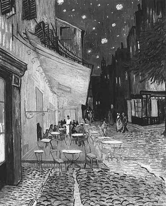
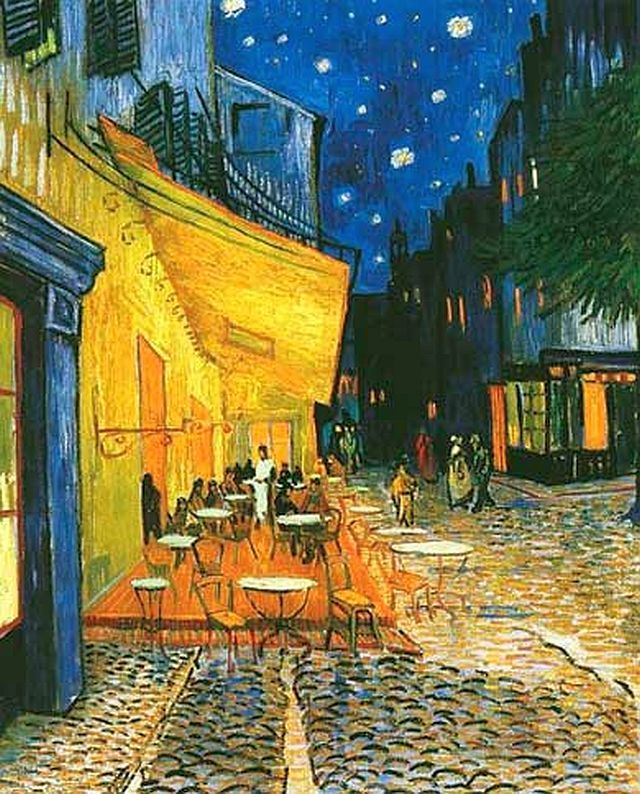
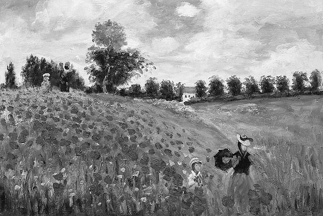
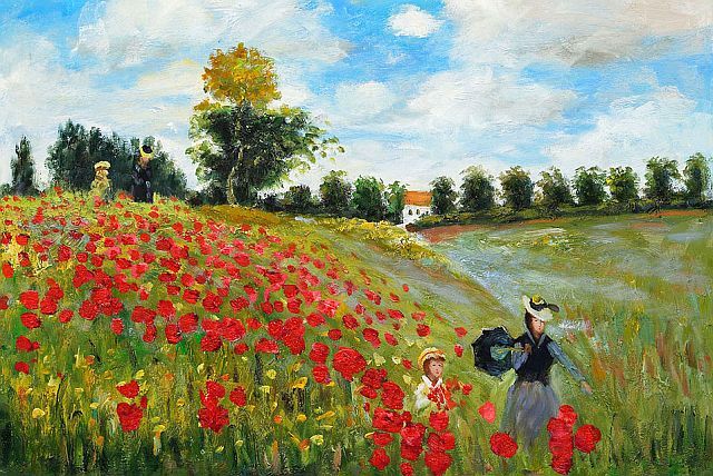
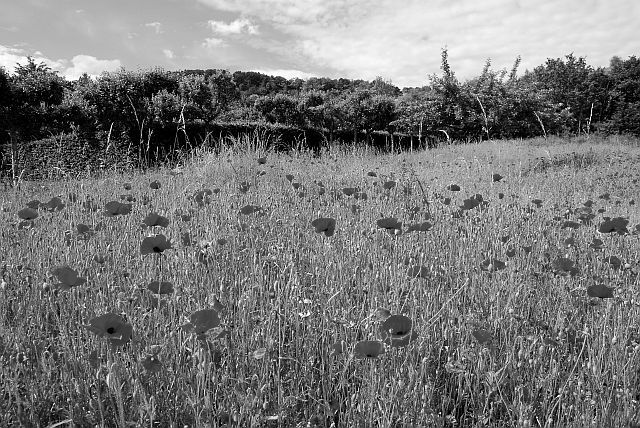
B&W or Colour ??
-
17-07-2013 8:46am#1

Comments
-
-
-
-
-
-
Advertisement
-
-
-
-
-
-
Advertisement
-
-
-
-
-
-
-
-
-
-
-
Advertisement
-
-
-
-
-
-
-
-
-
-
Advertisement
-
-
-
-
-
-
-
Advertisement
-


Advertisement