Advertisement
If you have a new account but are having problems posting or verifying your account, please email us on hello@boards.ie for help. Thanks :)
Hello all! Please ensure that you are posting a new thread or question in the appropriate forum. The Feedback forum is overwhelmed with questions that are having to be moved elsewhere. If you need help to verify your account contact hello@boards.ie
Hi there,
There is an issue with role permissions that is being worked on at the moment.
If you are having trouble with access or permissions on regional forums please post here to get access: https://www.boards.ie/discussion/2058365403/you-do-not-have-permission-for-that#latest

Jack Daniels (C&C)

  • 24-07-2009 8:30pm
    #1
    Registered Users, Registered Users 2 Posts: 2,705 ✭✭✭


    Hi All
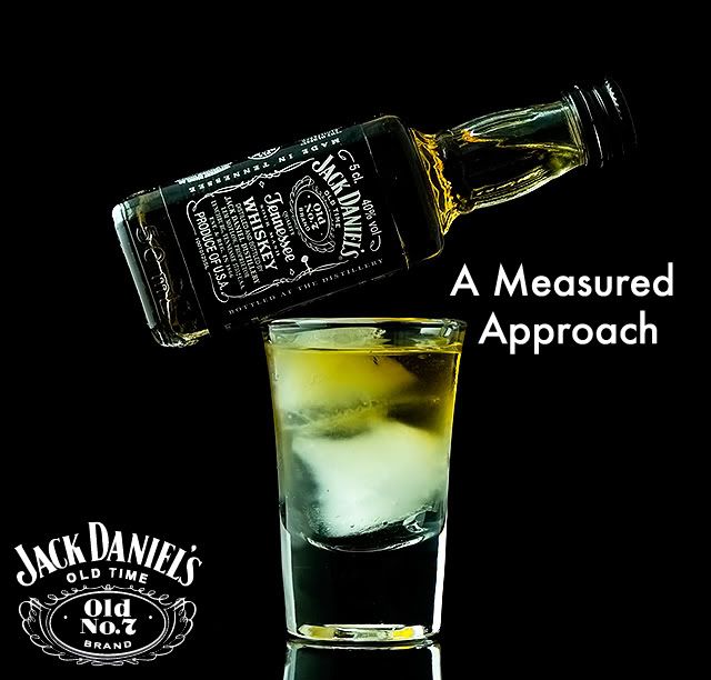
    Had a photo image i took and added some text to see if i could make an add.

    Comments welcome.

    jack-2.jpg


Comments

  • Closed Accounts Posts: 14,277 ✭✭✭✭Rb


    Love it!


  • Registered Users, Registered Users 2 Posts: 3,057 ✭✭✭kjt


    Cool idea but I think there's a few things you could do to improve the shot.

    The colour/white balance seems off, the whiskey seems a little too yellow. The shot feels too scrunched in, you need more white space (or black in this case ;) ) The text is too close, you need a bit more room. I like the reflection of the glass down the bottom but again it gets cut off too early.

    Sorry to sounds all negative but you asked for C&C :)


  • Registered Users, Registered Users 2 Posts: 2,705 ✭✭✭BrookieD


    thanks for the feed back. just what i wanted to hear ;-)

    more processing


  • Registered Users, Registered Users 2 Posts: 3,057 ✭✭✭kjt


    lol just my opinion mate... + if you where to change them 'tis only five seconds work :)


  • Registered Users, Registered Users 2 Posts: 2,705 ✭✭✭BrookieD


    kjt wrote: »
    lol just my opinion mate... + if you where to change them 'tis only five seconds work :)

    sorry dude that reads like i was pi$$ed with you reply, not at all.

    comments like your is what i am after. :D

    (i must re read before i press submit)


  • Advertisement
  • Registered Users, Registered Users 2 Posts: 1,542 ✭✭✭Tactical


    Can I ask a question?

    I'm curious, is this a shot you set up and took or is it an existing image that you've added text to?

    Sorry but I'm a little confused.

    The concept however is great, glass is very difficult to light correctly.


  • Registered Users, Registered Users 2 Posts: 3,057 ✭✭✭kjt


    BrookieD wrote: »
    sorry dude that reads like i was pi$$ed with you reply, not at all.

    comments like your is what i am after. :D

    (i must re read before i press submit)
    Not at all, just wanted to make sure you took my comment the right way. I know a lot of people on here ask for C&C and then take it the wrong way. I like people to be brutally honest when I put my images up too, you can't learn if everybodys just saying "nice", "good photo" etc :)


  • Registered Users, Registered Users 2 Posts: 2,705 ✭✭✭BrookieD


    @Tactical
    It was a set up i did in the kitchen with a light tent and two side lamps.

    Had a bunch of ideas and this was the best.


  • Banned (with Prison Access) Posts: 32,865 ✭✭✭✭MagicMarker


    Isn't the bottle normally bigger than the glass? :)

    From a photographic perspective, it's pretty good.
    From an advertising perspective, it's pretty bad.

    What's the general concept behind the image?


  • Registered Users, Registered Users 2 Posts: 2,705 ✭✭✭BrookieD


    Isn't the bottle normally bigger than the glass? :)

    From a photographic perspective, it's pretty good.
    From an advertising perspective, it's pretty bad.

    What's the general concept behind the image?

    The concept for the image was "balance" this was my take on it.
    The JD logo and text was a massive after thought.


  • Advertisement
  • Closed Accounts Posts: 812 ✭✭✭gary82


    Love it! V strong advertising image, nice clean shot.

    Would like to see a shot of your setup if you have it!


  • Registered Users, Registered Users 2 Posts: 5,718 ✭✭✭.Longshanks.


    Isn't the bottle normally bigger than the glass? :)

    From a photographic perspective, it's pretty good.
    From an advertising perspective, it's pretty bad.

    What's the general concept behind the image?

    Yeah - it must be a massive glass ;)


  • Registered Users, Registered Users 2 Posts: 16,624 ✭✭✭✭Fajitas!


    From a photographic perspective, it's pretty good.
    From an advertising perspective, it's pretty bad.

    Back up statements like these, otherwise they have no credibility :)


  • Posts: 5,589 ✭✭✭ [Deleted User]


    Fajitas! wrote: »
    Back up statements like these, otherwise they have no credibility :)

    I'd have to agree with him.

    I really like from a photographic perspective, but it needs work from an advertising perspective.

    Without derailing the thread:
    -the colour of the whiskey is dodge
    -the focus is on the glass, and again the colour of the drink is odd
    -the 'point' of the image doesn't really come across

    However, I really like the image - its very clever and interesting. Well done!!
    Have you any pictures from the set up?


  • Banned (with Prison Access) Posts: 32,865 ✭✭✭✭MagicMarker


    Fajitas! wrote: »
    Back up statements like these, otherwise they have no credibility :)
    I'd have to agree with him.

    I really like from a photographic perspective, but it needs work from an advertising perspective.

    Without derailing the thread:
    -the colour of the whiskey is dodge
    -the focus is on the glass, and again the colour of the drink is odd
    -the 'point' of the image doesn't really come across

    However, I really like the image - its very clever and interesting. Well done!!
    Have you any pictures from the set up?

    What he said ^


  • Registered Users, Registered Users 2 Posts: 8,070 ✭✭✭Placebo


    contrast too hight,
    jack Daniels is not that colour ?

    good concept though, all fits in nice.


  • Registered Users, Registered Users 2 Posts: 2,705 ✭✭✭BrookieD


    sorry no set up pics.

    Whiskey colour i can punch up a little, bur it was straight out of a JD bottle (was also nice after the shot)

    I will need to work on the point of the image more. maybe some research and try another set up.

    TBH i need to have more time to get back to photography again.

    thanks for the comments so far though


  • Registered Users, Registered Users 2 Posts: 156 ✭✭kgpixels


    A clever and interesting shot, no doubt. However I agree that the bottle should be bigger than the class and perhaps standing up straight to the left of the class. Personally the bottle at an angle speaks nothing to me. I'd then put the text over the class, to the right of the bottle neck and put the JD logo to the upper right. Just my opinion :)


Advertisement