Advertisement
If you have a new account but are having problems posting or verifying your account, please email us on hello@boards.ie for help. Thanks :)
Hello all! Please ensure that you are posting a new thread or question in the appropriate forum. The Feedback forum is overwhelmed with questions that are having to be moved elsewhere. If you need help to verify your account contact hello@boards.ie

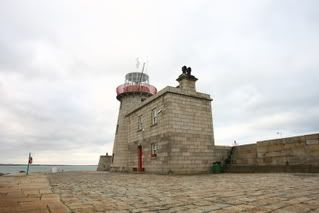
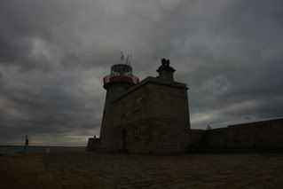
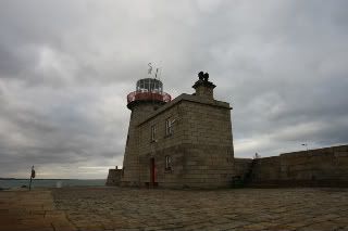
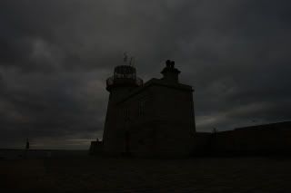
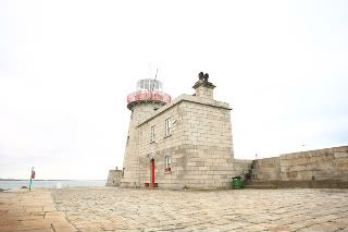
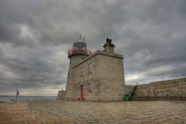
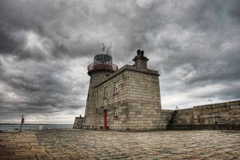
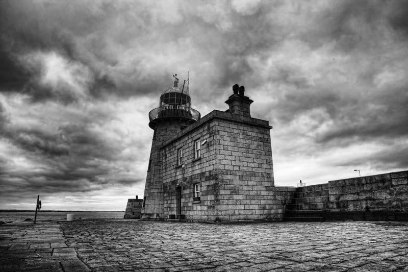
Howth Black and White

Options
  • 22-02-2009 1:40am
    #1
    Moderators, Sports Moderators Posts: 10,257 Mod ✭✭✭✭


    I went out to Howth today to see if I could get some nice black and white shots of some of the local landmarks. I dont do a lot of landscape work so always good to keep my eye in. I wanted a vivid colour shot that would make a good B&W conversion without too much fiddling around.

    I shot with the Canon 1dmk3 17-40L with a polariser and mostly using the 5 shot bracketing with a 1 stop spread, converted shots using Photomatix Pro and then using the enhance contrast setting in Topaz Labs and the reduce noise setting of 5, in curves used medium contrast and channel mixer to monochrome. Applied curves with medium contrast again.

    Saying all that I wanted over the top results so thats what I got :)
    C&C welcome as always

    1:Looking back from the road to the Bailey Lighthouse
    ADCC4A4A1495430FAF409F899358339F-800.jpg

    2: Conversion of above
    9684B33E80064468AB38F0378195943C-800.jpg

    3: Looking towards Howth Harbour
    31014C1789254BD3A68DE1C7BDE23A51-800.jpg

    4: Conversion of above
    9BF9CA067232496FA17F5C0F6748EB44-800.jpg

    5: Howth Lighthouse (I have seen the green bin)
    9982989B309542DCAB0B364486DA3A29-800.jpg

    6: Conversion of above
    DD647F23BB454EEE87E23DBB7676430C-800.jpg

    7: Panoramic from Bailey to Dublin view (8 shot panorama with 15mm fisheye)
    9D7FD9CC2325446EB66EAA2C68AAFC11-800.jpg

    8: Conversion of above
    E96CBF23C9B84D98963779CD92675D17-800.jpg


Comments

  • Registered Users Posts: 13,585 ✭✭✭✭thebaz


    Keith - the first one is my favorite , definitly in b & w , the colour looks too unnatural for my eyes -

    The second one works for me in colour ,

    The 3rd one also looks better in colour,

    The last one is probably the weakest , but is best in b & w .

    they are just my thoughts from a quick look, but they are certainly different , giving Dublin a David Lynch look , nice one


  • Moderators, Sports Moderators Posts: 10,257 Mod ✭✭✭✭Borderfox


    Thanks Barry, I agree the colours ones are a bit Yahoo but to get to the black and white was all I wanted.


  • Registered Users Posts: 13,585 ✭✭✭✭thebaz


    The 3rd one for me is much stronger in colour , it just suits the image - well to my eyes - which are tiring before i hit the hay


  • Registered Users Posts: 4,699 ✭✭✭ThOnda


    In fairness, I prefer the BW versions, the colour ones look a little too much unrealistic for my tired eyes. It is wonderful idea to process the picture to enhance colours and than use that picture for BW conversion! You are getting not only tonality range, but increased colour range. Brilliant!


  • Registered Users Posts: 293 ✭✭countryjimbo


    Its interesting looking at the colour versions to see how they convert, the OTT colours convert very nicely in the first two.
    The lighthouse shot is the strongest, I think that the sky is a bit over bearing, and that stonework would "pop" more if the sky was lighter.
    Undecided on the last one!


  • Advertisement
  • Moderators, Sports Moderators Posts: 10,257 Mod ✭✭✭✭Borderfox


    I wanted the world is going to end from the sky in the lighthouse one, also with the vivid colours I wanted my black and white shots to have some repeatablity.


  • Registered Users Posts: 3,057 ✭✭✭kjt


    Great set of shots Keith, clearly a very well spent few hours!!
    I love #1 & #2, I'm not sure which I prefer but I think the colour wins. #6 is my favourite and a great black and white shot! You seem to be using a fair bit of the Topaz Labs of late, I think I may have to take a closer gander at it.

    Good work!


  • Closed Accounts Posts: 831 ✭✭✭achtungbarry


    Some fantastic shots. I really love the black and whites. The monochrome really adds drama to the shots especially with those skies. The only thing I noticed is that in the black and white skys, there are blown out highlights in most of them that don't exist in the colour versions. Was this maybe caused by pushing the contrast slider too far. I usually use curves to prevent this or create a layer, increase the contrast slider and then erase the blown out areas to reveal the detail from the layer below. All in all, very dramatic shots and moody shots which I love.


  • Closed Accounts Posts: 279 ✭✭TheNorthBank


    I like them all but my 2 cents: The first one is better in B&W, 2nd and 3rd better in colour and the 4th (which is my least favourite) is much better in B&W.
    My favourite is the 3rd one though, particularly the rich colours in the stonework. Good stuff!


  • Registered Users Posts: 1,894 ✭✭✭dreamer_ire


    Both lighthouse shots are the best imo. I'm also quite drawn to the last B&W... there's something about it, kind of bleak but welcoming at the same time. Good days work!


  • Advertisement
  • Registered Users Posts: 107 ✭✭nameandanumber


    Yep, like this technique alright. Definitely works for the sky in particular. Provides great contrast.

    I'm not a fan of the overly-processed HDR look but, as you say, it really works when converted to B&W


  • Registered Users Posts: 694 ✭✭✭kgiller


    Excellent. One word for you, excellent. I love the conversion. The HDR converted to B+W really brings out a lot of detail in the highlights and shadows. #8 in my opinion might be a bit bright in the sky (only a tad). #6 is brilliant, detail in the building is incredible.

    Great work Keith


  • Closed Accounts Posts: 2,131 ✭✭✭oshead


    It is very difficult to critise these. They are very good, both HDRs and BWs. It's obivious you had a very clear idea in you head of what you were trying to achieve when you set about taking these. I find this can make all the difference to the finished images.

    All I can say really is, well done! :)


  • Registered Users Posts: 7,067 ✭✭✭AnimalRights


    I'm a big fan of Topaz after seeing Brian use it, must get my hands on it soon.
    Fantastic photos btw, all good and my favourites would be 1 and 5.

    edit
    It's a plug in for PS which I don't use.


  • Moderators, Sports Moderators Posts: 10,257 Mod ✭✭✭✭Borderfox


    Many thanks for all the comments and I have said on Pix.ie that the black and white shots are the destination and the colour ones are the journey. Before I went out I sat down and thought of the finished pictures that I wanted to make and the process was to match the real world with the picture in my head, I find this is often the way I work (and have done in the past in realtion to other subjects too)

    The first two and last two shots are on the private road down to the Bailey Lighthouse and is alone worth a visit by other Boardsies, so much to see in terms of landscapes as you can see.


  • Moderators, Sports Moderators Posts: 10,257 Mod ✭✭✭✭Borderfox


    I'm a big fan of Topaz after seeing Brian use it, must get my hands on it soon.
    Fantastic photos btw, all good and my favourites would be 1 and 5.

    edit
    It's a plug in for PS which I don't use.

    It will also work in photoshop elements which is within the grasp of many more people


  • Moderators, Sports Moderators Posts: 10,257 Mod ✭✭✭✭Borderfox


    Two more from the same set

    E5AC5516FB6B45DEBFB008EA0BAA3ED2-800.jpg

    1F9A7977D91D450D98717CAE45210185-800.jpg

    328B4FA03403456C8D8BC4D67225ABBC-800.jpg

    F57FA6D1DE0E4C8189CEFA8246E98C21-800.jpg


  • Closed Accounts Posts: 279 ✭✭TheNorthBank


    That last one of the B&W lighthouse is fantastic.


  • Registered Users Posts: 694 ✭✭✭kgiller


    Brilliant


  • Closed Accounts Posts: 139 ✭✭paulkellypix


    I love the way you treat the contrast in the BW conversions.

    Number 8 for me is the best - the way you captured the swirling cloud movements are class

    Well Done.

    Paul


  • Advertisement
  • Registered Users Posts: 5,962 ✭✭✭GhostInTheRuins


    Lovely shots


  • Moderators, Sports Moderators Posts: 10,257 Mod ✭✭✭✭Borderfox


    thanks for the comments


  • Moderators, Sports Moderators Posts: 10,257 Mod ✭✭✭✭Borderfox


    Start images
    ACC_0319.jpg
    ACC_0318.jpg
    ACC_0316.jpg
    ACC_0317.jpg
    ACC_0320.jpg

    HDR Tonemapped with Photomatix Pro
    HDRToneMapped.jpg

    Topaz Enhance Contrast Preset
    TopazEnhanceContrast.jpg

    Gradient Map and Medium Contrast in Curves in PS CS3
    Finished.jpg


  • Banned (with Prison Access) Posts: 11,001 ✭✭✭✭Masada


    Great shots there man.,:)

    I actually find the colour shots a lot more interesting, I dont think theres enough in the B&W shots to grab your attention and really stand out.

    No.3 would be my favourate one, what kind of lens did you use for no.5?


Advertisement