Advertisement
If you have a new account but are having problems posting or verifying your account, please email us on hello@boards.ie for help. Thanks :)
Hello all! Please ensure that you are posting a new thread or question in the appropriate forum. The Feedback forum is overwhelmed with questions that are having to be moved elsewhere. If you need help to verify your account contact hello@boards.ie

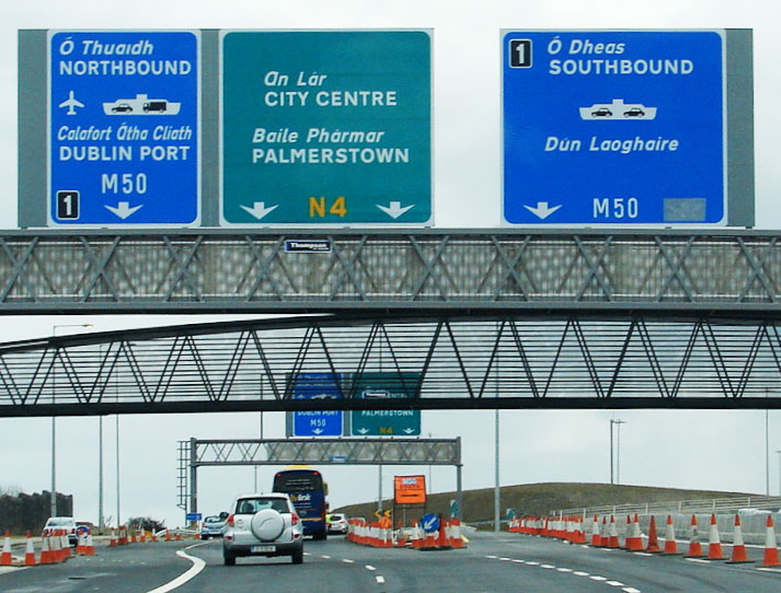
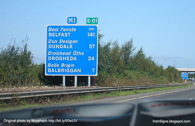
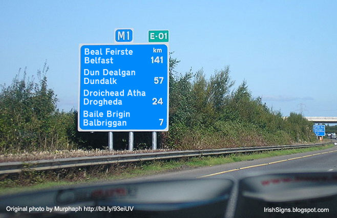
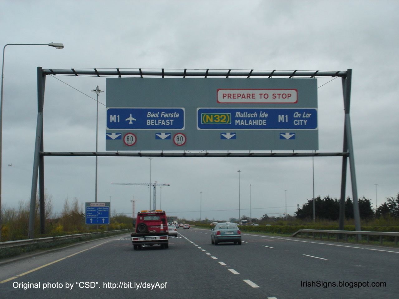
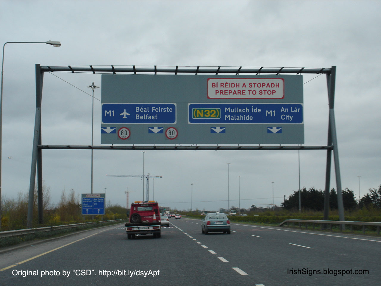
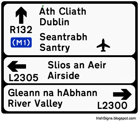
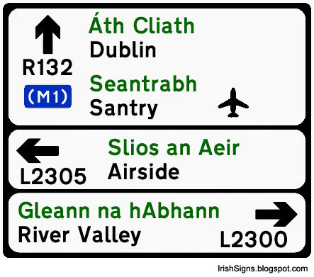
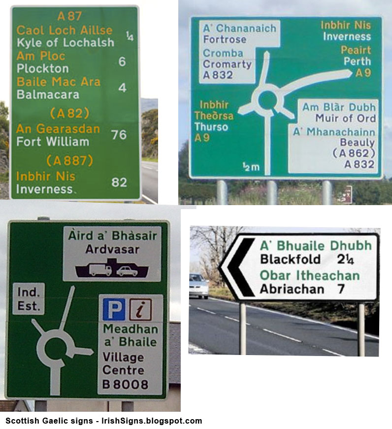
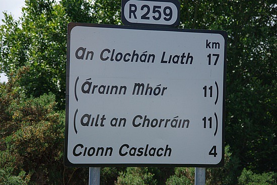
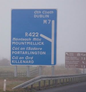
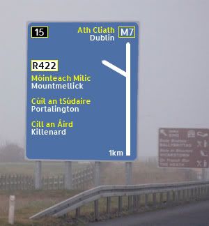
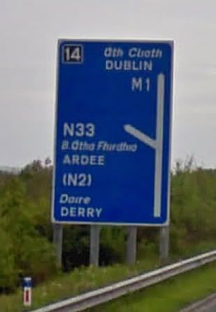
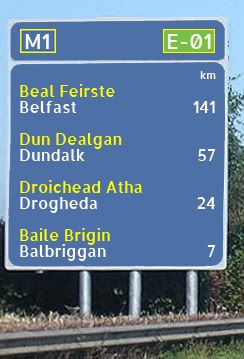
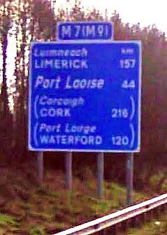
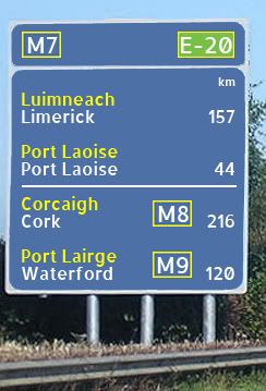
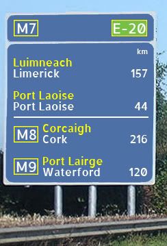
Bilingual Road Signs in Ireland

Options
«134567

Comments

  • Registered Users Posts: 186 ✭✭That username is already in use.


    Here are a few of my own proposals:

    Current signage
    dunlaog-m50-orig.jpg

    Proposed 1
    m50dub2.jpg

    Proposed 2
    m50dub1.jpg


  • Registered Users Posts: 186 ✭✭That username is already in use.


    Current signage
    balbrig-orig.jpg

    Proposed 1
    balbrig-white.jpg

    Proposed 2
    balbrig-orange.jpg


  • Registered Users Posts: 186 ✭✭That username is already in use.


    Current signage
    m1-airport-orig.jpg

    Proposed
    m1-airport.jpg


  • Registered Users Posts: 186 ✭✭That username is already in use.


    Current signage
    townsign-orig.jpg

    Proposed 1
    townsign-mono.jpg

    Proposed 2
    townsign1.jpg


  • Closed Accounts Posts: 6,093 ✭✭✭Amtmann


    This was posted by Garret Reil in 2009 on another forum:

    sign-comparison-no-halation.jpg


  • Advertisement
  • Moderators, Business & Finance Moderators, Motoring & Transport Moderators, Society & Culture Moderators Posts: 67,736 Mod ✭✭✭✭L1011


    As goes the overhead gantry signage, I don't agree with warning text being translated at all (the "PREPARE TO STOP").

    It reduces readability significantly and there isn't a single Irish-only speaker in the country; let alone a single Irish-only driver. Also a lot of them are recognisable by non-English speakers (many countries use identical STOP signs even if they don't have that word).

    They definitely should *never ever ever ever* be Irish-only as I've seen in the Gaeltacht from time to time. A warning that only a few % of drivers can read is worse than useless.


  • Registered Users Posts: 3,381 ✭✭✭JohnC.


    I think the Proposed 1 examples above reduce readability. They need something to differentiate them. Being the same, it makes it look like one name split across two lines. On bigger signs with several names, it is harder to read quickly. It just becomes a mass of words with nothing breaking them. And I know what I'm looking at. I'd hate to be a foreigner looking at those. The current italics or Proposal 2 with different colours is easier.


  • Registered Users Posts: 3,771 ✭✭✭Nuttzz


    I agree that Proposed 1 examples above reduce readability, what is wrong with what we have at present?


  • Registered Users Posts: 369 ✭✭Empire o de Sun


    I did this one before, though I used the wrong font for clearview at the time :o

    136723.png


  • Registered Users Posts: 5,850 ✭✭✭Chris_5339762


    Proposed 2 would be better I reckon. However, I'd be for removing the Irish entirely but thats just me. [I understand why its there and all but how many people ACTUALLY USE IT?]


  • Advertisement
  • Registered Users Posts: 1,490 ✭✭✭pegasus1


    You would get people slowing down to read your proposals and that is just wrong...road signage should jump out at you and not be in any way confusing !!


  • Registered Users Posts: 674 ✭✭✭etchyed


    Nuttzz wrote: »
    I agree that Proposed 1 examples above reduce readability, what is wrong with what we have at present?
    What's wrong with the current arrangement is that putting the Irish in italics seems to attribute less importance to it. While road signs are exempt from the requirement for equal prominence, it makes the presence of the Irish on the signs look tokenistic (which some would argue it is anyway, but that's a debate for another day). Road signs are one of the most prominent examples we have of Irish language policy, and whether you agree with the premise of that policy or not, you have to agree that the current signs are a pretty half-assed way of implementing it.

    Having italics on road signs is a bizarre idea, and I'd love to know how it ever got off the ground. Most people don't notice this now because they're so used to it, but when you see signs for places like Port Laoise and Dún Laoghaire with just the italics and no English you realise how stupid it looks.

    More importantly, the current signage puts the English in all caps, which is proven to be a lot less readable from a distance than mixed case. The UK font that Ireland uses (Transport) was never meant to be used in all caps.

    Finally, and least importantly, the current signs are ugly.

    Personally I find the 1st proposal the most appealing, and it works perfectly well in Wales. But realistically I think that Proposed 2 would be the best implementation. There is no reason for this to be controversial. The signs could be replaced as would be required anyway, but it would be a very slow process as the NRA have been putting up a lot of new signage lately. It's a shame the recent changes in signage didn't lead to a rethink of the way the languages are treated. I suspect it would be politically difficult to do, with all kinds of accusations of money wasting, when in fact it wouldn't cost an extra penny to roll these signs out over the space of 20 years or so.


  • Registered Users Posts: 150 ✭✭Bill G


    I don't care about the language, but what country in the world except Ireland puts the city/town that is furthest away at the top of the sign, and the closest town at the bottom? That makes absolutely no sense at all......


  • Registered Users Posts: 369 ✭✭Empire o de Sun


    Not just the treatment of the languages has to be looked at, but also the fonts for route numbers, and speed limits. The should be the same or atleast part of the same family of fonts.

    The Clearview Family of fonts should be used in my opinion.


  • Registered Users Posts: 3,771 ✭✭✭Nuttzz


    etchyed wrote: »
    Road signs are one of the most prominent examples we have of Irish language policy, and whether you agree with the premise of that policy or not, you have to agree that the current signs are a pretty half-assed way of implementing it.

    I dont want to embark on a language policy discussion, however road signs are for getting motorists from A to B and serve no other function imho

    How do they manage this in Canada where they have a real bilingual situation?

    From the limited driving I did in Toronto this year I cant remember any bilingual road signs (but then I could have filtered them out like I do with the Irish bits here)


  • Registered Users Posts: 7,476 ✭✭✭ardmacha


    I dont want to embark on a language policy discussion, however road signs are for getting motorists from A to B and serve no other function imho

    Why are you doing it, then? Keep the thread about sign design, please.
    Scottish style proposal 2 is good.


  • Moderators, Business & Finance Moderators, Motoring & Transport Moderators, Society & Culture Moderators Posts: 67,736 Mod ✭✭✭✭L1011


    Bill G wrote: »
    I don't care about the language, but what country in the world except Ireland puts the city/town that is furthest away at the top of the sign, and the closest town at the bottom? That makes absolutely no sense at all......

    UK. From whom our road directional signage is roughly copied; like how our road instructional signage is roughly US.


  • Registered Users Posts: 7,476 ✭✭✭ardmacha


    UK. From whom our road directional signage is roughly copied; like how our road instructional signage is roughly US.

    Don't worry. As a requirement of the current negotiations, these "Anglo" style arrangements will soon be harmonised in favour of German style signage. :) Personally I'd be happy with the present styles with German consistency.


  • Registered Users Posts: 2,091 ✭✭✭marmurr1916


    MYOB wrote: »
    UK. From whom our road directional signage is roughly copied; like how our road instructional signage is roughly US.

    If directional signposts are supposed to be a visual shorthand for a route, then it makes perfect sense to have the destination furthest away at the top of the sign.

    OT: I can't see much wrong with bilingual road signs in Ireland. Most people, even Irish speakers, will be looking for the English language name for their destination. The present system, where these are in a clear, easy to read font, in capital letters makes it easy to see them even when driving at high speed.

    It's true that bilingual signs are slightly harder to read than monolingual signs but I think anyone who has real difficulty in reading these signs probably shouldn't be driving in the first place.

    FWIW, similar signs are used in many Arab countries, with destinations shown in Arabic script and Latin script.

    33944986vSGnFT_ph.jpg

    Arabic speakers clearly look at the Arabic script, non-Arabic speakers look at the Latin script.

    AFAIK, this doesn't cause any problems in those countries.


  • Registered Users Posts: 150 ✭✭Bill G


    I've never seen a sign in the UK with the farthest town at the top.

    MES4453.jpg

    If it was the standard in the UK, they have changed it, probably because having it that way is stupid.


  • Advertisement
  • Registered Users Posts: 186 ✭✭That username is already in use.


    Here are some Gaelic examples:

    scotgaelic.jpg


  • Registered Users Posts: 186 ✭✭That username is already in use.


    Example of dreadful signage design in Donegal.

    UK Transport font in forced italics.

    1.1277092011.english-map_-gaelic-road-signs.jpg


  • Registered Users Posts: 1,132 ✭✭✭Stonewolf


    Especially given than nobody uses the Irish versions of the top and bottom ones. Actually, I don't even know what the second from bottom one is.


  • Moderators, Business & Finance Moderators, Motoring & Transport Moderators, Society & Culture Moderators Posts: 67,736 Mod ✭✭✭✭L1011


    Burtonport!

    Also, the second from the top doesn't have a road to it at all...


  • Closed Accounts Posts: 6,093 ✭✭✭Amtmann


    I quite like the green and black typography on the R and L road signage. I'm reluctant to endorse yellow lettering on N and M signage, as I think the eyes are more drawn to this than to the white. I realise choice is limited by what colours stand out on a green and blue background, and one would want to avoid strong colours bleeding into one another. When you consider that, yellow and green/blue isn't a bad combination I suppose.


  • Registered Users Posts: 740 ✭✭✭Jayuu


    I decided to have a go at this and also expanding out from Garret Reil's site and project had a look at what I would like to see in signage both on motorways and in general.

    Here are a couple of examples I came up with. I used some of the examples already shown here and also I decided to use the ALLERTA font which I think works really well as a clean crisp font (it also helped that it was Open Source as well!).

    Firstly some advance directional signage:
    old-m-ads01.jpgm-ads01.jpg
    The first thing is that I decided to use the colours for the road types involved on the signage, so in this example because the R442 is a regional road its put into a black on white patch. I think this reinforces the road type of the exiting road. I also think the colour coding and mixed case font for Irish and English works much better from an understanding perspective and negates the need for italics which I think confuse the signs.

    old-m-ads02.jpgm-ads02a.jpg
    This is similar to the first one except to show how I would indicate where a secondary route is accessible. I really don't like the current arrangement of the brackets. I think it throws off the design of the signs. I'm not sure whether the white line between the destinations is necessary but I did want some way to indicate the primary route being taken. Note again the use of colour for the road type.

    m-ads02.jpg
    This is an alternative for the above sign where I've put the secondary route designation to the right of the location. I can't make my mind up on whether this is a better option or not. It does make better use of space on the sign should there be a need to indicate more than one secondary route.

    Finally for the moment in the advance directional signage is an option for overhead gantries. This may need further refinement.
    old-m-ads03.jpgm-ads03.jpg
    What I really hate about the old sign here are the inconsistencies on it. Now I know this is one that has been around a while and newer signs may be better but the fact the route numbers, arrows and names are all in different places make the sign really messy. In my version the route numbers are on the same level (although I still have to work out how you would deal with an exit with multiple route numbers!) and the junction number is in the familiar top left position. Also the arrows are consistently at the bottom.
    Another thing here is that I think the use of different colour for Irish and English makes it possible to centre all the text on one axis as opposed to centering the overall text but having the Irish and English version start in the same positions.


  • Closed Accounts Posts: 6,093 ✭✭✭Amtmann


    What software application are people using to redesign the signage?


  • Registered Users Posts: 740 ✭✭✭Jayuu


    Just some more examples. These are for route confirmations.

    old-m-rc01.jpgm-rc01.jpg
    This is the example give by "That username is already in use". My take on it is very similar to him/her with again the use of colour coding and mixed case for Irish and English. The only real difference is that I've incorporated the route numbering into the actual sign as opposed to having in as a bolted on piece at the top. I think it just makes the sign that bit more complete.

    old-m-rc02.jpgm-rc02.jpg
    And here's an example with secondary route distances. Again I've used the idea of the white line to separate primary and secondary routes in order to drop the horrible brackets which makes the old sign extremely nasty (imho!). Also I've added the actual route numbers to the right of the secondary destinations. What I'm not sure about is whether doing that makes it hard to read the actual distances involved.
    The other thing to consider here is what to do when there is no official English language name for a location. I have to say I really hate the current concept of making the italicised version twice the size as in this example. I think it makes the sign completely confusing for tourists. My compromise is to use the Irish name in both colours. It may be redundant but it keeps consistency on the signage.
    I know the current sign has been there for a long while so again it may not be an accurate example of what might be put up today in such a place but even so under our current setup I think you'd end with a confusing sign.

    m-rc02a.jpg
    This was an alternative to the above image with the secondary routes indicated to the left. The problem here though is what you would do if the secondary route numbers were different lengths. Would you start all the text in the same place or just leave a set gap between the route numbers and the destinations. Are the route numbers necessary at all?


  • Registered Users Posts: 740 ✭✭✭Jayuu


    Furet wrote: »
    What software application are people using to redesign the signage?

    I'm using Photoshop and Google StreetView to get some of my images. I could be a little tider in my overlays of colour on some of the sign but I just want to get the concept across so I'm not spending too much time on making them neat.


  • Advertisement
  • Registered Users Posts: 369 ✭✭Empire o de Sun


    using AutoCAD Lt

    here an old one I did

    136824.png


This discussion has been closed.
Advertisement