What are you supposed to do with the used loo roll? 🤢
You don't use toilet roll you wash your ass with the water. And wash down the shít/ poo down the drain.
Why the loo roll so?
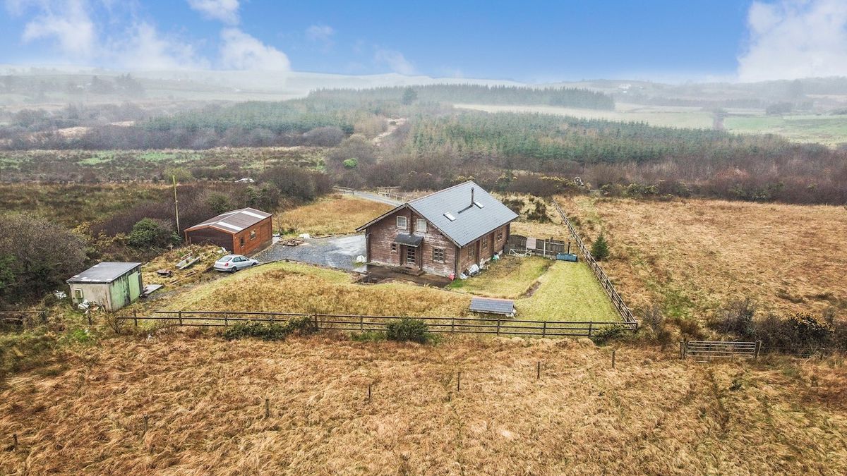
This isn't so much "Who'd live in a house like this?" as "Who or what the fúck is living in it now?"
Wooden shack in what appears to be a nuclear wasteland; "This property is being sold occupied under terms unknown".
I like how the EA replaced the sky with a blue one, even though the landscape shows that it was a miserable foggy day. As if a blue sky is going to make this place more attractive to anyone.
C1? Somehow I doubt it!
No internal pictures.
I guess maybe someone could buy it as a site, rip it down and build a real house there?
That's if the unknown occupant can be removed.
That looks like a set from a horror movie, the advertised amenities aren't adding to its appeal either.
Local amenities are available in Ennistymon including SuperValu, Spar, local shops and restaurants.
And it's closer to Ennis than Ennistymon?
Problem there being the fact that it is occupied - by people with a lease, or squatters, who knows?
Yep. I'm picturing Cletus from the Simpsons….
😁sadly, I think I am the only person on earth who has never watched an episode of the Simpsons!
I wonder how much they charge for ringside seats?
You can find a Simpsons reference for anything. 😊
No, you're not. I never watched it either.
I'm sorry, but I just love this. It's a pity they seem to have sent a four year old to take the photographs.
Getting strong cult vibes off that 😄
Dreadful interior, it looks dark with cheap carpets, curtains and furniture. The hall looks like the foyer in an apartment building too.
And who the hell needs over 6000 ft² and 7 bedrooms?
Very small kitchen compared to the size of the house.
It looks like someone took the designs for four different houses and just mashed them together.
Looks like an office building. Nice that they left a wall for playing handball against on the front though
That Craughwell gaff reminded me of the Simpons too...
Toughens the germs.
They are absolutely terrible photos, especially considering that they are likely looking at a huge price.
I love the idea of a sunken sitting room, but that one isn't doing it for me.
Lots didn't sit well with me , but in a house / room this size, did they really have to wedge the tv above the fireplace.
A HUGE waste of space bathroom, and then cramped bedrooms with two single beds and not even a headboard.
Whoever built this house had notions.
Agreed about the TV mounting. In fact theres an entire Reddit thread dedicated to this crime against humanity.
https://www.reddit.com/r/TVTooHigh/
All the money was spent on the building and landscaping, then they had nothing left to furnish it, and even less ability to create something half reasonable. They could not possibly have done a more clueless, tacky and cheapo job of the 'furnishing'. If you wanted that much house it could be made attractive with just more attention to detail and more appropriate decor. The kitchen island though! Who would want to perch over the sink and hob, eating breakfast while trying not to knock everything off the shelf?
The shelf is so high on the island, it's of no use. The house looks miserable, dark, low ceilings. The ultra wide steps up a half level from the landing are just one example of a hogde-podge design/layout that hurts my eyes. I think this is one of the worst examples I have seen of ambitious project failure.
That kitchen is so dark and unwelcoming. Shocking stuff if an architect was involved. Don't go 550m2+ and have a spot like that. Have a high ceiling open plan area and a realistic house size. Volume matters more than m2.
The exterior of the house looks too corporate for me. Kinda golf clubby but much better looking than the interior.
Inside, I get that they may not have had the budget to furnish as they might have liked after their build but the photos make it look like the interior of two different houses: one leaning towards a modernist approach but the other styled by someone’s grandmother & not in a good way. The kitchen doesn’t look right somehow in the photos either, even the better ones.
White ceilings, walls & throws, particularly in the “conversation pit” would have been better.
Perhaps it’s the kind of house that you do actually need to see to appreciate.
Yeh they must have kept the 2006 built kitchen and room furniture in some places which are clearly from that era.
Pity the budget or plans didn't convert the existing kitchen into a cinema room or pantry and build new kitchen diner extension that gets natural light.
When the outside matches the inside:
I assume thanks go to the NI Housing Executive for this bunker.





![Photo of [Deleted User]](https://wd.vanillicon.com/v2/dbd35c43580ff62b54e9919958f2a898.svg)


