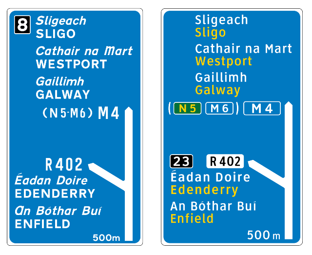
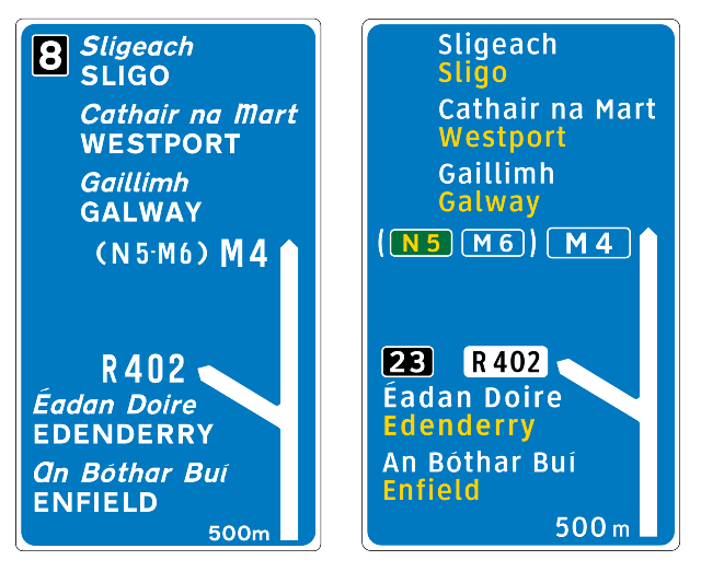
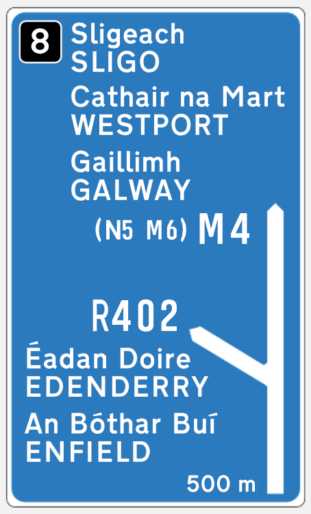
I know this was raised a few years ago, but I assumed there are still no plans to update our signage! The layout of the Irish language versions of towns/cities is terrible and extremely hard to read. Below is an example I put together quickly. I think it's so much clearer, using the same fonts and different colours.
The original (below) is a complete mess in my opinion.


![Photo of [Deleted User]](https://w8.vanillicon.com/v2/87962ff026856470eacf12f9c3179c90.svg)


![Photo of [Deleted User]](https://w9.vanillicon.com/v2/975d229199ef1950ddf5036fc947d0f4.svg)





![Photo of [Deleted User]](https://w9.vanillicon.com/v2/9c01dbda74e369436b15877a55556d85.svg)