Advertisement
If you have a new account but are having problems posting or verifying your account, please email us on hello@boards.ie for help. Thanks :)
Hello all! Please ensure that you are posting a new thread or question in the appropriate forum. The Feedback forum is overwhelmed with questions that are having to be moved elsewhere. If you need help to verify your account contact hello@boards.ie
Hi all! We have been experiencing an issue on site where threads have been missing the latest postings. The platform host Vanilla are working on this issue. A workaround that has been used by some is to navigate back from 1 to 10+ pages to re-sync the thread and this will then show the latest posts. Thanks, Mike.
Hi there,
There is an issue with role permissions that is being worked on at the moment.
If you are having trouble with access or permissions on regional forums please post here to get access: https://www.boards.ie/discussion/2058365403/you-do-not-have-permission-for-that#latest

Has the 1 week downtime & move to vanilla killed this place?

1356710

Comments

  • Registered Users Posts: 128 ✭✭motionwaves


    Bring back the old website. It was better


  • Registered Users, Registered Users 2 Posts: 6,939 ✭✭✭sporina


    people have a right to be angry and frustrated - the negativity and criticism is only natural - its a disaster!!! there is lots of feedback in the relevant threads... admins I am sure are well aware of the issues - no need to reiterate them.. I wouldn't even know where to start... its a disaster.. unbelievable how they cud ruin something so good


  • Registered Users, Registered Users 2 Posts: 25,789 ✭✭✭✭Strumms


    Yes, digging shouldn’t be necessary really though...

    should be a button on the top of every page, top right beside the search, notifications, messages and smiley face.. Just a button ‘AP’ ( all posts ) or whatever to bring users conveniently to a list of their x number of last contributions...

    in my view that would make a big difference in reverting the forum to a more user friendly experience.


  • Registered Users, Registered Users 2 Posts: 6,698 ✭✭✭Feisar


    Can someone explain to this luddite what is meant by "architecture crumbling". Surely if it worked yesterday it'd work today?

    First they came for the socialists...


  • Registered Users, Registered Users 2 Posts: 6,698 ✭✭✭Feisar


    Also, I'm a little sad that all the attachments and thanks from the old site are gone. That's a lot of Irish internet history lost. Maybe they can migrate them back over at some point.

    (In the quote box it didn't seem to bring that bit with it, maybe it did)

    Feeky McGee's exploits gone forever!


    Edit - I had to quote the whole post, I couldn't see an option to pull the bit I wanted and it didn't even quote said bit.

    First they came for the socialists...


  • Registered Users, Registered Users 2 Posts: 1,872 ✭✭✭mrslancaster


    Current users showing as 4239 all the time, not even 1 extra or less, bit odd.


  • Registered Users, Registered Users 2 Posts: 6,104 ✭✭✭Trigger Happy


    This new site is like learning how to drive again where you steer with your feet and clutch/brake with your nose.

    Too much effort.


  • Registered Users Posts: 379 ✭✭Tilden Katz


    I know! I am hating that I have to quote the whole post and can't even bold text the part I'm interested in highlighting.

    I don't know, this feels like sabotage. Does somebody want this site put to be bed? Or are we just being drama queens and the masses are using this away with little hassle?


  • Registered Users Posts: 379 ✭✭Tilden Katz


    I don't agree. The userbase is a very important part of a site like this working. There's plenty of constructive criticism here.


  • Registered Users, Registered Users 2 Posts: 5,355 ✭✭✭Man Vs ManUre


    Bring back Marathon this Snickers tastes like sh1t.


  • Advertisement
  • Registered Users, Registered Users 2 Posts: 31,946 ✭✭✭✭Mars Bar


    I've seen this observation posted time and time again and I'm wondering why people are even interested in it?


  • Registered Users, Registered Users 2 Posts: 2,996 ✭✭✭antimatterx


    I was primarily a boards touch user. Since the relaunch I haven't really posted much, and the threads I follow (such as Crypto) seem dead. It's just so difficult to use, there's no differentiation in posts when there's a new post to read (new posts use to bold the thread card, now they're all bold all the time.)

    It's just not easy to use. I suspect traffic has fallen off a cliff tbh.


  • Registered Users, Registered Users 2 Posts: 8,000 ✭✭✭Stone Deaf 4evr


    The very fact that there isnt a button on the font page to take you directly to your followed threads is baffling. I managed to find it via a random sticky I stumbled across


    Outside of that, I've all but stopped using the touch site as navigation is so obtuse, it borders on being something that was purposely designed to be hard to use.

    whole sections of subforums seem impossible to find now.


  • Registered Users, Registered Users 2 Posts: 766 ✭✭✭ger vallely


    I haaaattttteeeeee it, hate it, hate it, hate it. Is this it? Will it improve? It's ugly and not pleasant to navigate on a phone. Eugh. True the weather has something to do with people being occupied elsewhere and the downtime probably got people up to other stuff. But this new look, it's the oldest new look ever. Like shopping in Dunnes for decent clothes. It's like 1990.


  • Registered Users, Registered Users 2 Posts: 1,872 ✭✭✭mrslancaster


    Maybe it would be interesting to see how many are using the new site even with all the issues.


  • Registered Users, Registered Users 2 Posts: 14,310 ✭✭✭✭Cienciano


    If it's like most places I worked, every dumb idea is considered at the meetings, no one wants to be seen as "negative" so no one speaks out. Tested by a few people who don't use the same features 99% of people uses so they think it's fine. Top it off with no one in power admitting it was shít because then they admit they fúcked up.


    You can't click on a username to see their previous posts, how the hell do you multiquote, your own posts are buried somewhere, mobile site is terrible, it's hard to see when a post was even made, you have to use desktop which has loads of white space.


  • Registered Users Posts: 58 ✭✭HoliyMoliy


    Not a fan of the new site. Finding it very hard to navigate and find forums.


  • Registered Users, Registered Users 2 Posts: 13,186 ✭✭✭✭jmayo


    Sorry Jupiter Kid, but when the design is an unmitigated shambles, the migration took weeks and is a shambles, then the users have a right to gripe and complain.

    This site would be nothing without it's users, something the site owners seem to be endeavouring to proof.

    Our contributions, however bad some of them were or however much some people disagreed with them, over the years helped build this site.

    We are not alone users, we are a commodity to this site that can be harnessed for the profit of the owners.

    And as they say if you aren't paying for a product then you are the product.

    There appears to have been no proper testing of the layout, no market testing, nothing.

    I would like to know who was the eejit that signed off on the new boards site layout?

    I would also like to know how much the developer(s) charged for this abomination?

    Oh can someone let us know when they finish school so some of us can avoid hiring them in the future. ;-)

    I am not allowed discuss …


  • Registered Users, Registered Users 2 Posts: 8,738 ✭✭✭Quantum Erasure


    still slow...


  • Advertisement
  • Registered Users, Registered Users 2 Posts: 34,104 ✭✭✭✭listermint


    Still not slow for me. Faster than the old touch site by miles. And posting is lightening.


    Again I still don't like all the white or finding my forums. The hidden likes and search all goosed.


  • Registered Users Posts: 685 ✭✭✭TallGlass2


    Its so slow the favicon even takes time to load! (haven't seen a site do that in a few years!)


  • Registered Users, Registered Users 2 Posts: 5,615 ✭✭✭archfi


    I'm also not seeing any slowness, desktop or mobile.

    It's an odd one.

    The issue is never the issue; the issue is always the revolution.

    The Entryism process: 1) Demand access; 2) Demand accommodation; 3) Demand a seat at the table; 4) Demand to run the table; 5) Demand to run the institution; 6) Run the institution to produce more activists and policy until they run it into the ground.


  • Registered Users, Registered Users 2 Posts: 12,641 ✭✭✭✭bodhrandude


    The timestamp for each thread is is an hour behind too although my timestamp is showing in real time.

    If you want to get into it, you got to get out of it. (Hawkwind 1982)


  • Registered Users Posts: 685 ✭✭✭TallGlass2


    What's interesting is I switch to a VPN in Canada given that Vanilla software is at that location. Is Boards.ie hosted now in Canada or around that region as the VPN seems to have improved load times by selecting that region?


  • Registered Users Posts: 2,898 ✭✭✭Girly Gal


    On your phone you can change the view to the desktop version and it's much easier to navigate than the mobile site, however, I don't think you can set the desktop version as your default view, so need to change it everytime you click onto boards.ie site. While the desktop site is better, it still takes much more effort to find stuff than on the old site. Also seems to be less interesting things to view on the site since the changeover


  • Advertisement
  • Posts: 0 [Deleted User]


    Cheerio (with burning eyes)


  • Registered Users, Registered Users 2 Posts: 25,789 ✭✭✭✭Strumms


    Same, my newish broadband provider is pretty quick so maybe thats helping me.... but no trouble at all with speed.

    timestamp is accurate too here.


  • Registered Users Posts: 58 ✭✭HoliyMoliy


    My time stamp is spot on.


  • Registered Users, Registered Users 2 Posts: 761 ✭✭✭Agent_47


    Yeah, they didn't survey user needs before scoping the work, everyone likes dark mode and it is no where to be found or indeed if it is coming back at all.


  • Posts: 2,799 ✭✭✭ [Deleted User]


    The am/pm thing is annoying


  • Advertisement
  • Registered Users, Registered Users 2 Posts: 22,495 ✭✭✭✭Esel


    Every post should have a full timestamp (day/date and time in 24h format).

    Same needed on /discussions and ../bookmarked lists

    Not your ornery onager


  • Registered Users, Registered Users 2 Posts: 13,274 ✭✭✭✭Purple Mountain


    Is it really necessary to have to scroll so far to the page end to get to the next page tab (on phone)?

    It seems an excessively long scroll.

    I can't find how to activate dark mode on this site, only on my phone in general and my eyes are bleeding from the whiteness.

    It's like another poster said above, you don't just whip out your phone now and casually browse the site for a few minutes, it's too taxing.

    I'll go on record to say I absolutely hate the change.

    To thine own self be true


  • Registered Users, Registered Users 2 Posts: 6,580 ✭✭✭bassy


    you were not here long enough to remember the good old boards format.


  • Registered Users, Registered Users 2 Posts: 23,246 ✭✭✭✭Dyr


    I'm not automatically subscribed to threads that I post in so that's a deal breaker for me. Thats the most basic feature a forum needs.

    Also, WHERE HAVE MY STARZ GONE?


  • Registered Users, Registered Users 2 Posts: 40,513 ✭✭✭✭ohnonotgmail


  • Registered Users, Registered Users 2 Posts: 2,114 ✭✭✭PhilOssophy


    Probably my last boards post.....good many may say! :D

    This new layout is too awful. Every thread appearing as "unread", no "view first unread" button.

    I love a bit of change and a fresh outfit but above all, don't break what is working with change.

    Sad, it used to be so good.


  • Registered Users, Registered Users 2 Posts: 7,516 ✭✭✭Outkast_IRE


    This isnt available for me at all . I have no way to see threads i have commented on.


  • Registered Users, Registered Users 2 Posts: 9,087 ✭✭✭Gregor Samsa


    The Like button is just the default wording on the Vanilla platform. They seem to have a number of different reactions (positive and negative) available, but boards chose to just use the Like one as it was the closest to the old Thanks we know and love. It's nothing to do with Facebook (even though it uses the same wording and icon), so clicking on it just registers a reaction to the post in the exact same way the old Thanks button did. I think I saw Niamh mention that changing the wording to Thanks was one of the things on their list.

    I do think a lot of people do assume that it's somehow linked to FB though. There's far, far less thanks/likes being given out, even on threads that have a (relatively) large amount of activity.


  • Registered Users, Registered Users 2 Posts: 9,087 ✭✭✭Gregor Samsa


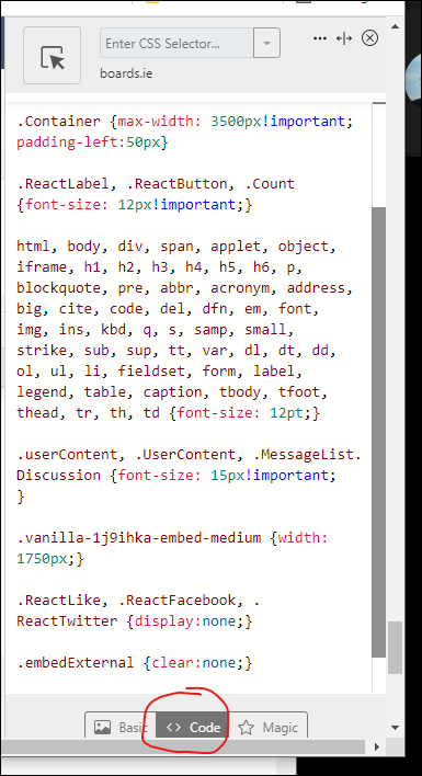
    I've used the Sylebot plugin for Chrome (on my PC) to write custom CSS to get rid of most of the whitespace at the sides, increase the font size a little, spread the post content out to fill the width of the screen and a few other bits and pieces.

    I've attached it here if anyone is interested. I threw it together very quickly, so it may introduce some unforeseen issues. I did try to do things like format stickies differently at the top of forums, and a few other thigs, but there wasn't an immediately easy way to do them, so I left it. The code I'm using also hides the ads, but I don't feel right about sharing that.


  • Registered Users, Registered Users 2 Posts: 40,513 ✭✭✭✭ohnonotgmail


  • Advertisement
  • Registered Users, Registered Users 2 Posts: 9,087 ✭✭✭Gregor Samsa


    install Stylebot in Chrome (https://chrome.google.com/webstore/detail/stylebot/oiaejidbmkiecgbjeifoejpgmdaleoha?hl=en)

    Visit Boards.ie, and then open the plugin and click "Open Stylebot"

    Make sure you've got the "Code" tab selected, and paste in the CSS from my attachment (or write your own).

    It auto saves, so just hit the X to close the code window. The CSS will only apply to boards.ie, not any other sites.


    EDIT: I will say that the much improved image management features of Vanilla made this post much easier to make than it would have been on vBulletin.


  • Registered Users, Registered Users 2 Posts: 9,087 ✭✭✭Gregor Samsa


    These screenshots are full-screen on a 2k 27" monitor.


    Original:

    With my Stylebot script:

    The huge amount of white space in the second post in the image above is actually a signature that user has added. The whitespace in the third post seems to be cause by the user hitting the return key a few times after typing their post, so effectively this whitespace is content and not the fault of Boards. Most posts are like the first one, without excessive white space between the content and the reaction buttons.


  • Registered Users, Registered Users 2 Posts: 18,067 ✭✭✭✭fryup


    C'MON those in authority - listen to the people revert to the old version for the love of god

    "lord bless us & save us"

    😐️


  • Registered Users, Registered Users 2 Posts: 14,217 ✭✭✭✭briany


    Get rid of the 'Like' button with the thumbs up thing. I don't think the Facebook aesthetic is a direction to be moving in. There was nothing wrong with the old thanks system and the way the names of the posters would appear in the thanks list below your post.


  • Registered Users, Registered Users 2 Posts: 9,087 ✭✭✭Gregor Samsa


    They can't revert, that's just not going to happen. This isn't just a new design they've put on Boards, they've changed the entire software they're running on. They moved for a reason: because the old platform was held together with customisations and hacks that were becoming untenable. We've all suffered through the glitches and performance issues and outages over the past couple of years. They weren't going to go away without a change like this.

    The problems we're facing now are with the interface. They can be fixed.

    The problems they were facing was with the infrastructure. That can't be fixed anywhere near as easily.

    So in that situation the right thing to do is to move to a more stable and sustainable infrastructure. Where they went wrong was in not preparing properly. Downtime was far too long, and when it came back up, things obviously weren't complete. But they're one full-time developer and a volunteer helper.

    I manage teams that implement and maintain ecommerce sites. On our bigger clients, I've teams consisting of 4 or 5 developers, 2 or 3 QA, a Solution Architect, two project managers and a Business Analyst - and that's just for dealing with the front end. For a site the size of Boards, they're vastly under-resourced.


  • Registered Users, Registered Users 2 Posts: 6,047 ✭✭✭appledrop


    They need to get rid of whiteness + long scroll on mobile.

    I'll stay because I love the weather forums but couldn't be bothered looking up anything else anymore, so I suppose I'll save myself a lot of time!


  • Registered Users, Registered Users 2 Posts: 43,028 ✭✭✭✭SEPT 23 1989


    If the new site was a car it would be launch of the VW Mk3 GTI 8v


  • Registered Users, Registered Users 2 Posts: 9,087 ✭✭✭Gregor Samsa


    They are back (must be since yesterday).

    Go into Edit Profile - Notification Settings, and configure the notifications you want.

    there’s actually better, more granular notification settings than there was on vBulletin.

    I just set mine up a few minutes ago, and was notified about your post.

    Again, where Boards went wrong here was not having this available from the start, giving the impression that the new system lacked features the old one had.


  • Registered Users, Registered Users 2 Posts: 4,696 ✭✭✭Pretzill


    I can't navigate the new setup at all - can't find any topics or categories? I'm using touch, maybe I'm missing something obvious?


  • Advertisement
  • Registered Users, Registered Users 2 Posts: 4,696 ✭✭✭Pretzill


    Just after seeing the top navigation now ;)


Advertisement