Advertisement
If you have a new account but are having problems posting or verifying your account, please email us on hello@boards.ie for help. Thanks :)
Hello all! Please ensure that you are posting a new thread or question in the appropriate forum. The Feedback forum is overwhelmed with questions that are having to be moved elsewhere. If you need help to verify your account contact hello@boards.ie
Hi all,
Vanilla are planning an update to the site on April 24th (next Wednesday). It is a major PHP8 update which is expected to boost performance across the site. The site will be down from 7pm and it is expected to take about an hour to complete. We appreciate your patience during the update.
Thanks all.
Experienced teachers in Ireland among the lowest paid among OECD countries
Options
-
29-09-2014 12:21am#1The OECD publication, Education at a Glance, tweeted an interesting chart recently which showed that experienced teachers in Ireland are among the lowest paid teachers among OECD countries relative to other countries which have third level graduates in their workforce.
I'd be pretty certain that the teachers in many of these countries are not forced to contribute 15%+ of their wage to a pension fund which does not exist - as is the case in Ireland - also.
Ally this to the fact that teachers in Irish schools work among the longest classroom contact hours among OECD countries and it is pretty clear that teaching in Ireland is no longer an attractive job when compared internationally.
These statistics do not include the free work that teachers in Ireland must do as a result of the Haddington Road Agreement.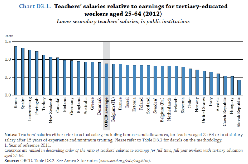 7
7
Comments
-
Here is a link to the full report, it would be better if people read the whole report rather than focussing on one table as it might be misleading. You run the danger of being accused of not telling the full story.
http://www.oecd.org/edu/Education-at-a-Glance-2014.pdf
For example, Chart D.3 A would show that we don't get the mathematical performance from students that the teacher salary level suggests we should.
Chart D.3.2 shows only 9 countries pay better at the minimum than Ireland, and only 11 at the maximum.
Despite the cuts, Chart D.3.3 shows that Irish teachers had the fifth highest increase between 2000 and 2012.
I am only pointing these out for accuracy, not saying anything about whether teachers are unfairly (high or low) or fairly paid.0 -
Here is a link to the full report, it would be better if people read the whole report rather than focussing on one table as it might be misleading. You run the danger of being accused of not telling the full story.
http://www.oecd.org/edu/Education-at-a-Glance-2014.pdf
For example, Chart D.3 A would show that we don't get the mathematical performance from students that the teacher salary level suggests we should.
Chart D.3.2 shows only 9 countries pay better at the minimum than Ireland, and only 11 at the maximum.
Despite the cuts, Chart D.3.3 shows that Irish teachers had the fifth highest increase between 2000 and 2012.
I am only pointing these out for accuracy, not saying anything about whether teachers are unfairly (high or low) or fairly paid.
Why don't you actually refer to the chart that was in the opening post?
What sort of nonsense is this. . ."we don't get the mathematical performance from students that the teacher salary level suggests we should"
Are you trying to imply that mathematical performance is directly correlated to teacher pay?
Recent OECD PISA results (Released Dec 2013) in Science, Mathematics & Reading show Ireland to have among the best results in Europe in terms of reading, higher than average results across the world in terms of Science and Mathematics.
Now please refer to the chart in the opening post and let us know what it is you disagree with in that chart. . . Or does it not suit your prejudice?0 -
Peter Flynt wrote: »Why don't you actually refer to the chart that was in the opening post?
Because it is one table from a report hundreds of pages long and anyone posting it in isolation without linking to the report could justifiably be accused of selective quoting.
One swallow does not make a summer, one chart does not make a solid argument.
Funnily enough, I am not arguing that teachers are not underpaid (like the double negative?), I am only pointing out the limitations of using one chart. Apologies if you were not able to understand that.
If you were just posting it to have a rant or a sermon about how teachers are underpaid, then fair enough. If you were posting it to try and make a point in discussion, then it isn't enough to convince anyone with half a brain.Peter Flynt wrote: »What sort of nonsense is this. . ."we don't get the mathematical performance from students that the teacher salary level suggests we should"
Are you trying to imply that mathematical performance is directly correlated to teacher pay?
I am not but the OECD go to some interesting lengths to show that there is a link, that the higher the teacher salary, the higher the mathematical performance of students. There is a definite correlation shown on their graph. Maybe if you read the report in full, you will see this.
The point I was making was that Ireland's position on the graph demonstrated underperformance in maths relative to teacher salary. Like the usage of one chart, this isn't a swallow that makes a summer but it is as interesting as your one chart.Peter Flynt wrote: »
Now please refer to the chart in the opening post and let us know what it is you disagree with in that chart. . . Or does it not suit your prejudice?
Unlike you, I don't have any prejudice. Over on the Irish Economy forum, I am often accused of overly defending public servants. I am just interested in the facts and I strongly dislike seeing something like this where one chart out of a huge report is used to make a point.0 -
Maybe if you read the report in full, you will see this.
. . and you've read the report in FULL I suppose. :rolleyes:The point I was making was that Ireland's position on the graph demonstrated underperformance in maths relative to teacher salary. Like the usage of one chart, this isn't a swallow that makes a summer but it is as interesting as your one chart.
Ireland is NOT under performing in Mathematics. Please refer to the PISA stats released in 2013 which you choose to ignore.Unlike you, I don't have any prejudice.
Yes you do. But you're trying to give the appearance that you don't.Over on the Irish Economy forum, I am often accused of overly defending public servants. I am just interested in the facts and I strongly dislike seeing something like this where one chart out of a huge report is used to make a point.
Answer this - Are teachers in Ireland paid less than their third level graduate counterparts in comparison to teachers/graduates in other OECD economies?0 -
Peter Flynt wrote: »The OECD publication, Education at a Glance, tweeted an interesting chart recently which showed that experienced teachers in Ireland are among the lowest paid teachers among OECD countries relative to other countries which have third level graduates in their workforce.
I'd be pretty certain that the teachers in many of these countries are not forced to contribute 15%+ of their wage to a pension fund which does not exist - as is the case in Ireland - also.
Ally this to the fact that teachers in Irish schools work among the longest classroom contact hours among OECD countries and it is pretty clear that teaching in Ireland is no longer an attractive job when compared internationally.
These statistics do not include the free work that teachers in Ireland must do as a result of the Haddington Road Agreement.
While Godge is correct in saying that only one chart from an extremely long report is insufficient evidence,nonetheless the evidence as a whole does paint a dismal picture of teacher salaries in Ireland and as such is very depressing.
Peter Flynt also quite rightfully pointed out that the charts don't account for the pension levy,a defacto pay cut.Taking into account the extra hours teachers now work,the extra taxes brought in over the years,the high ratio of class contact time, the volunteer work teachers do [also acknowledged in that report] alligned with the high cost of living in Ireland,there is no doubt whatsoever that teaching in this country is now a poorly paid job.0 -
Advertisement
-
It is a little confusing when I see in Table X2.4b of annex 2 (Annual statutory teachers’ salaries in public institutions for teachers with 15 years of experience and minimum training by level of education, in national currency) that Ireland has a higher salary than countries such as Finland, France and Spain for Primary, Lower and upper secondary, yet it is lower in the chart in the OP. We also see in B2.4 that Ireland has a relatively high spending in 'core educational services' relative to many other countries. I stopped there as I realised that in order to actually get a feel for the report, I would really need to read it all....and at 500 pages I have better things to do than that.0
-
It is a little confusing when I see in Table X2.4b of annex 2 (Annual statutory teachers’ salaries in public institutions for teachers with 15 years of experience and minimum training by level of education, in national currency) that Ireland has a higher salary than countries such as Finland, France and Spain for Primary, Lower and upper secondary, yet it is lower in the chart in the OP. We also see in B2.4 that Ireland has a relatively high spending in 'core educational services' relative to many other countries. I stopped there as I realised that in order to actually get a feel for the report, I would really need to read it all....and at 500 pages I have better things to do than that.
It's not salary per se that is being measured.
It is examining salary in comparison to the salary of other non-teacher third level graduates with respect to each economy.
Regarding the Education at a Glance series. . . This is not a book which is read from page 1 and then a conclusion is made at the end of the last page.
It is simply a statistical list of various factors to compare and contrast different education systems across the world.
So there is absolutely nothing wrong with taking a particular table and using the results and data coagulated in that table to draw one particular conclusion.
For instance - Teachers in Irish secondary schools work more classroom contact hours than teachers in most other OECD countries. This is a fact that is entirely based on the table proving that fact.
You don't have to read reems and reems of irrelevant information to arrive at that particular chart/table before drawing that conclusion.0 -
........
I am not but the OECD go to some interesting lengths to show that there is a link, that the higher the teacher salary, the higher the mathematical performance of students. There is a definite correlation shown on their graph. Maybe if you read the report in full, you will see this.
Meh!! Correlation and causation... here is a 'definite correlation' for yis.
I'd hazzard a guess that the places where they get paid the most they also have the lowest class sizes too. Are their classes streamed? Do they study the exact same course content as Ireland? Were they allowed to select particular schools/students to be put forward for testing?0 -
Peter Flynt wrote: »
So there is absolutely nothing wrong with taking a particular table and using the results and data coagulated in that table to draw one particular conclusion.
.
I think if I was to present the fact that Irish teachers earn more than Spanish, French, Finnish etc teachers in its isolation I would quite rightly be accused of selective fact checking. Comparing education pay and policy among several OECD countries is not something that can be summed up with one graph in my opinion.0 -
I think if I was to present the fact that Irish teachers earn more than Spanish, French, Finnish etc teachers in its isolation I would quite rightly be accused of selective fact checking. Comparing education pay and policy among several OECD countries is not something that can be summed up with one graph in my opinion.
It can be done and has been done. This is what OECD inspectors do. They visit various countries. In those countries they meet Principals, teachers, students, Ministers for Education, Prime Ministers even.
They then produce their stats and report which are awaited with bated breath by policy makers and politicians.
So whilst you may be right to conclude that teachers in Ireland are more highly paid than teachers in some other OECD countries (hardly a surprise given the high cost of living here in comparison to other OECD countries). . . . It is also simultaneously true that experienced teachers in Ireland are not remunerated to the same extent that they are in other OECD countries when economies are compared.0 -
Advertisement
-
I think if I was to present the fact that Irish teachers earn more than Spanish, French, Finnish etc teachers in its isolation I would quite rightly be accused of selective fact checking. Comparing education pay and policy among several OECD countries is not something that can be summed up with one graph in my opinion.
Although they are comparing the salary of teachers to other 3rd level graduates within those countries.. so it would factor out costs of living etc.
I think it's not the € amount between countries that's the crux of the issue but the ratio within. So from that point of view then I think 1 self contained chart is enough... what more do we need to know?0 -
Surely that depends on how you do the comparison. I mean according to the OECD the cost of living in Finland is higher than Ireland yet their base salary is lower. I only mention cost of living as it was measure you used. The point being that any comparison will be multifaceted. I haven't read the report (as I already mentioned) however I really think some infromation on what comparisons they did would be helpful.
In the table above they're comparing the salary of different teachers after 15 years in comparison to a third level graduate working in the same country.
That's the comparison. . . and clearly in Ireland we pay less.
So the message is clear to graduates - A career in teaching in Ireland will lead to a lower future wage than an alternative career elsewhere.
Irish teachers are also in the unenviable position of not being in a position to be promoted. . . which is pretty much unheard of - even in the poorest of countries0 -
Peter Flynt wrote: »
Irish teachers are also in the unenviable position of not being in a position to be promoted. . . which is pretty much unheard of - even in the poorest of countries
And there lies the crux of the matter.Here they are in Ireland imposing a business model in the second level education sector where it's all about accountability,inspections,targets etc but with almost zero promotion prospects and poor pay.All you bright, ambitious third level graduates,go figure!0 -
Although they are comparing the salary of teachers to other 3rd level graduates within those countries.. so it would factor out costs of living etc.
I think it's not the € amount between countries that's the crux of the issue but the ratio within. So from that point of view then I think 1 self contained chart is enough... what more do we need to know?
Not all economies are the same. Take a small open economy that has a large number of foreign companies employing imported graduates on high salaries in particular well-paid industries such as finance/banking, pharmaceutical and IT.
If such an economy existed (sounds a lot like Ireland), their teachers, whether well-paid or underpaid, would look underpaid compared to the average graduate. Which is what Peter's table shows. Can't argue with that.
However, it doesn't tell us whether teachers are underpaid. It tells us that the different structure of Ireland's economy creates an impression from one graph that teachers are underpaid. Whether that is the truth requires further investigation.
As was said already in this thread: "Correlation and causation... here is a 'definite correlation' for yis"0 -
Here is a link to the full report, it would be better if people read the whole report rather than focussing on one table as it might be misleading. You run the danger of being accused of not telling the full story.
http://www.oecd.org/edu/Education-at-a-Glance-2014.pdf
For example, Chart D.3 A would show that we don't get the mathematical performance from students that the teacher salary level suggests we should.
Chart D.3.2 shows only 9 countries pay better at the minimum than Ireland, and only 11 at the maximum.
Despite the cuts, Chart D.3.3 shows that Irish teachers had the fifth highest increase between 2000 and 2012.
I am only pointing these out for accuracy, not saying anything about whether teachers are unfairly (high or low) or fairly paid.
But that's not really accuracy is it? It's just another point of view surely? It is simply a few other charts carefully chosen to elicit a particular and opposing picture. Given the nature of the charts chosen people will inevitably infer bias on your part. Not saying that this is automatically a bad thing - bias is virtually impossible to guard against - but your implication that someone else's choice of chart might be "misleading" while yours could not be doesn't stack up.0 -
Powerhouse wrote: »But that's not really accuracy is it? It's just another point of view surely? It is simply a few other charts carefully chosen to elicit a particular and opposing picture. Given the nature of the charts chosen people will inevitably infer bias on your part. Not saying that this is automatically a bad thing - bias is virtually impossible to guard against - but your implication that someone else's choice of chart might be "misleading" while yours could not be doesn't stack up.
Maybe I wasn't clear. What the report in total presents is a complex picture. By some measures Irish teachers are overpaid, by others they are underpaid. The OP presented one table with a stark conclusion.
The more correct approach is to discuss the various weaknesses and strengths of the particular sets of data and come to a conclusion based on what is most relevant.
There are arguments about the methodology of the report, particularly around the use of purchasing power parity comparisons, and also arguments about the particular metrics. I have addressed some of the weaknesses in the OP's chart in another post but I am open to being convinced as to what the correct conclusion of the report is by evidence-based discussion.
As to bias, ironically, the bias I am most accused of on here is of being a slavish defender of public servants.0 -
Maybe I wasn't clear. What the report in total presents is a complex picture. By some measures Irish teachers are overpaid, by others they are underpaid. The OP presented one table with a stark conclusion.
The more correct approach is to discuss the various weaknesses and strengths of the particular sets of data and come to a conclusion based on what is most relevant.
There are arguments about the methodology of the report, particularly around the use of purchasing power parity comparisons, and also arguments about the particular metrics. I have addressed some of the weaknesses in the OP's chart in another post but I am open to being convinced as to what the correct conclusion of the report is by evidence-based discussion.
As to bias, ironically, the bias I am most accused of on here is of being a slavish defender of public servants.
You've addressed nothing - you went off on one about Maths teachers and Ireland "under performing" when the recent PISA results (which you ignored) showed that Ireland is NOT under performing.
Where are the "arguments about the methodology of the report"? - I don't see them.0 -
Maybe I wasn't clear. What the report in total presents is a complex picture. By some measures Irish teachers are overpaid, by others they are underpaid. The OP presented one table with a stark conclusion.
The more correct approach is to discuss the various weaknesses and strengths of the particular sets of data and come to a conclusion based on what is most relevant.
There are arguments about the methodology of the report, particularly around the use of purchasing power parity comparisons, and also arguments about the particular metrics. I have addressed some of the weaknesses in the OP's chart in another post but I am open to being convinced as to what the correct conclusion of the report is by evidence-based discussion.
As to bias, ironically, the bias I am most accused of on here is of being a slavish defender of public servants.
Welll unless I;m reading it wrong purchasing power parity does not enter into it as it's a ratio between teachers and other 3rd level graduates within each country... Sure there are other factors, but supposing you were comparing the ratio of the wealthiest to the poorest earnings in each country (as an extreme example)... It would be very easy to compare the differences between Monaco and India... all from one chart. Sure there are flaws but the essential difference would still stand.
Correct me if im wrong but the report does not come to any one conclusion!0 -
Peter Flynt wrote: »You've addressed nothing - you went off on one about Maths teachers and Ireland "under performing" when the recent PISA results (which you ignored) showed that Ireland is NOT under performing.
Where are the "arguments about the methodology of the report"? - I don't see them.
Have a read of the report, including some of the methodology appendices.0 -
-
Advertisement
-
Peter Flynt wrote: »The graph is clear. . . Sorry it doesn't match your prejudice.
Perhaps the OECD could be so kind as to come up with graphs that suit your prejudice?
At least read my posts if you are not going to read the report.Here is a link to the full report, it would be better if people read the whole report rather than focussing on one table as it might be misleading. You run the danger of being accused of not telling the full story.
http://www.oecd.org/edu/Education-at-a-Glance-2014.pdf
For example, Chart D.3 A would show that we don't get the mathematical performance from students that the teacher salary level suggests we should.
Chart D.3.2 shows only 9 countries pay better at the minimum than Ireland, and only 11 at the maximum.
Despite the cuts, Chart D.3.3 shows that Irish teachers had the fifth highest increase between 2000 and 2012.
I am only pointing these out for accuracy, not saying anything about whether teachers are unfairly (high or low) or fairly paid.Because it is one table from a report hundreds of pages long and anyone posting it in isolation without linking to the report could justifiably be accused of selective quoting.
One swallow does not make a summer, one chart does not make a solid argument.
Funnily enough, I am not arguing that teachers are not underpaid (like the double negative?), I am only pointing out the limitations of using one chart. Apologies if you were not able to understand that.
If you were just posting it to have a rant or a sermon about how teachers are underpaid, then fair enough. If you were posting it to try and make a point in discussion, then it isn't enough to convince anyone with half a brain.
I am not but the OECD go to some interesting lengths to show that there is a link, that the higher the teacher salary, the higher the mathematical performance of students. There is a definite correlation shown on their graph. Maybe if you read the report in full, you will see this.
The point I was making was that Ireland's position on the graph demonstrated underperformance in maths relative to teacher salary. Like the usage of one chart, this isn't a swallow that makes a summer but it is as interesting as your one chart.
Unlike you, I don't have any prejudice. Over on the Irish Economy forum, I am often accused of overly defending public servants. I am just interested in the facts and I strongly dislike seeing something like this where one chart out of a huge report is used to make a point.0 -
edit0
-
Peter Flynt wrote: »The graph is clear. . . Sorry it doesn't match your prejudice.
Perhaps the OECD could be so kind as to come up with graphs that suit your prejudice?
MOD WARNING:
Please desist from the name calling.
Arguing over stats can lead to ratholing so I would suggest that members 'agree to differ' at some stage and then move on.
Member has been warned
0 -
Welll unless I;m reading it wrong purchasing power parity does not enter into it as it's a ratio between teachers and other 3rd level graduates within each country... Sure there are other factors, but supposing you were comparing the ratio of the wealthiest to the poorest earnings in each country (as an extreme example)... It would be very easy to compare the differences between Monaco and India... all from one chart. Sure there are flaws but the essential difference would still stand.
Correct me if im wrong but the report does not come to any one conclusion!
As I have said already, the chart is one chart in a whole report, there are other charts and there are other reports. To reach conclusions based on one chart is not sensible.
Here for example is another report I came across.
http://www.ipa.ie/pdf/Public_Sector_Trends_2013.pdf
Generally, the picture it paints of the public sector is broadly favourable, especially in the context of the cutbacks over the last few years. But for the education sector in particular, there are some conclusions which are worrying. Everyone is familiar with the PISA scores which Ireland has been doing well on, and these are referenced in the reports, it is on other measures that there are significant worries:
On adult literacy: "• Ireland ranked 14th of 17 participating European countries. Only France, Spain and Italy had lower scores."
"Ireland had a high proportion of adults (37.6 per cent) at proficiency level 2 (from 226-275 points), where 5 was the highest proficiency level. In most countries, most adults performed at proficiency level 3 (276-325 points)."
Similarly on adult numeracy: "As with the literacy proficiency scores, Ireland ranked 14th of 17 participating European countries. Finland ranks highest"
This one is most worrying given we are trying to build a high-technology society:
"For the purposes of this OECD study, problem solving in technology rich environments is defined as the ability to use digital technology, communication tools and networks to acquire and evaluate information, communicate with others and perform practical tasks.
• Ireland ranked 12th of 13 participating European countries on this test. This ranking also applied when just looking at young adults aged 16-24."
Then there is a section that puts the PISA results into the context of spending i.e. do we get the expected PISA results for the money we spend on education?
On literacy, we perform as expected: "Ireland is with a cluster of countries that spend around the European average and get results that are similarly around the average, that is, performance is in line with what might be expected given the resources put in, showing an average level of efficiency." Not good enough.
But on numeracy: "Ireland spends around the European average per student but achieves a lower level of performance in maths than most countries that spend comparable amounts." Not good at all.0 -
As I have said already, the chart is one chart in a whole report, there are other charts and there are other reports. To reach conclusions based on one chart is not sensible.
Here for example is another report I came across.
http://www.ipa.ie/pdf/Public_Sector_Trends_2013.pdf
Generally, the picture it paints of the public sector is broadly favourable, especially in the context of the cutbacks over the last few years. But for the education sector in particular, there are some conclusions which are worrying. Everyone is familiar with the PISA scores which Ireland has been doing well on, and these are referenced in the reports, it is on other measures that there are significant worries:
On adult literacy: "• Ireland ranked 14th of 17 participating European countries. Only France, Spain and Italy had lower scores."
"Ireland had a high proportion of adults (37.6 per cent) at proficiency level 2 (from 226-275 points), where 5 was the highest proficiency level. In most countries, most adults performed at proficiency level 3 (276-325 points)."
Similarly on adult numeracy: "As with the literacy proficiency scores, Ireland ranked 14th of 17 participating European countries. Finland ranks highest"
This one is most worrying given we are trying to build a high-technology society:
"For the purposes of this OECD study, problem solving in technology rich environments is defined as the ability to use digital technology, communication tools and networks to acquire and evaluate information, communicate with others and perform practical tasks.
• Ireland ranked 12th of 13 participating European countries on this test. This ranking also applied when just looking at young adults aged 16-24."
Then there is a section that puts the PISA results into the context of spending i.e. do we get the expected PISA results for the money we spend on education?
On literacy, we perform as expected: "Ireland is with a cluster of countries that spend around the European average and get results that are similarly around the average, that is, performance is in line with what might be expected given the resources put in, showing an average level of efficiency." Not good enough.
But on numeracy: "Ireland spends around the European average per student but achieves a lower level of performance in maths than most countries that spend comparable amounts." Not good at all.
How does achieving the best results in reading in Europe in recent PISA results constitute an "average level of efficiency"?
Ignore the question as usual - The mods are perfectly happy to let you spoof away whilst letting you get away with it.0 -
Peter Flynt wrote: »How does achieving the best results in reading in Europe in recent PISA results constitute an "average level of efficiency"?
Ignore the question as usual - The mods are perfectly happy to let you spoof away whilst letting you get away with it.
Oi! Mr. Ignore the charter as usual.. yer barred.
MOD0


Advertisement